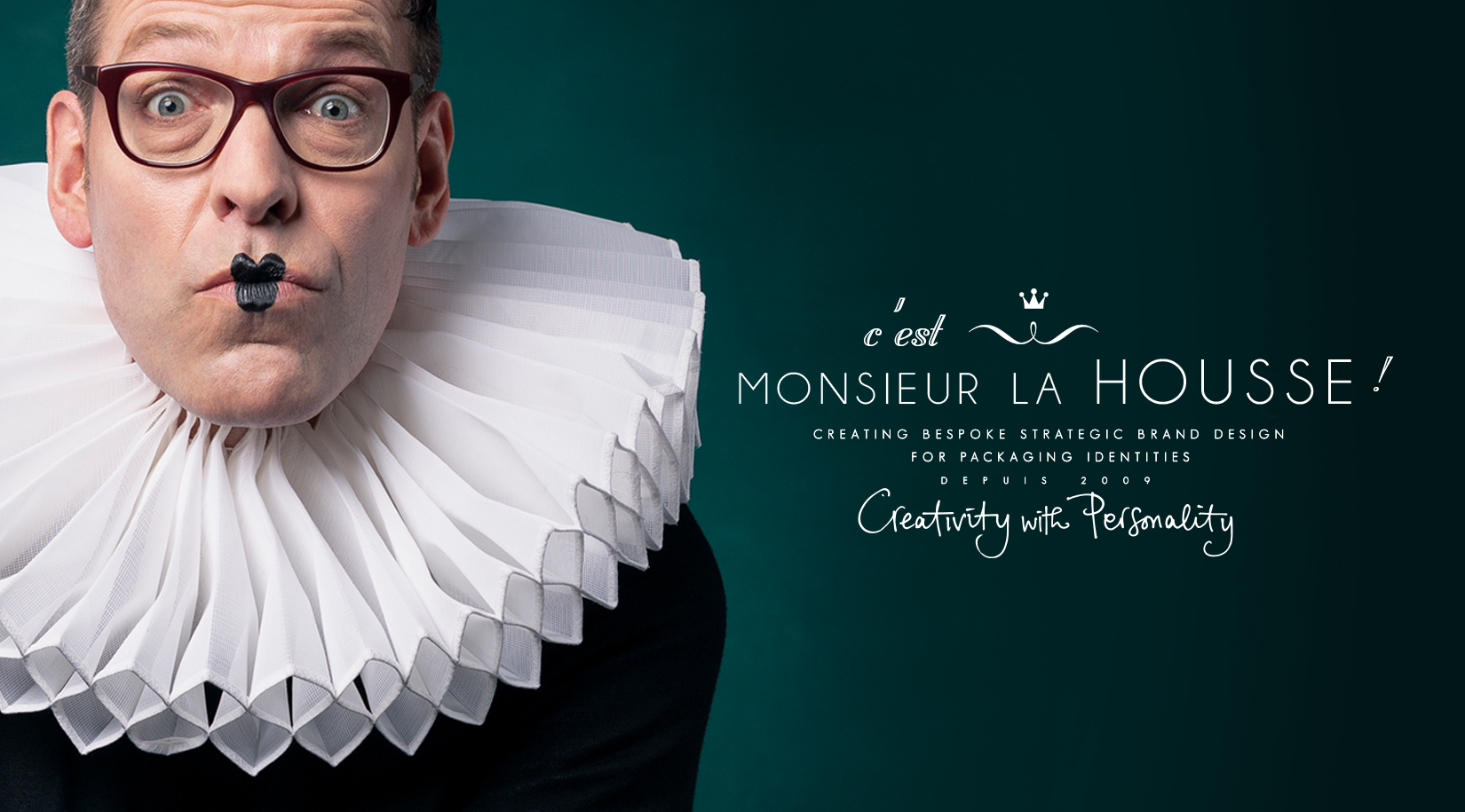
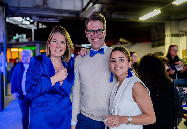
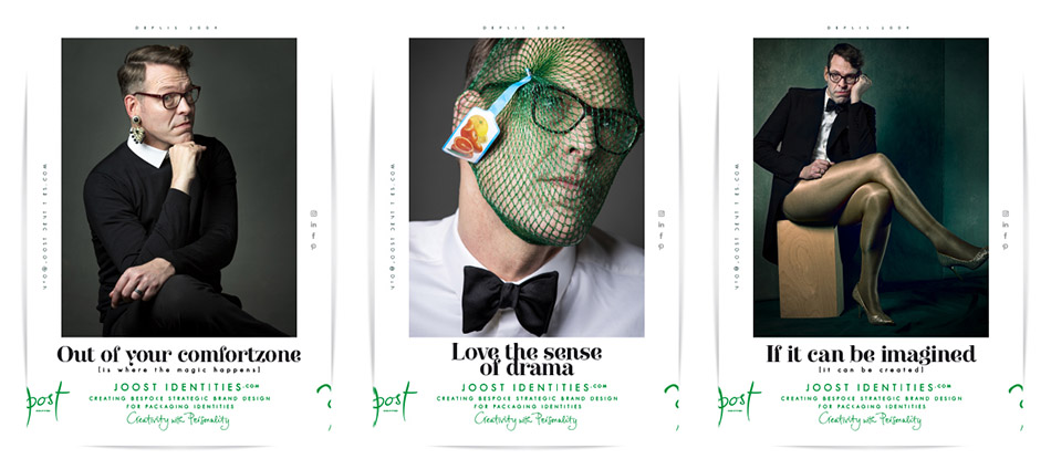
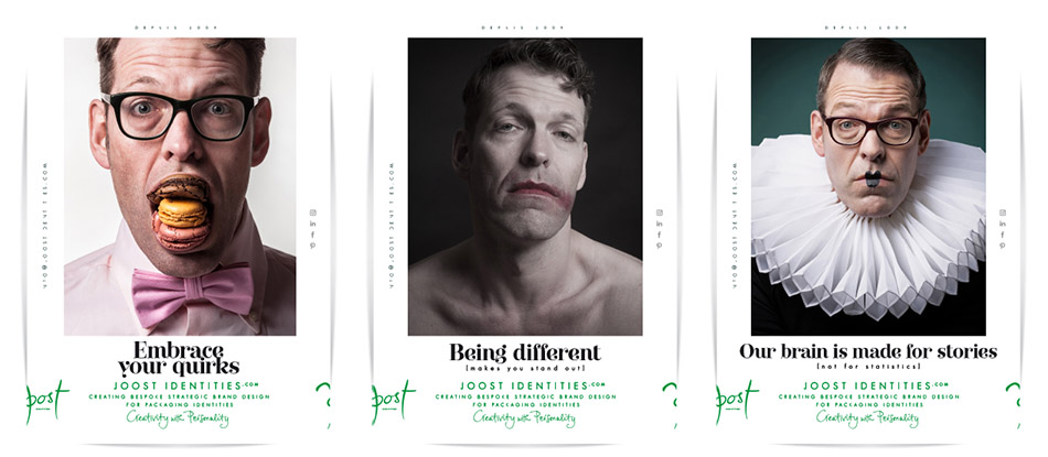
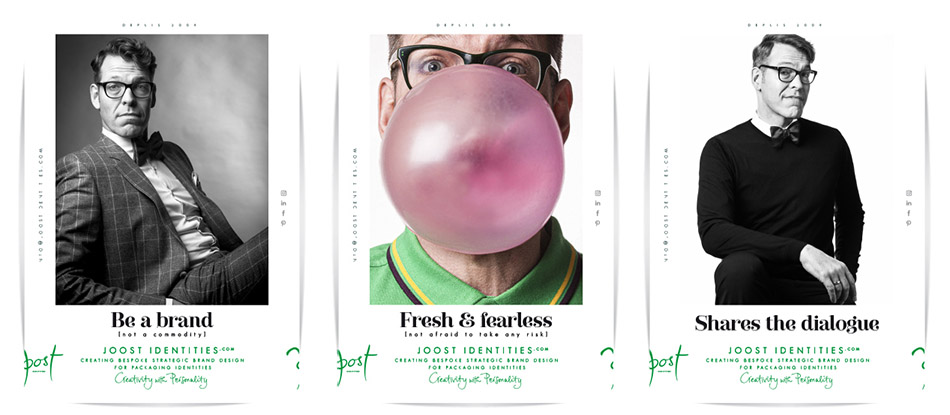
Joost la Housse is de Nederlandse onafhankelijke, award-winning strategisch brand- & packaging designer. Na 15 jaar besloot hij zijn ervaring en expertise bij designbureaus om te zetten naar een eigen onderneming ‘Joost Identities’: 360 graden brand- en packagingdesign voor merken met persoonlijkheid.
Joost voelt zich thuis in de wereld van food, non-food, beauty, cosmetics en lifestyle, daar waar merken weten dat echte connectie begint bij authenticiteit.
“Ik verbind empathie met effectiviteit, het abstracte met het concrete via brand- en packagingdesign.Om het onmogelijke mogelijk, en het complexe eenvoudige te maken.
Bedrijven hebben steeds vaker een in-house marketing, DTP en/of creatie afdeling. Juist binnen deze ‘Do-It-Yourself’ cultuur gelooft hij dat co-creatie met specialisten de meerwaarde oplevert.
Joost werkt niet vóór je, maar met je. Geen verkoop, maar samenwerking. Dat is een essentieel verschil. Want merken met betekenis ontstaan uit samenwerking. Hij stelt vragen, daagt uit, denkt mee, en geeft vorm aan wat nog niet zichtbaar is, maar wél gevoeld wordt.
“Een merk is meer dan een mooie buitenkant. Het is, net als wij, een mens met een identiteit en de behoefte om verbonden te zijn met het grotere geheel.“
Met een hoge mate van betrokkenheid levert hij unieke tailormade concepten, verrassend, eigen, met karakter. Of zoals ze in Frankrijk zeggen: 'savoir-faire': bekwaam, competent en sociaal.
Joost weet donders goed dat hij het leukste werk van de wereld heeft gecombineerd met zijn andere passie; toneel. Want ook daar draait het om beroering, activatie en verbeelding.
In ‘gesprek’ zijn met het publiek om een verhaal over te brengen dat blijft hangen.
Joost la Housse is the Dutch independent, award-winning strategic brand- & packaging designer. After working with the crème de la crème of design agencies for 15 years, Joost decided to convert his experience and expertise into a sole proprietorship, Joost Identities. 360 degrees brand- and packaging design for for brands that deserve a strong, distinctive personality and want to be noticed.
Joost feels at home in the world of food, non food, beauty, cosmetics and lifestyle, where brands understand that real connection starts with authenticity.
“I connect empathy with effectiveness, and the abstract with the concrete world – through brand- and packaging design. To make the impossible possible, and the complex beautifully simple.“
As more companies build in-house marketing, DTP, and creative teams and within this ‘Do-it-Yourself’ culture Joost believes that co-creation with specialists brings real added value.
Joost doesn’t sell to clients, he collaborates. He doesn't work for you, but with you. That’s an essential difference. Because meaningful brands are born from collaboration. He asks questions, challenges ideas, thinks alongside and gives shape what’s may not yet visible, but already felt.
“A brand is more than just a beautiful outside. Like us, it’s a human being, with an identity and the need to feel part of something bigger.”
With a sharp eye for detail and personal involvement, he delivers bespoke tailor-made concepts – surprising, characterful, and distinctly their own. Or as the French say: savoir-faire. Skilled, competent, and sociable.
Joost realizes that he has the greatest job in the world – one that beautifully combines with his other passion: theatre. Because just like creating brands, it’s all about stirring emotion, sparking imagination, and moving people. Engaging in dialogue with your audience to tell a story that truly resonates.
We leven in een complexe en fluïde wereld die voortdurend aan verandering onderhevig is. Juist dan dien je als mens dicht bij jezelf te blijven met een blijvende hang naar het verlangen om uniek en origineel te zijn met een sterke persoonlijkheid. Dit geldt voor mensen dus ook voor jouw merk.
Een merk dat raakt, leeft. Omdat het menselijke eigenschappen bezit. Met bezieling en betekenis. Alleen dan raak je de ander in het hart. Alleen dan genereer je interactie, connectie en word je onderdeel van iemands leven. Wat je betekent is belangrijker wat je doet. Daar is niets spiritueels aan maar keiharde realiteit. De hedendaagse consument co-creert zijn eigen bestaan op overtuiging, ideaal en het eerlijke verhaal. Het is aan jou of je meedoet of niet.
Ik help merken groeien vanuit een sterke branding en packaging identiteit. Van positionering tot verpakking met als doel: jouw merk relevant, geloofwaardig en betekenisvol te maken. Van strategie tot design werk ik co-creatief, met empathie en effectiviteit.
“Toon jouw persoonlijkheid en laat zien wie en hoe geloofwaardig je bent en wat je te vertellen hebt. Straal naar buiten uit hoe je je van binnen voelt , vertel jouw verhaal en mensen kiezen jou. Dat geldt voor onszelf. Dat geldt voor ieder merk, verpakking en iedere identiteit. Adem, leef en groei in alle opzichten! Wil je iemand zijn? Of ben je iemand? Kijk vooruit, wees relevant en vernieuw! Creativity with Personality.”
We live in a complex and fluid world which is constantly changing. For that precise reason, we need to stay close to ourselves, trying to retain our unique, original and strong personalities. What’s true for people, is just as true for your brand.
A brand that resonates, lives. Because it carries human qualities. Inspirational and meaningful. Only then will it touch someone’s heart. Generating, interacting, connecting and becoming part of people's lives. Being meaningful is more relevant than what you do. There is nothing spiritual about this, it is the harsh truth. Today's consumers co-create their own existence based on conviction, ideals and the honest story. It is up to you whether you participate or not.
“Disclose your personality and show who you are and what you have to say. Radiate your inner feelings, tell your story and people will choose you. This applies for us as people. It applies to brands, packaging and identities. Breathe, live and grow in every sense! Do you want to be someone? Or are you someone?. Look ahead! Be relevant and refresh! Creativity with Personality.”
Strategic repositioning Brand-, logo- & packaging identity, tone of voice, copy, communication design.
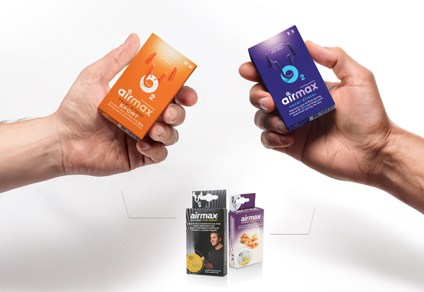
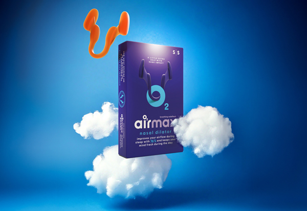
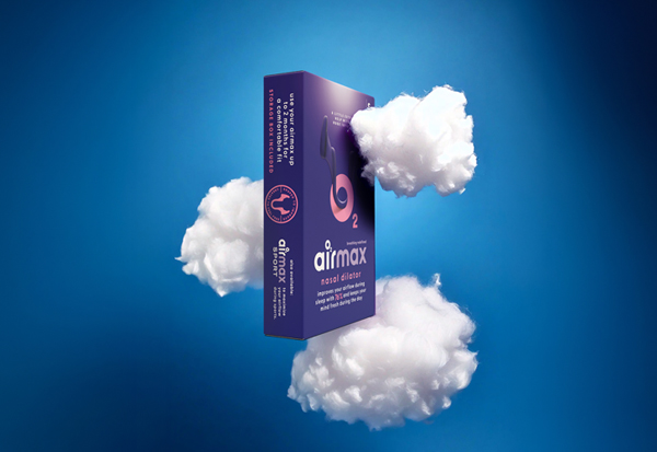
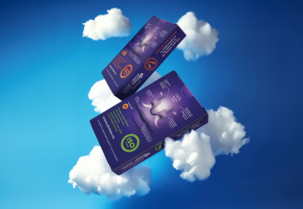
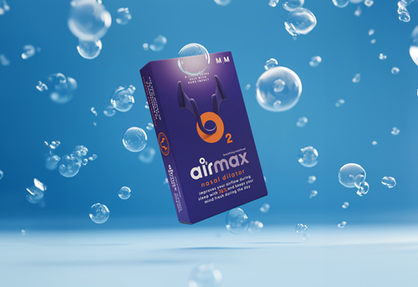
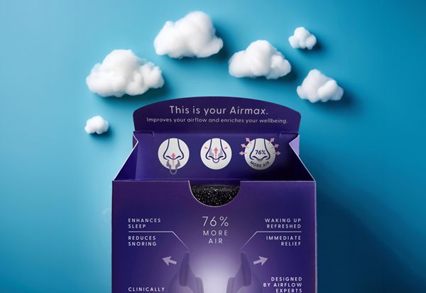
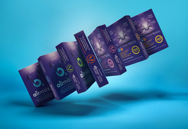
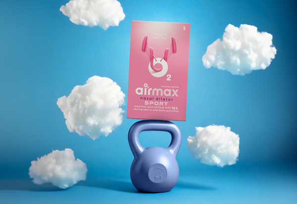
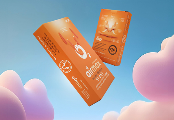
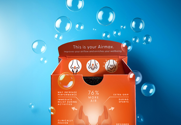
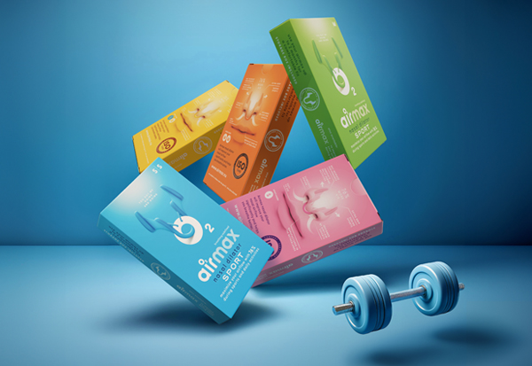
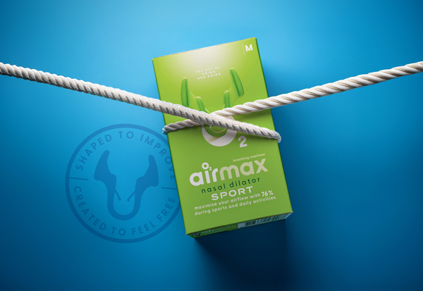
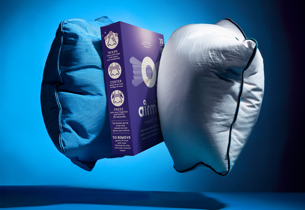
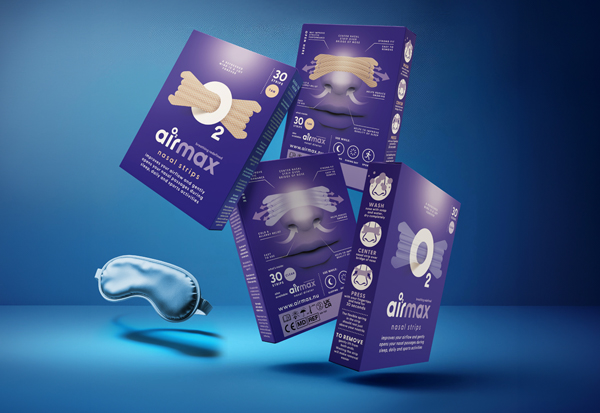
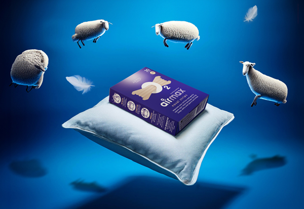
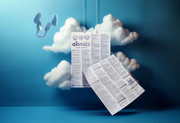
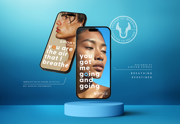
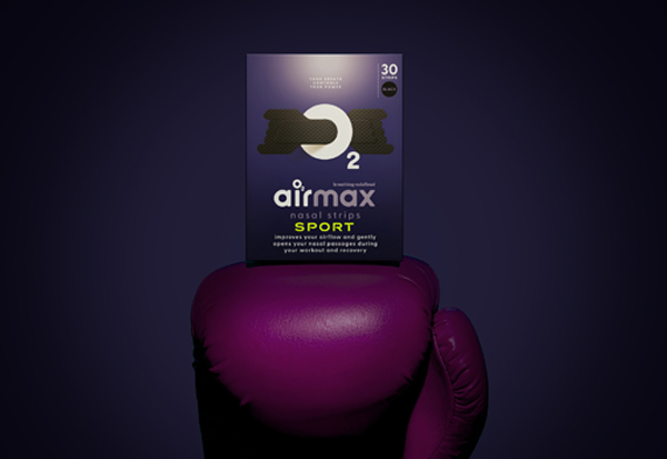
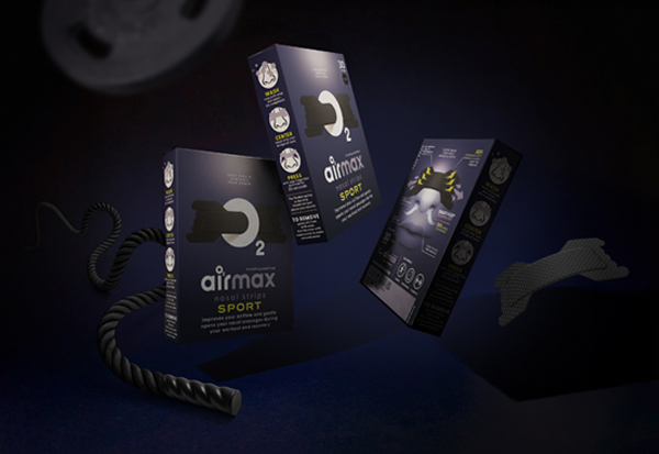
Airmax. Breathing redefined.
We breathe as one, working hand in hand to build a world where everyone can experience the joy of better breathing. Better breathing can help you sleep better, stay focused and feel more energized during sports and everyday activities. The Airmax is a well-developed product in the field of nasal dilators.The shape of the Airmax has been developed by airflow experts and its positive effects have been tested and proven by ENT doctors. Airmax nasal dilator is available in two versions Classic and Sport and both in two sizes: small and medium. Airmax strips are available in a clear, tan and black edition.
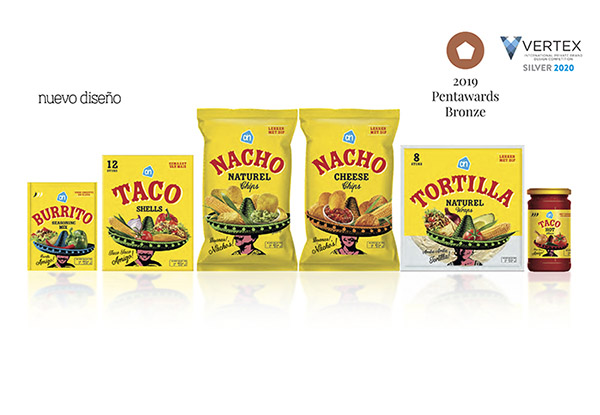
AWARD WINNING - Private label packaging design.
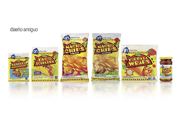
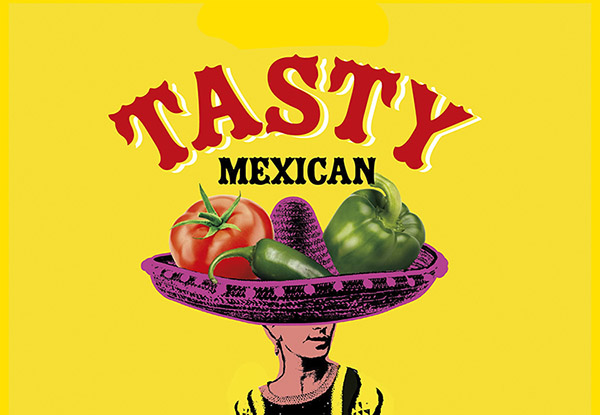
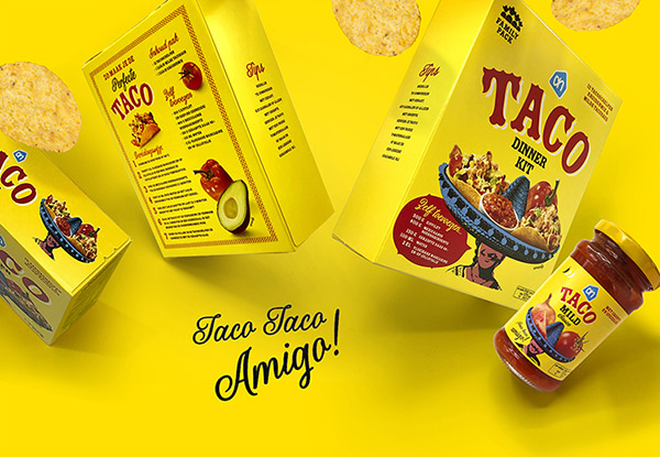
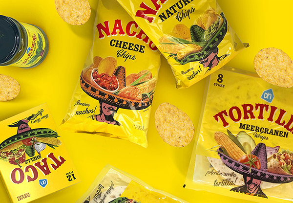
Arriba! Arriba! Ándale! Ándale! On behalf of Brand Potential (formerly Millford Brand identity) I was pleased to create this Mexican Food packaging range for Albert Heijn. Speedy up to get it!
Private label packaging design.
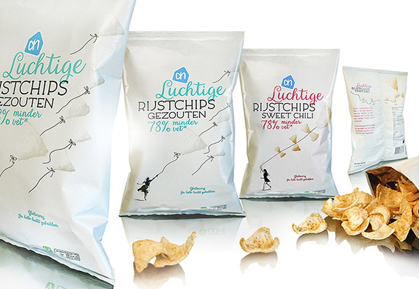
Close your eyes and turn your face into the wind. Experience the breeze of tasty light ricechips. On behalf of Brand Potential (formerly Millford Brand identity) I was pleased to create the packaging for Albert Heijns light ricechips assortment.
Private label packaging design.
Ginger Spice, Baby Spice, Sporty Spice or Scary Spice... reunion Spice Girls? Hell no! On behalf of Brand Potential (formerly Millford Brand identity) I was pleased to create the packagingrange for Albert Heijns Dry Spices.
AWARD WINNING - Strategic positioning Brand-, logo- & packaging identity.
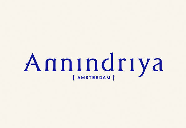
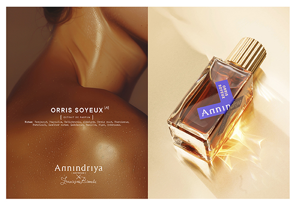
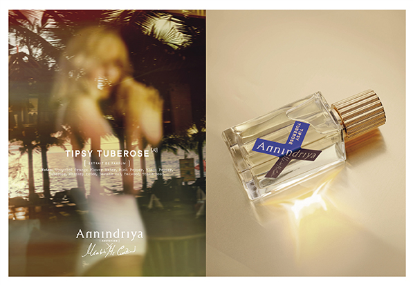
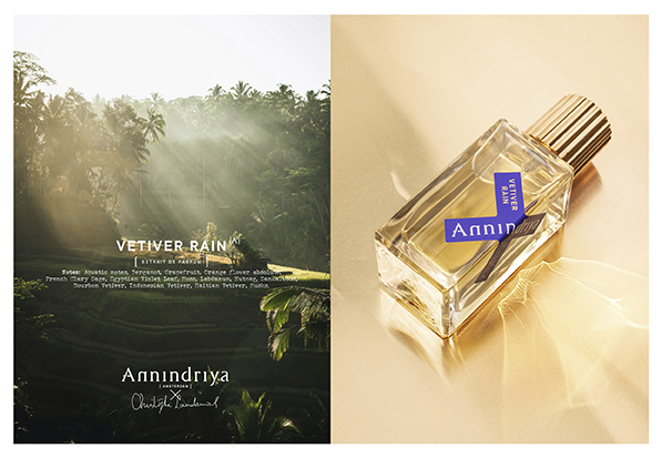
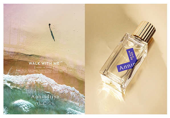
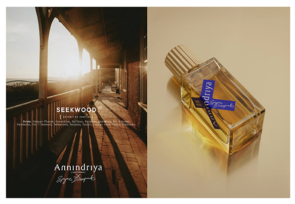
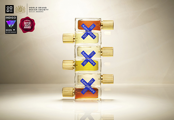
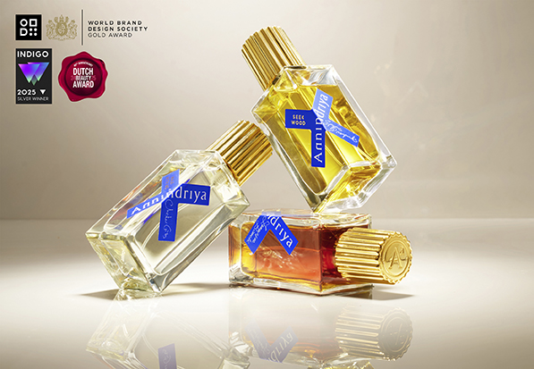
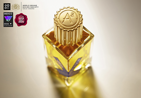
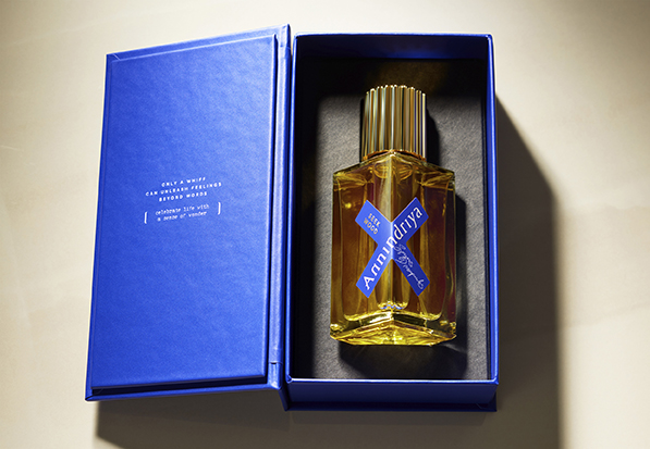
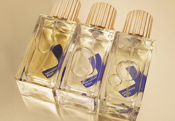
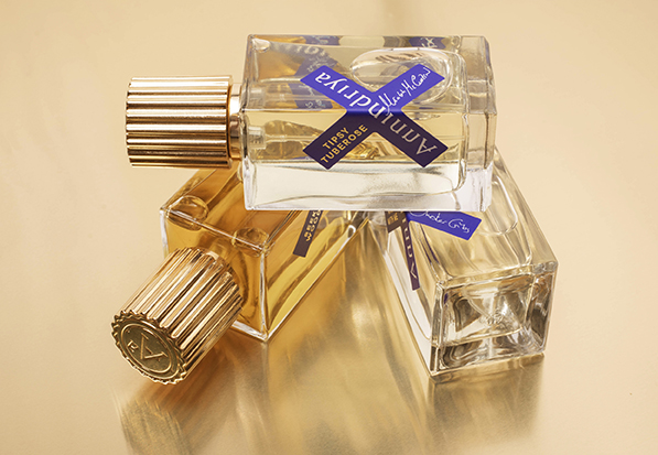
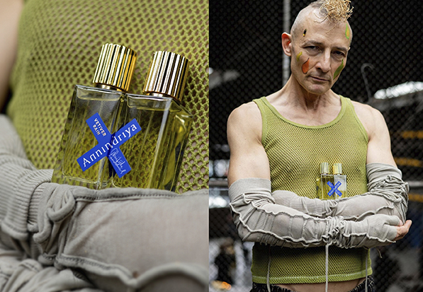
Annindriya. The joy of collaboration with a sense of wonder.
Annindriya is a space where creativity and freedom of exploration meet to create unique fragrances that evoke moments of awe and well-being. Founded as first refined niche perfume house in Amsterdam, Annindriya collaborate with creative professionals, emerging and star perfumers worldwide. “Collaboration is at the heart of our process, and we cherish collaboration for the joy it brings and the synergies it creates. The ’X’ on our perfume labels represents the crossroads where people connect. The name Annindriya has its roots in one of the oldest languages, Sanskrit, meaning ’the power of the senses’ and ’the highest insights’. With a curious mind and a nose for sensorial delight, synergies occur when deep technical expertise, human connection and creativity are combined.
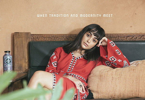
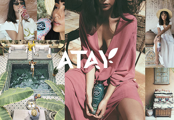
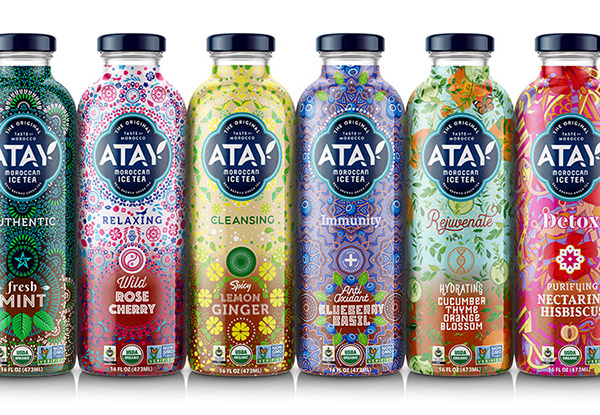
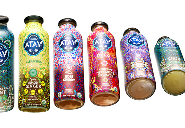
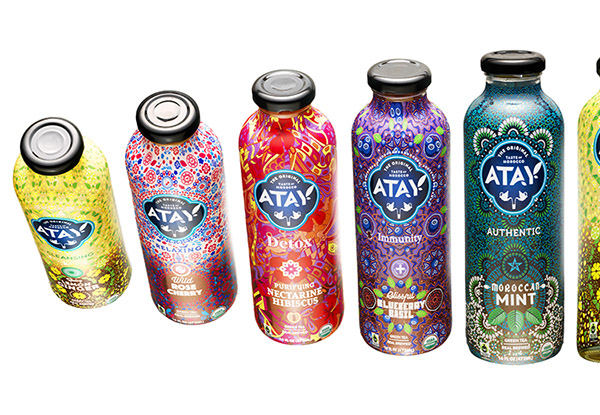
ATAY Moroccan Ice Tea. When tradition and modernity meet. Brand-, packaging design and naming.
Moroccan mint tea is synonymous with friendship and hospitality. ATAY (means "Tea" in Moroccan dialect) finds its origin in this cultural tradition.
ATAY: The Original Taste of Morocco and culturally inspired. A symbol of warm-hearted people. Watch the brandmovie here!
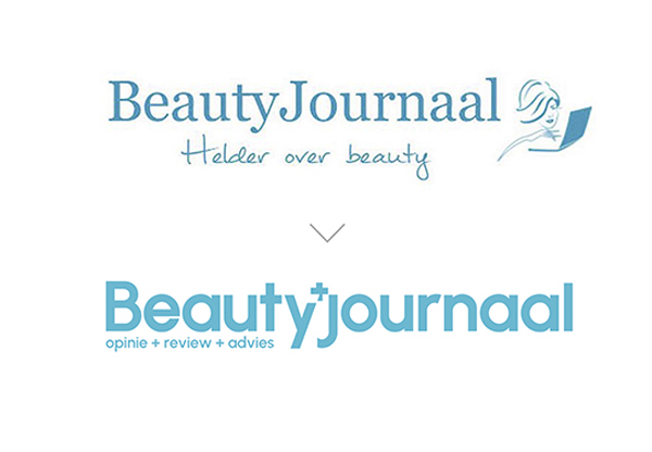
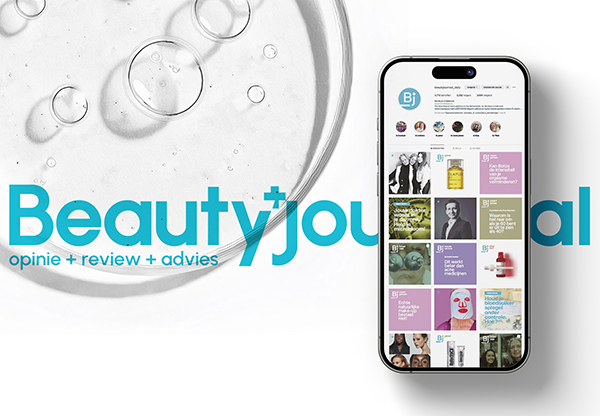
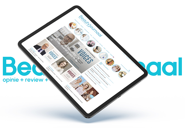
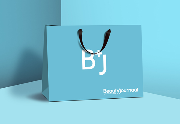
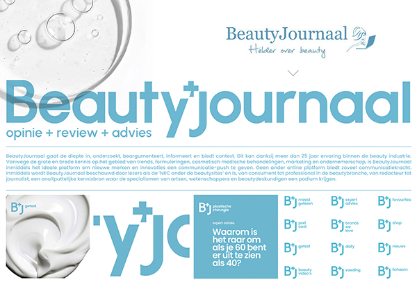
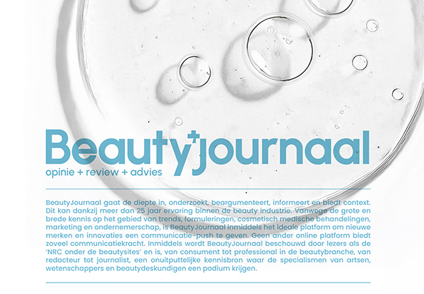
Repositioning Brand- & logo identity
BeautyJournaal, founded in 2009 by journalist and communication expert Monique Lindeboom, delves deep, investigates, argues, informs, and provides context. Due to its extensive and broad knowledge of trends, formulations, cosmetic medical treatments, marketing, and entrepreneurship, BeautyJournaal has become the ideal platform to give new brands and innovations a communication boost. No other online platform offers such communication power. An inexhaustible source of knowledge for everyone, from consumers to professionals in the beauty industry, from editors to journalists. It provides a platform where the expertise of doctors, scientists, and beauty experts is showcased.
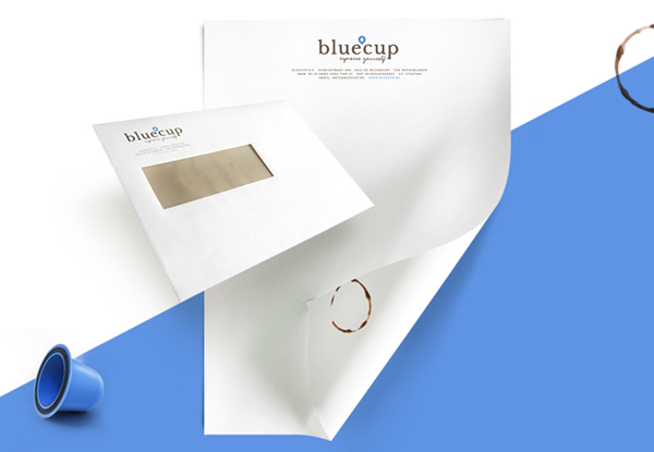
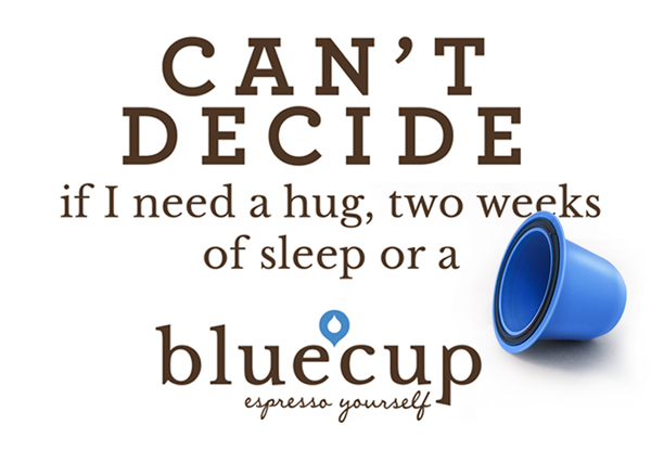
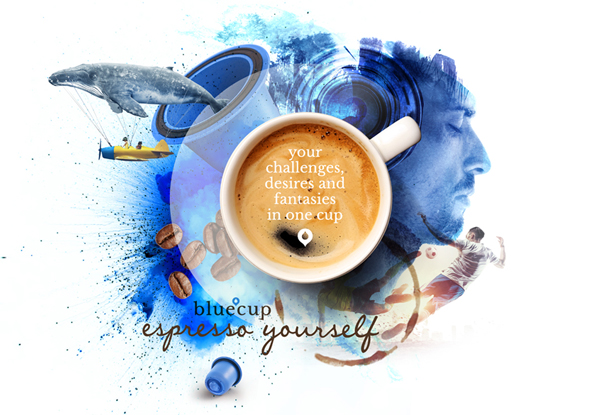
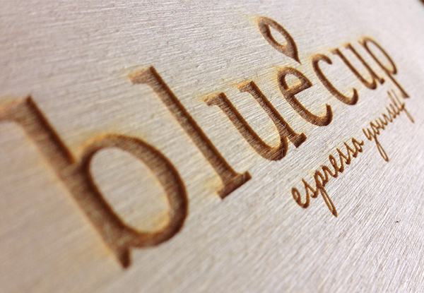
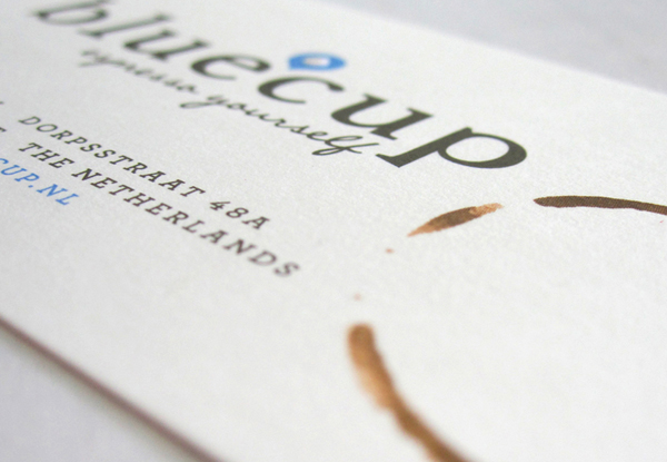
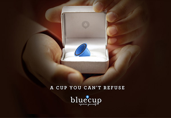
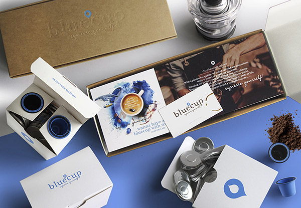
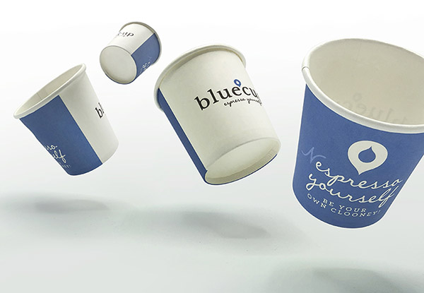
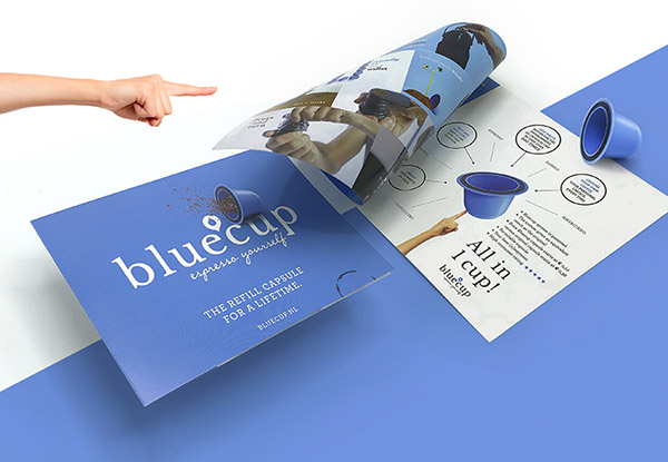
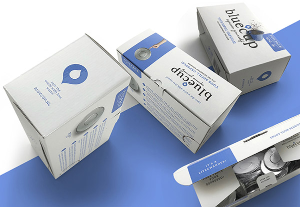
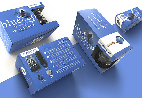
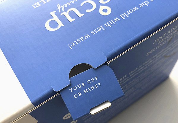
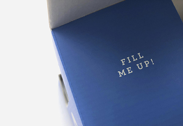
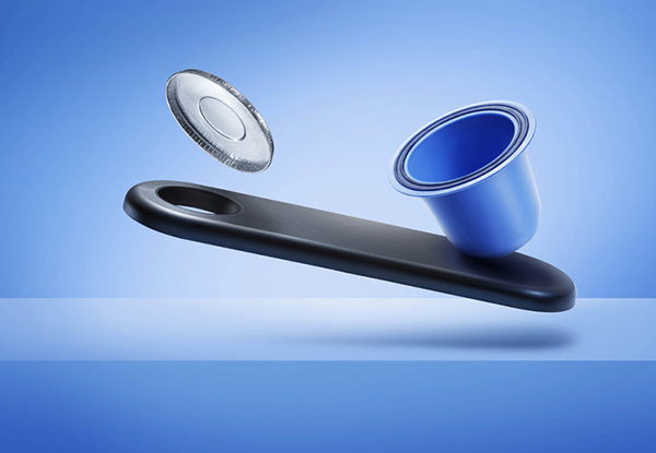
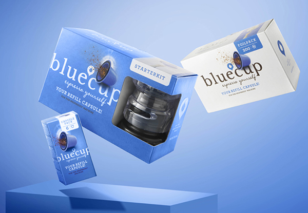
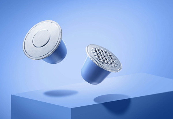
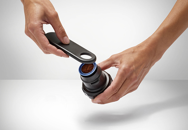
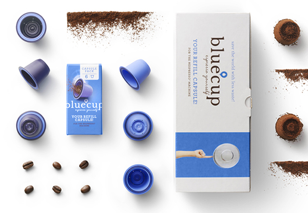
Brand & Packaging identity and copy for Bluecup, the refill cup for Nespresso
Making the world better: The Bluecup Revolution!
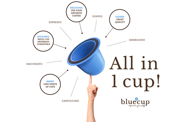
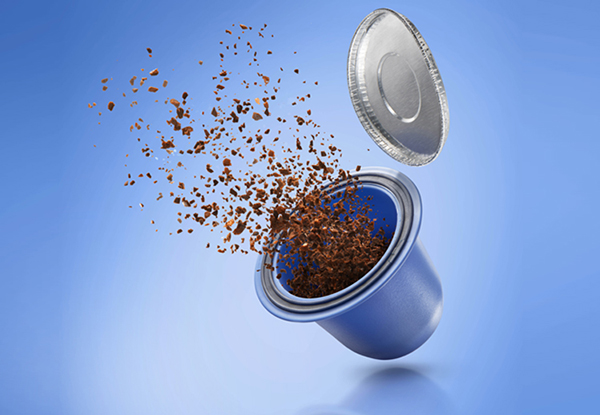
Refuse to make any concessions where it comes to good taste and smell. Bluecup is a revolutionary, reusable coffee cup for your Nespresso machine.
Choose your own coffee beans or ready-ground coffee, simply fill the Bluecup and put the cup into the machine.
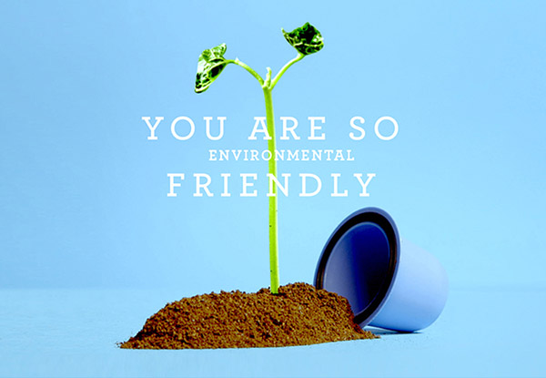
The result? Your best espresso ever! And at least 99 x more environmentally friendly and less waste than pre-filled cups.
Easy to clean and ready for reuse in no time! Start the Revolution and place your order here.
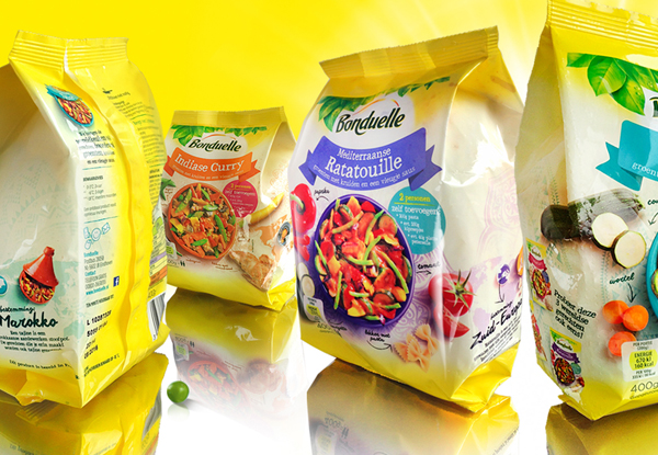
Packagingdesign
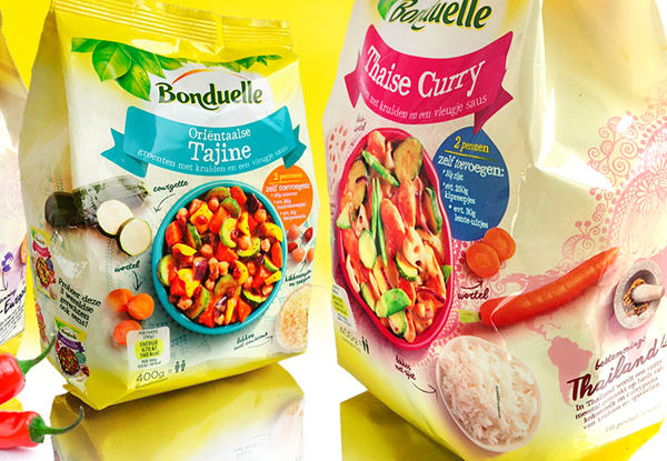
Surprise yourself with these tasty Worldly vegetable dishes! What culinary destination are you going to choose?
Created during my freelance activities at HAJOK Design GmbH
Redesign Corporate- and Packaging identity
In cooperation with Barbara van de Hoorn - van Noort
Still taking shape. More to come soon.
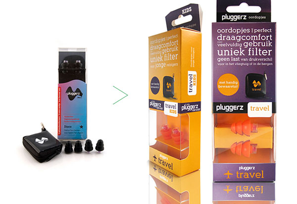
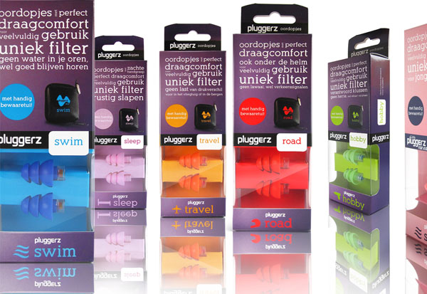
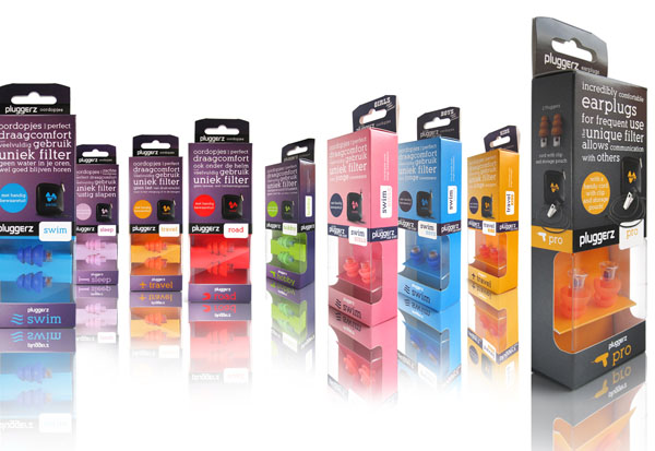
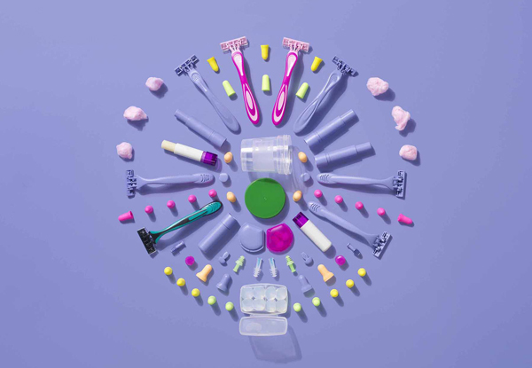
Packaging range for a big variety in earplugs
If we spoke with our ears, and listened through our mouth, then a kiss might be the most romantic sound in the world.
Created during my freelance activities at House Of Retail. Production: Alfons Jansen
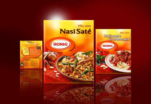
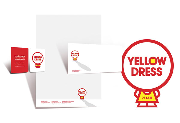
Private label design
Created during my freelance activities at Yellow Dress Retail
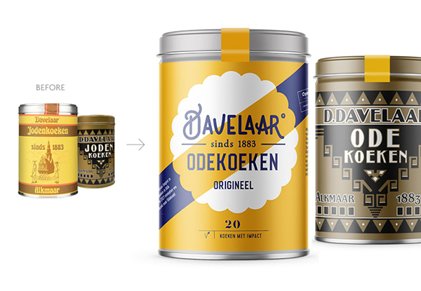
Brand - & Packaging identity in cooperation with Ariane van Mancius of Now New Next.
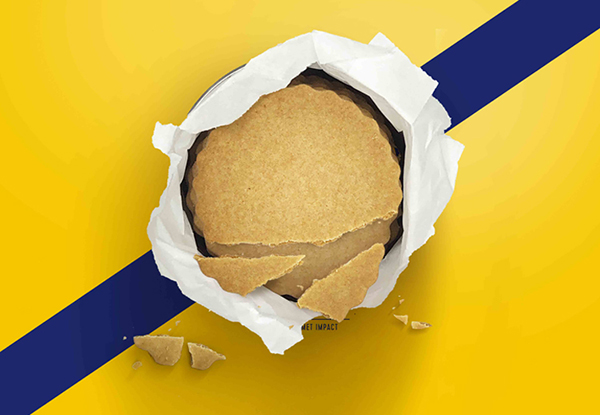
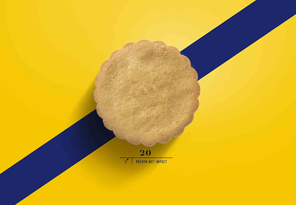
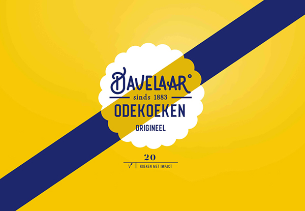
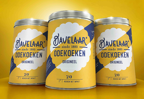
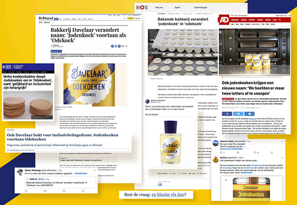
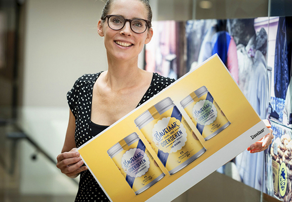
Biscuits with impact! The history of Davelaar’s Jodenkoeken started in 1883 in a small bakery in Alkmaar. The tinned biscuits became a concept and icon in The Netherlands.
In 2021, we have made society more inclusive because everyone deserves and should be given a chance. Anyone can come to work in the bakery via ‘open hiring’. And that is why we have taken a bite of two letters out of the biscuit, from Jodenkoek to Odekoek. An ode to the past and an ode to you. Everyone deserves an ode!
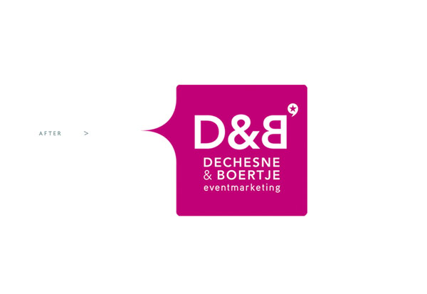
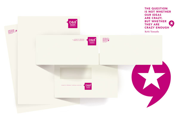
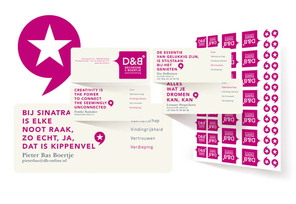
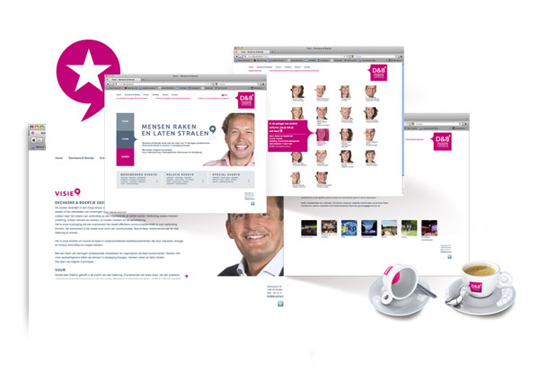
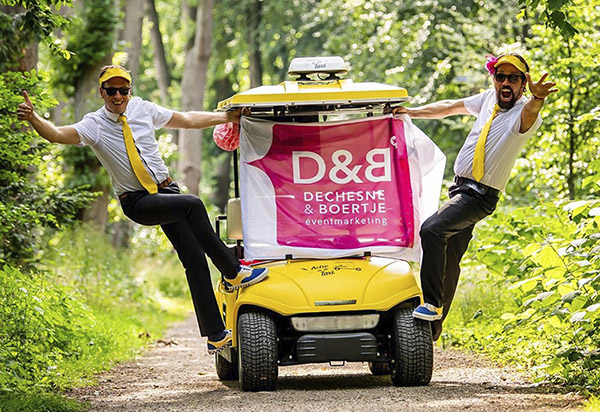
Corporate Indentity for a full service event marketing company
What touches you? What makes you shine? What gives you inspiration? Share the dialogue
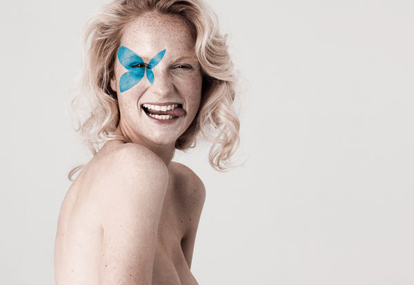
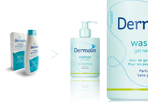
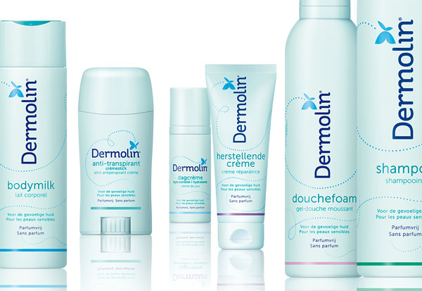
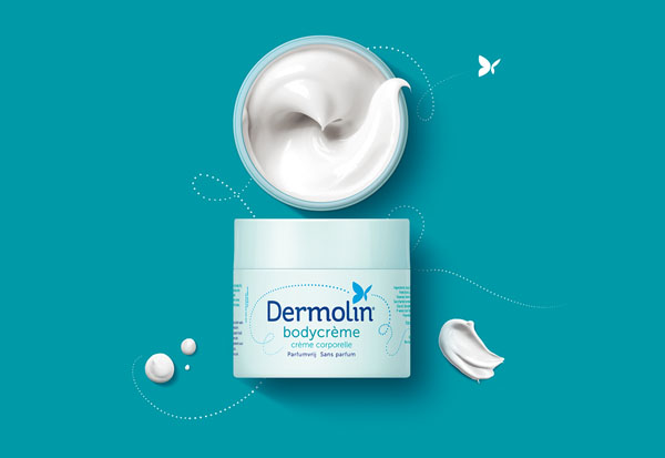
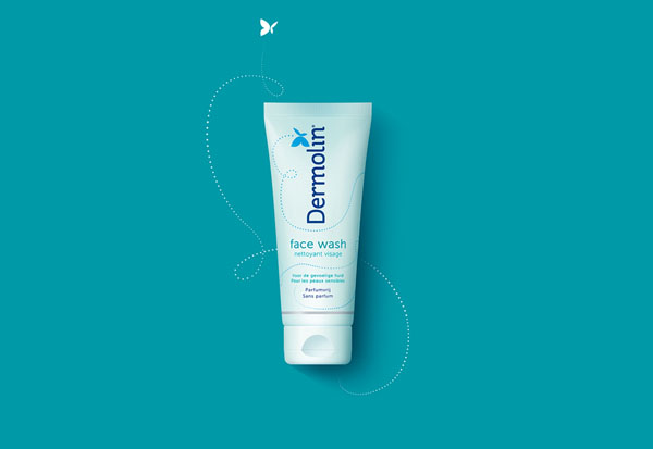
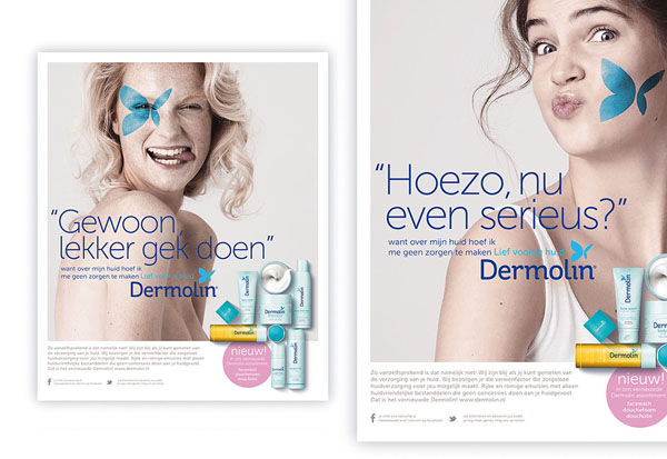
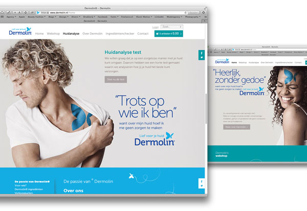
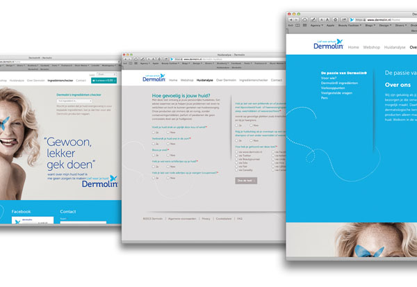
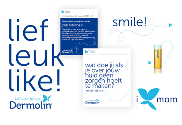
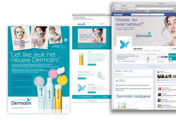
Repostioning beautycare brand for extra sensitive skin - brandbook, logo identity, packaging, tone of voice,
copy, communication design, casting, social media kit and website
I don't have to worry about my skin this is not as obvious as you might think!
Created during my freelance activities at nu: amsterdam
Have a look to see how our lovely logo comes to life.
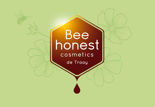
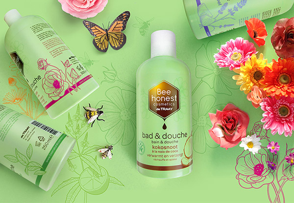
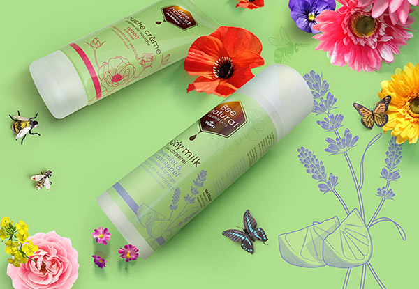
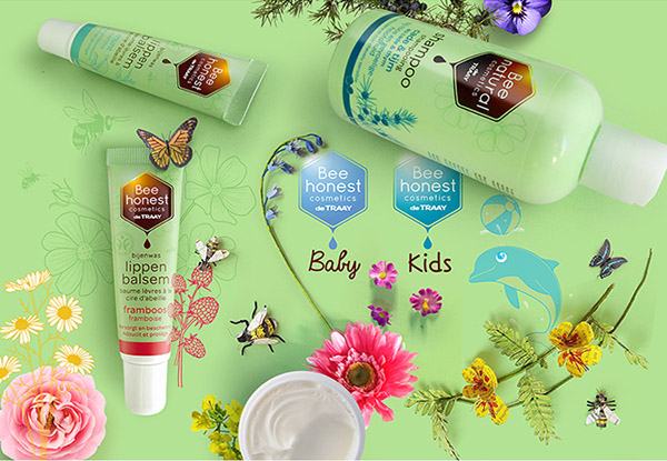
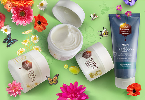
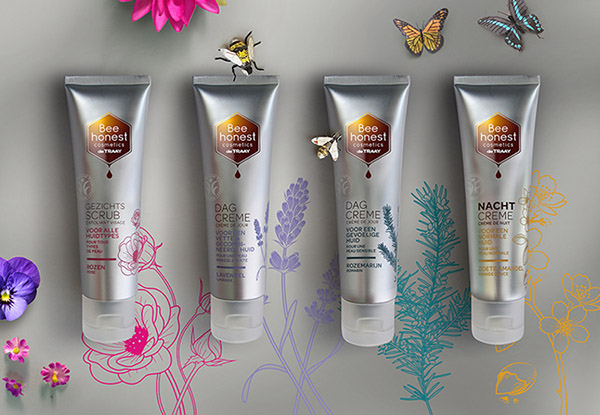
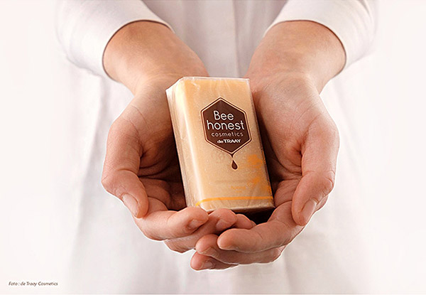
Corporate- and Packaging identity Bee Honest Cosmetic range
Well, let’s bee honest right now. We like to keep bees as far away from us. But view them in a different way.
Except that they are necessary for the pollination, they provide natural ingredients for our beauty products.
Created during my freelance activities at nu: amsterdam.
Repositioning Brand- & logo identity.
Nature. Different. Effective.
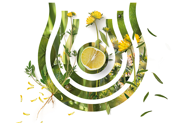
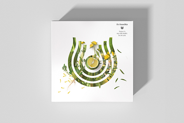
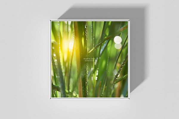
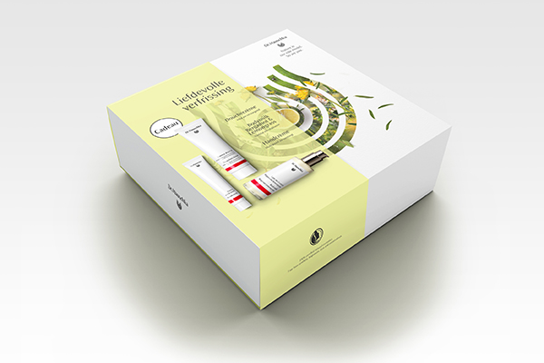
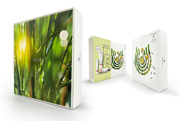
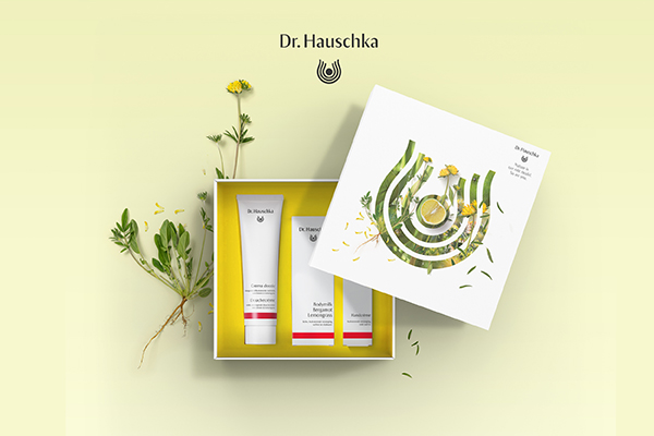
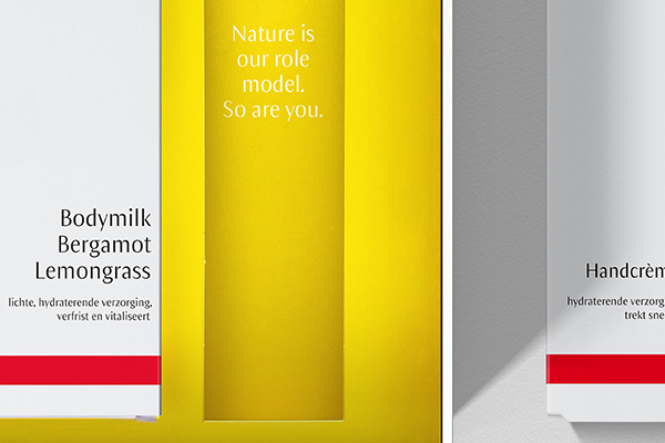
At Dr. Hauschka real natural cosmetics have been a trend since 1967. But Dr. Hauschka is much more than cosmetics, it is an ode to our earth with the selected medicinal plants from organic cultivation. The brand’s DNA and logo were literally and figuratively placed at the center for this limited Mothers day giftbox. The outer box is an experience and exudes a love for nature .The double-facing design provides a rich story. The inside references fields of yellow anthyllis .When you take out a product, a beautiful meaningful text appears. Attention to every detail, and to our mothers.
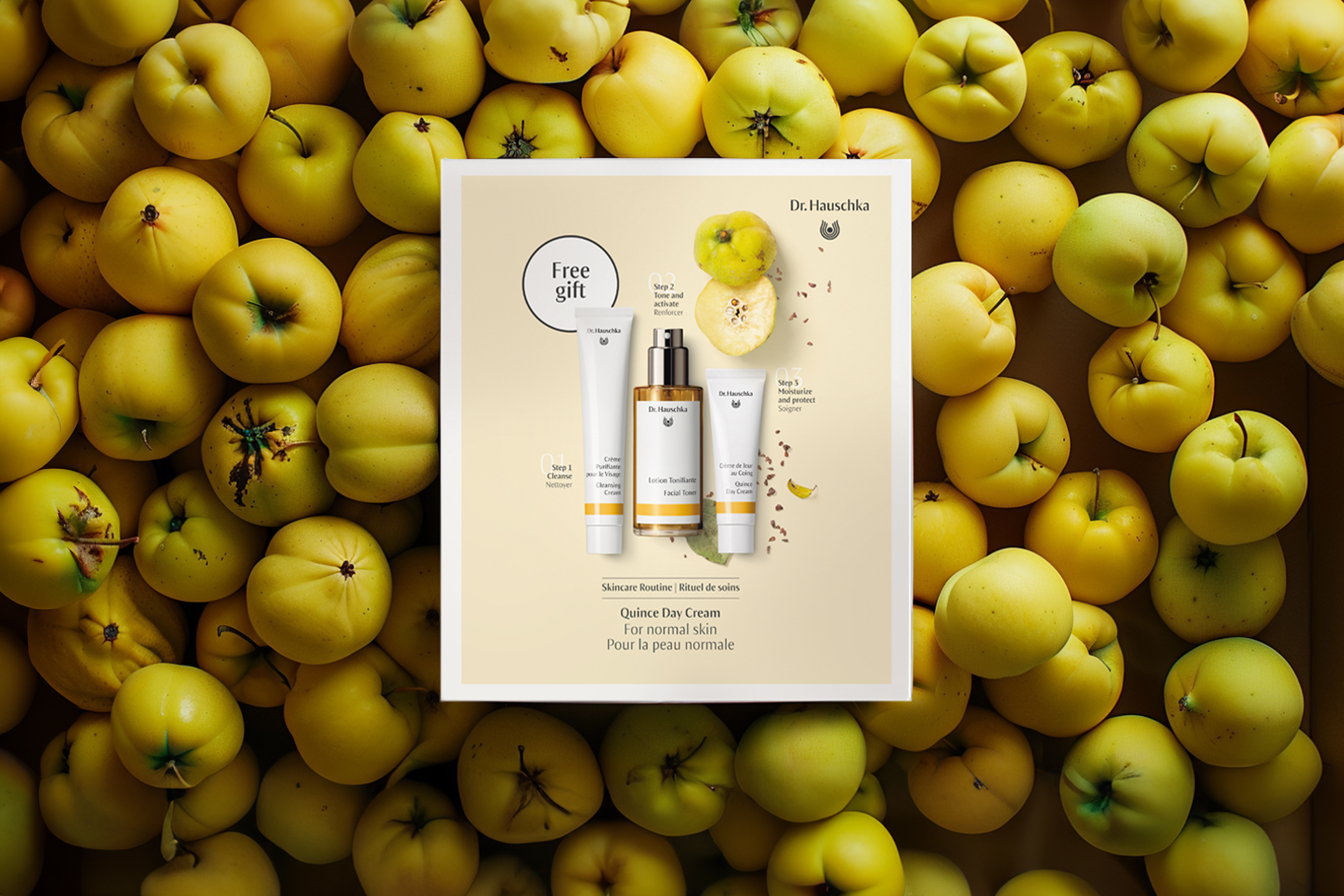
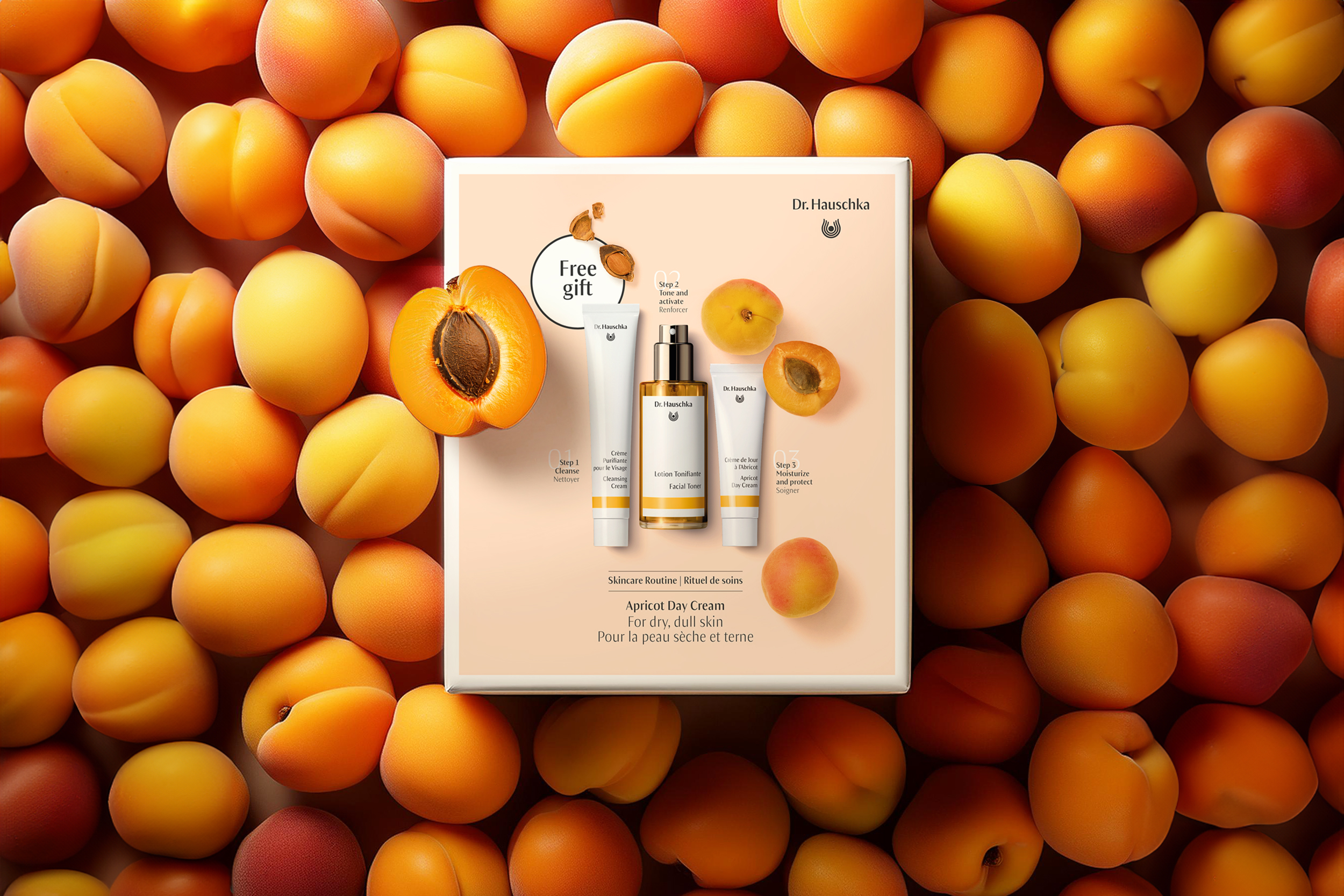
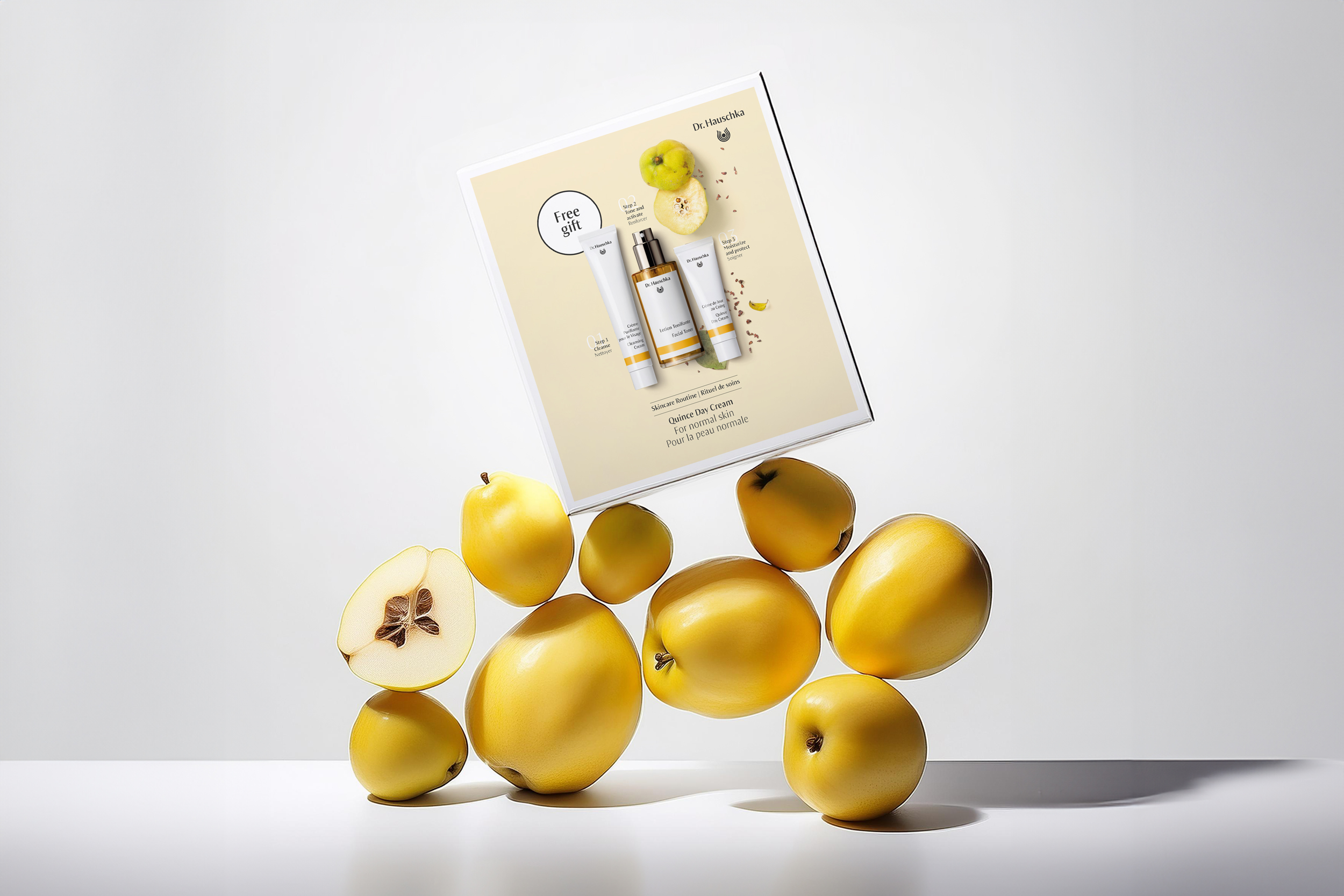
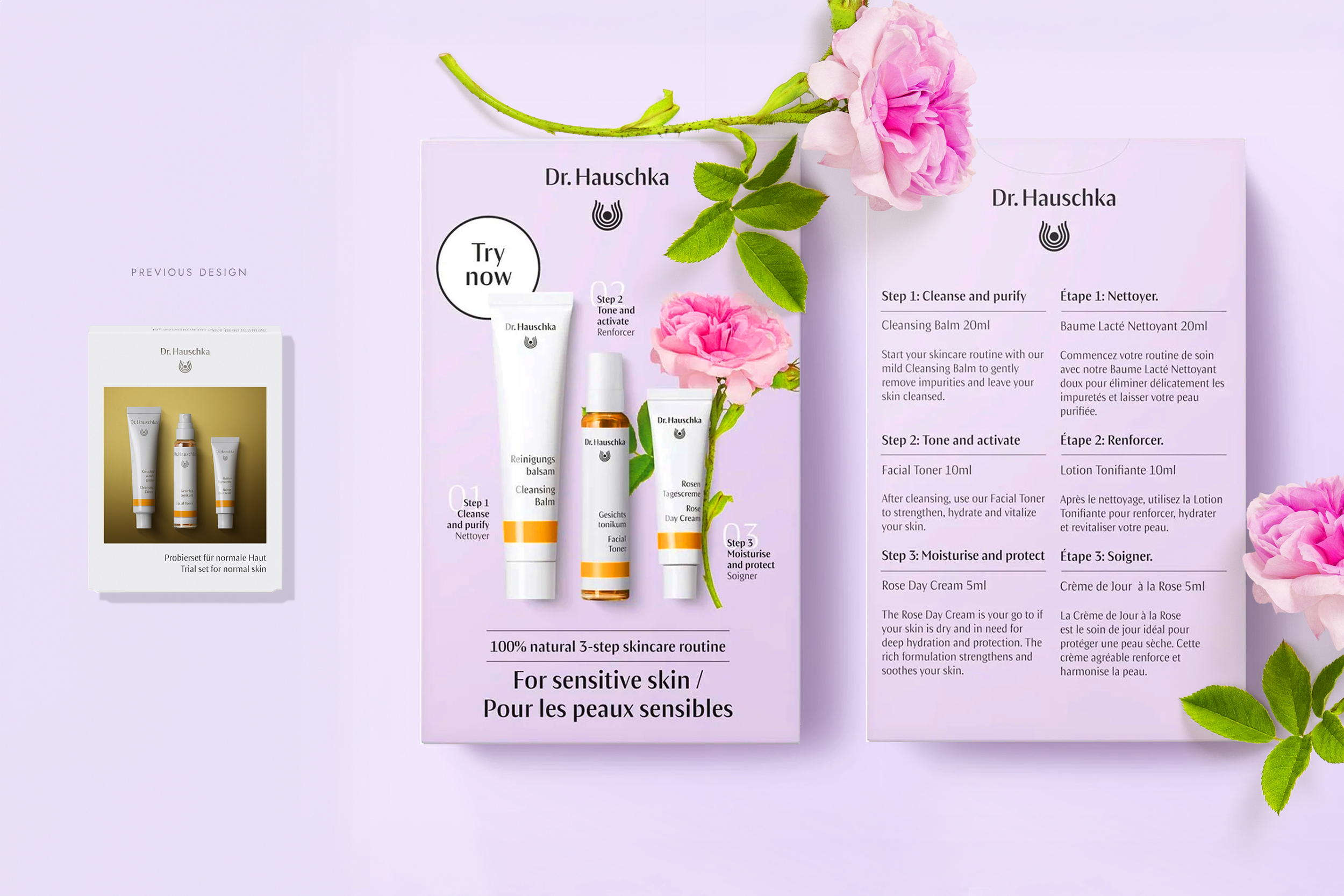
Restyle Packaging identity.
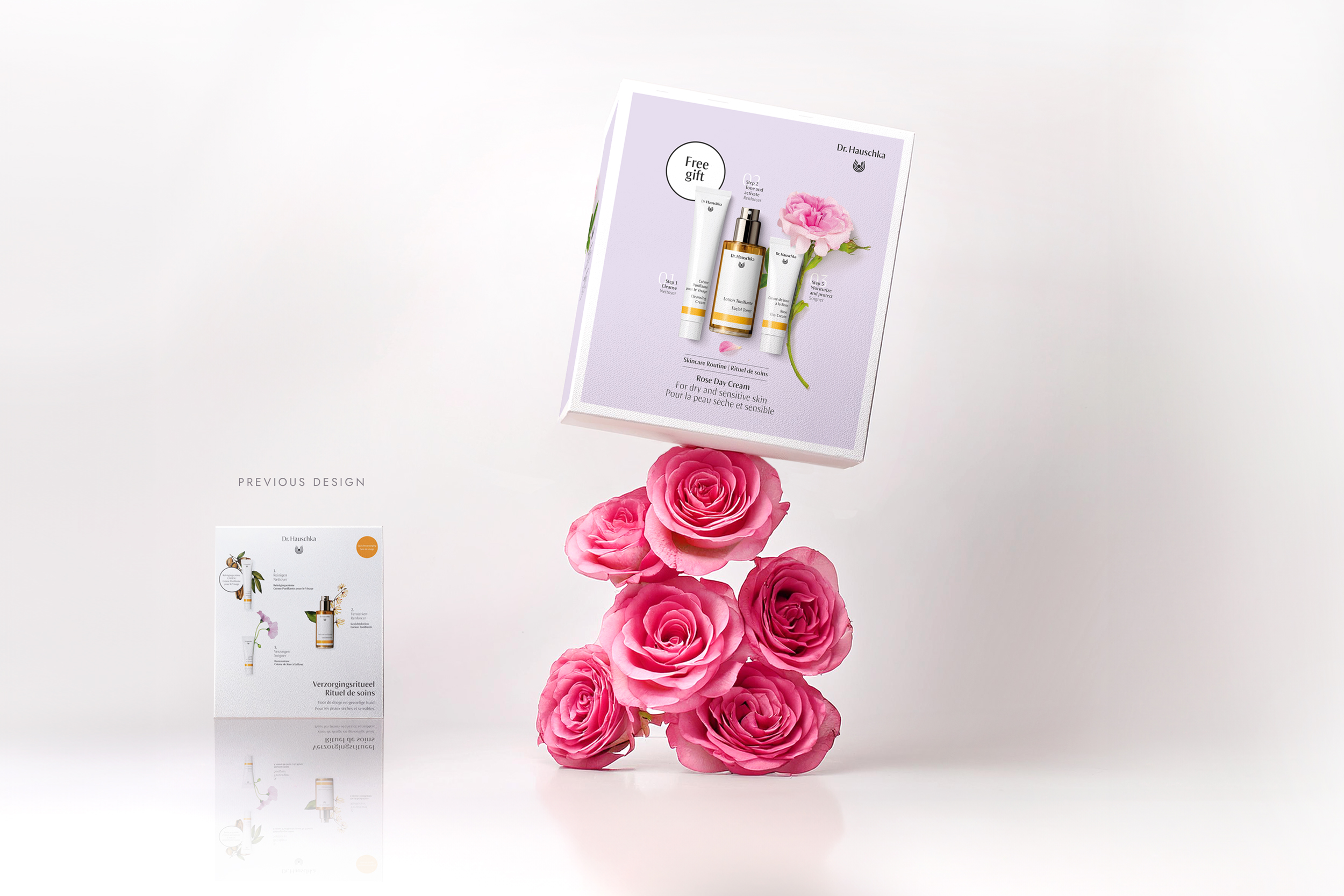
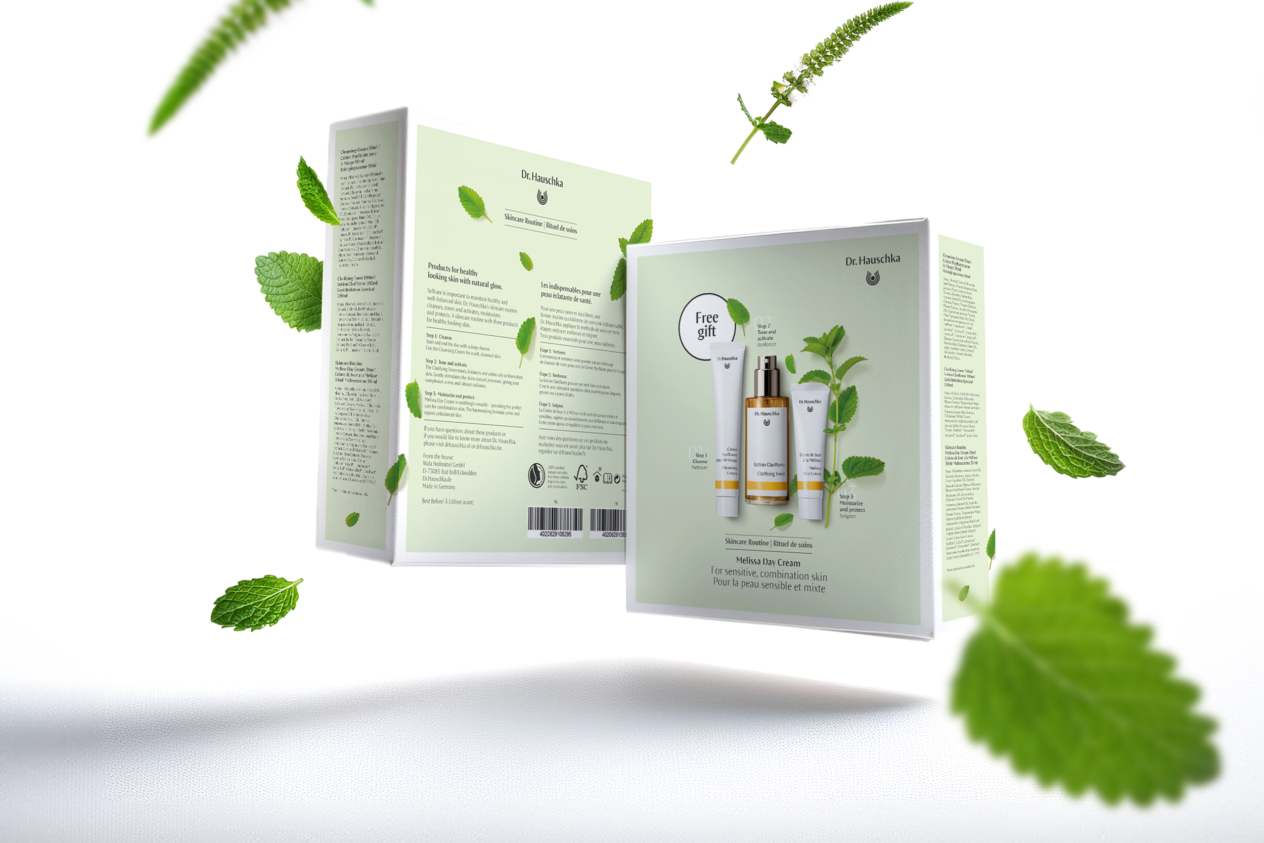
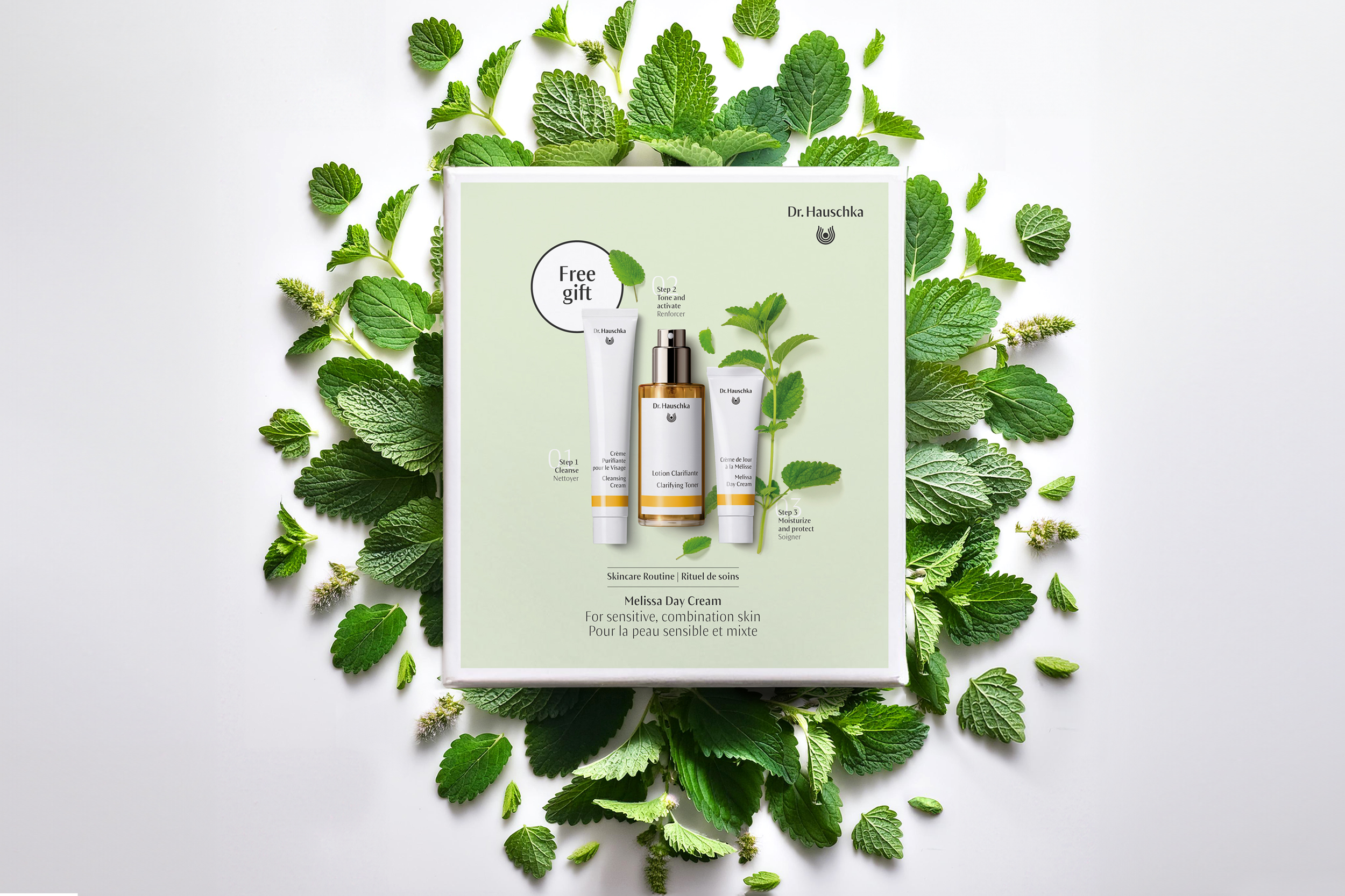
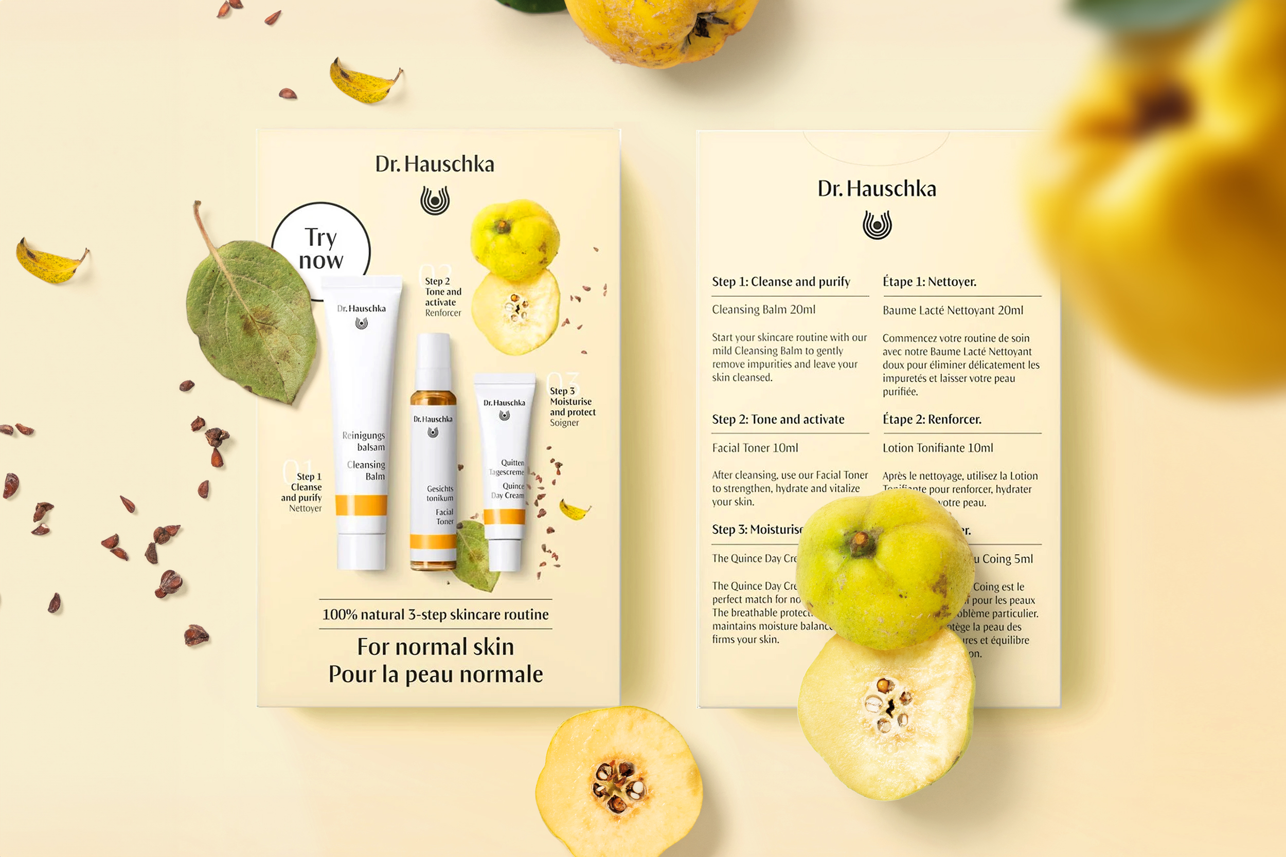
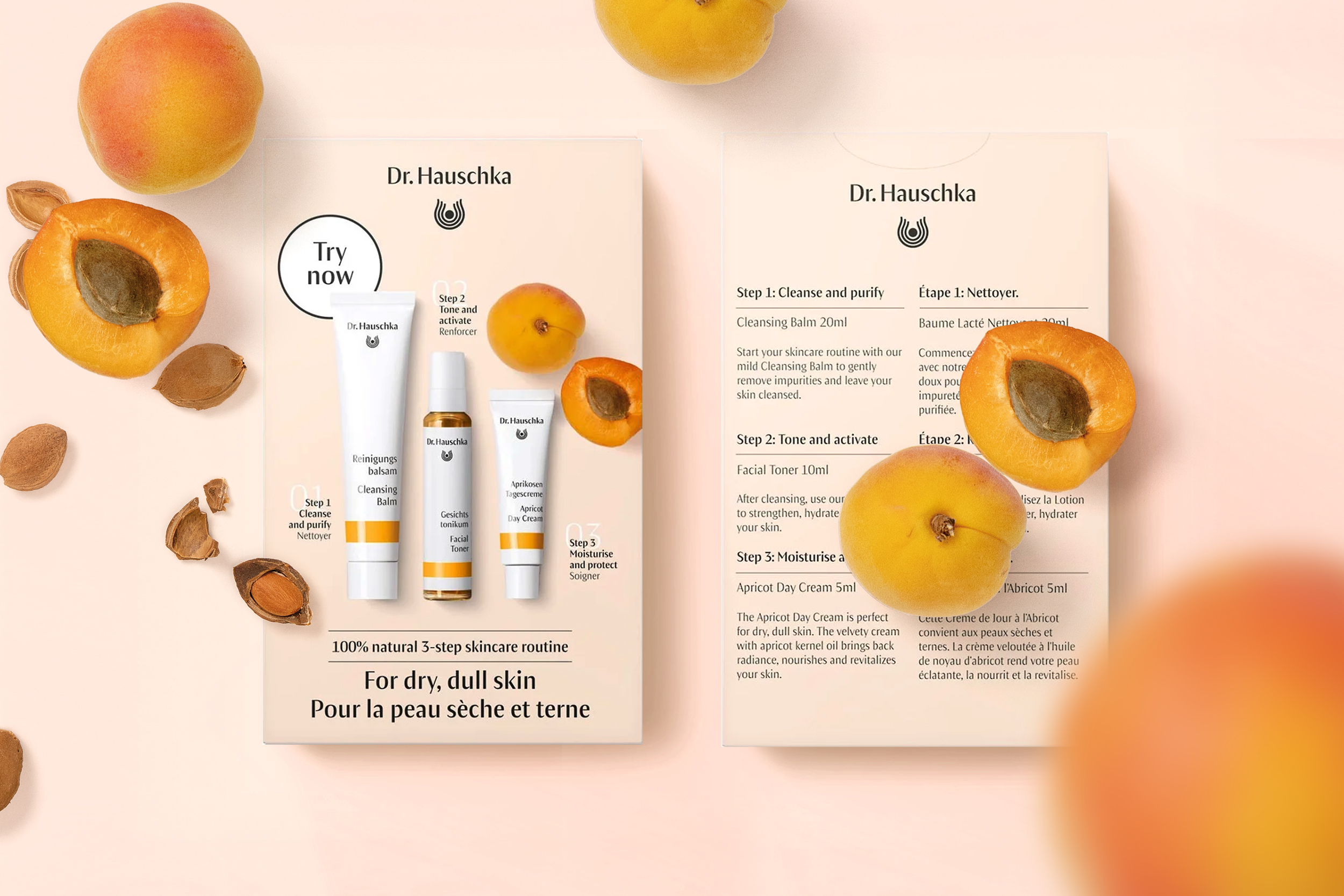
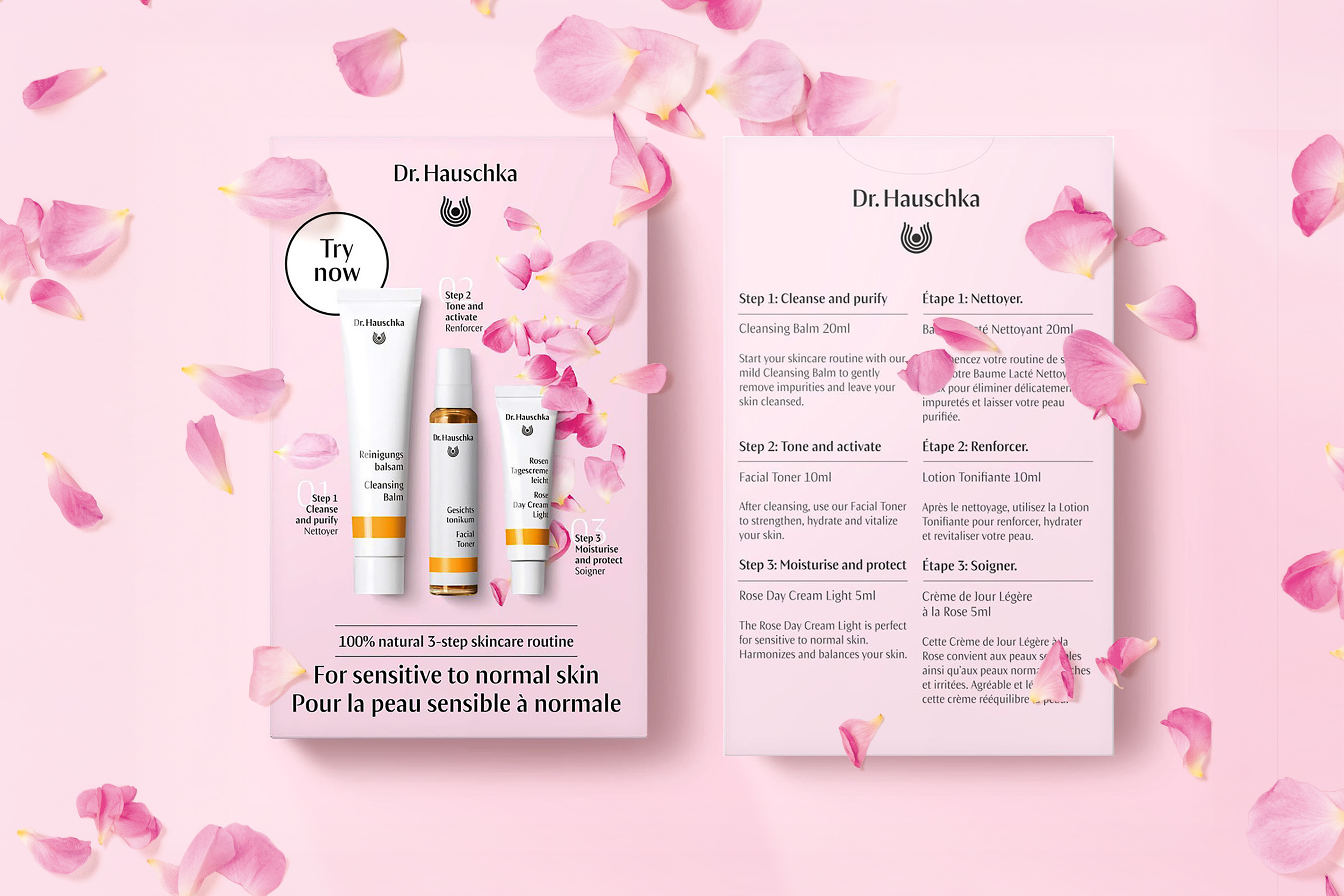
Dr. Hauschka’s 3-step routine beauty kits, cleanse, tone, and care tailored to five different skin profiles.
A new refreshing, contemporary look that still stays true to the Dr. Hauschka brandfeel while exploring its boundaries. Dr. Hauschka supports the skin in maintaining its health and beauty naturally. This beauty kit represents the ultimate routine. 100% natural must-haves for your skin with 0% unnecessary skincare steps.
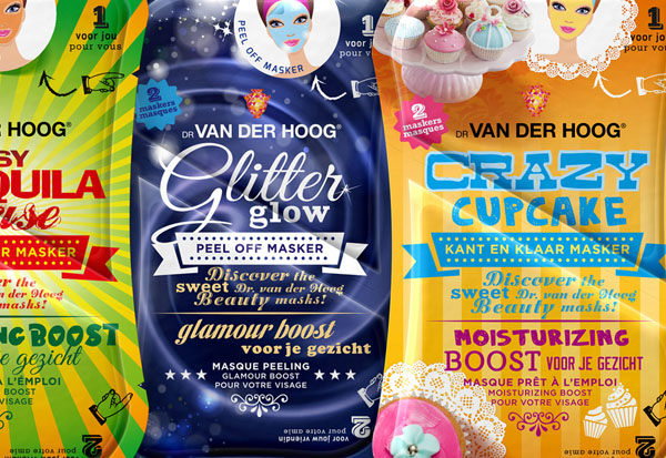
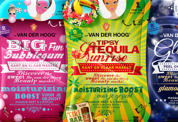
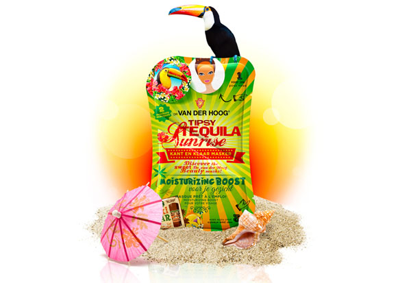
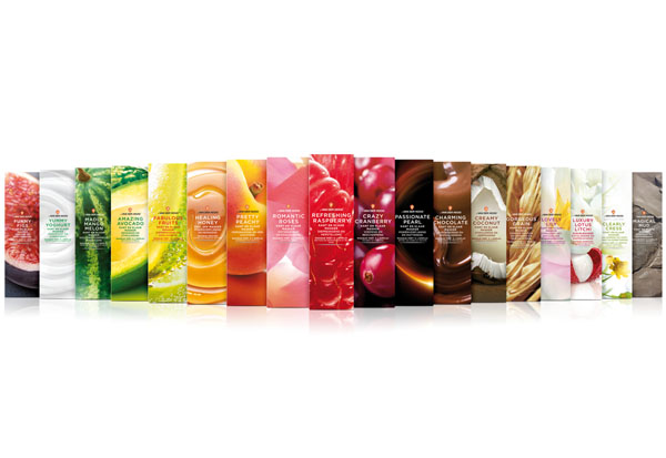
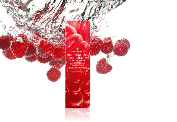
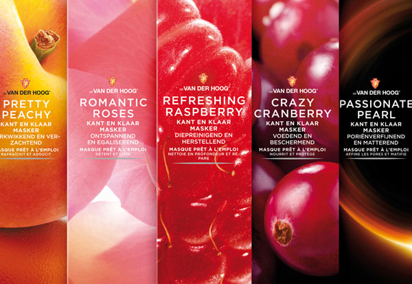
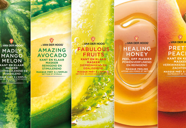
Restyle cosmetic range of moisturizers and beautymasks
Let's play in the Beauty Candy Shop! Have fun and be beautiful!
Created during my freelance activities at nu: amsterdam.
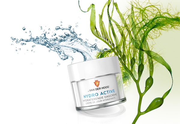
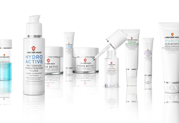
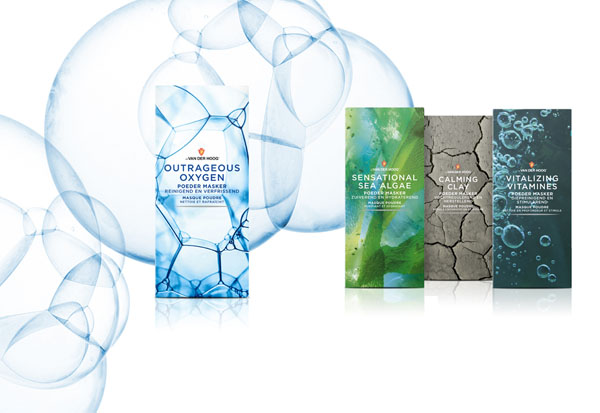
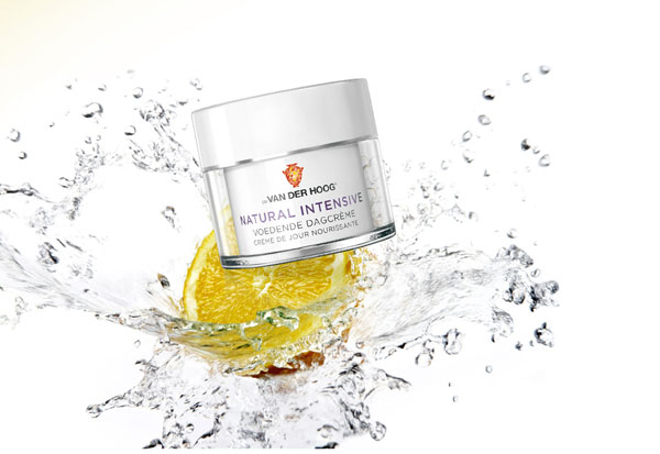
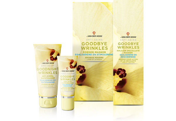
Restyle cosmetic range of moisturizers and beautymasks.
Created during my freelance activities at nu: amsterdam.
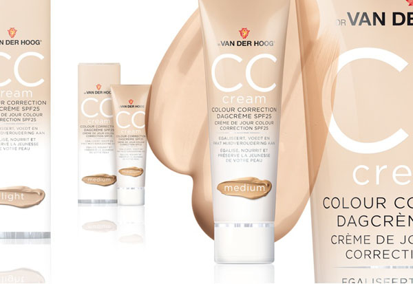
Logo & productshots: Gleijm en van der Waart.
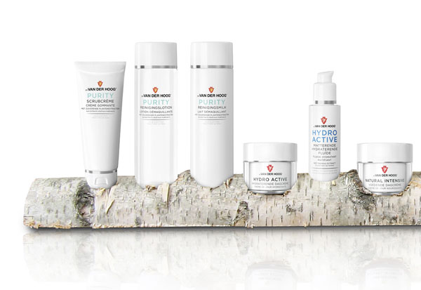
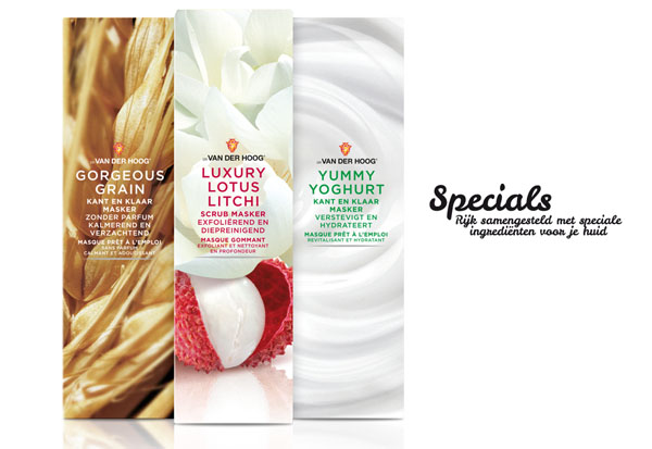
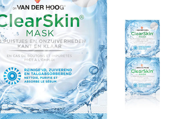
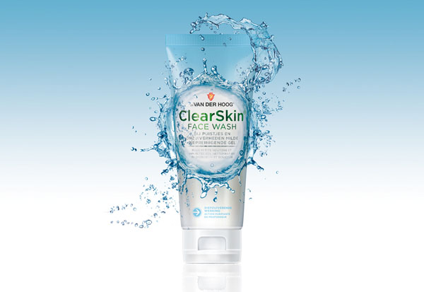
Restyle skin purifying and cleansing productrange for younger skin.
I do not wanna have any pimples! Please give me a fresh face feeling like a splash purified water!
Created during my freelance activities at nu: amsterdam.
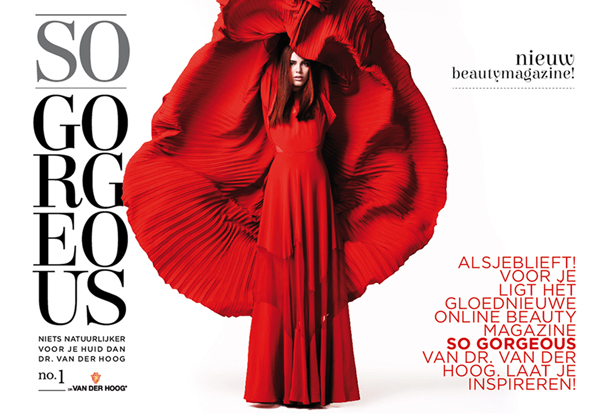
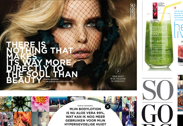
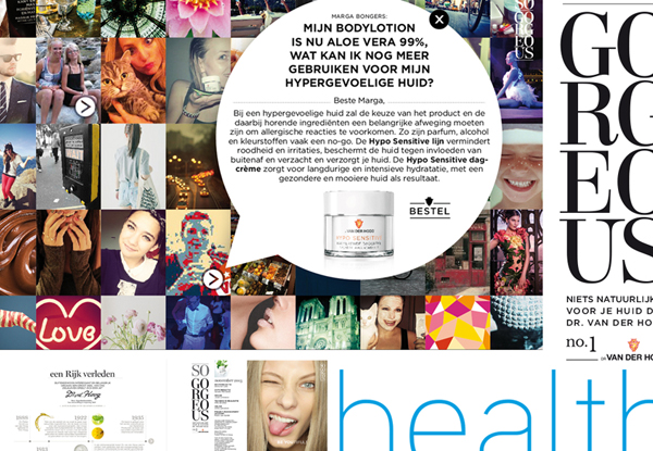
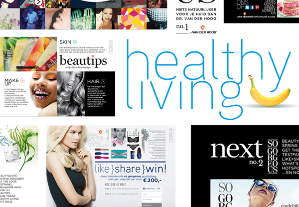
SO GORGEOUS online magazine - concept, design and naming.
Get in touch with your target group. What keeps them busy? A magazine that informs and inspires. Wanna have a look? Click here.
Created during my freelance activities at nu: amsterdam.
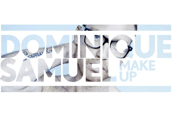
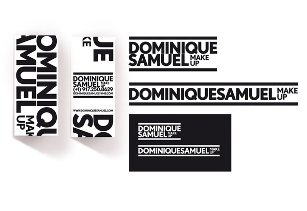
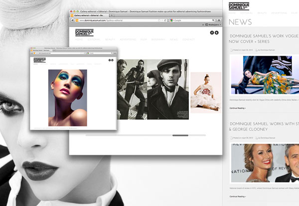
Corporate Identity Dominique Samuel in New York based Make Up Artist
Internationally minded. Rough edges but with a touch of elegance.
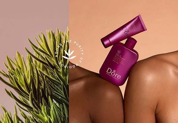
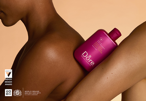
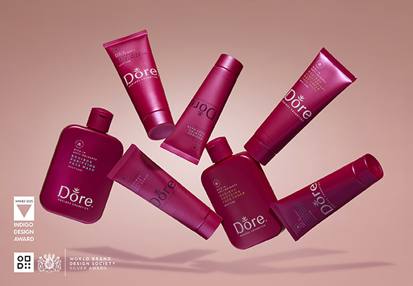
AWARD WINNING – Strategic positioning Brand-, logo- & packaging identity.
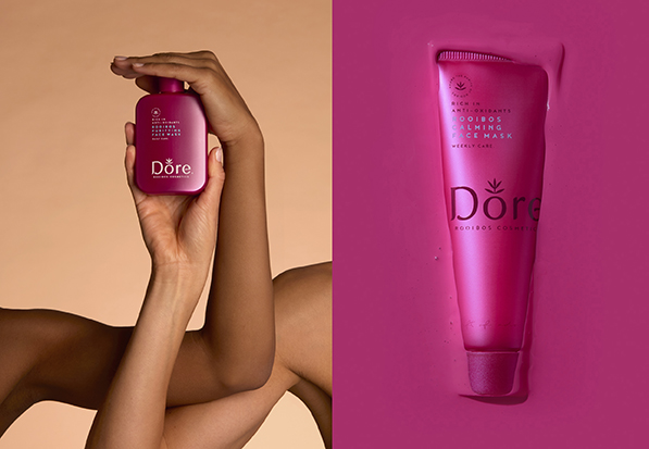
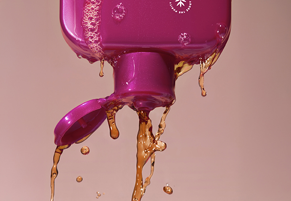
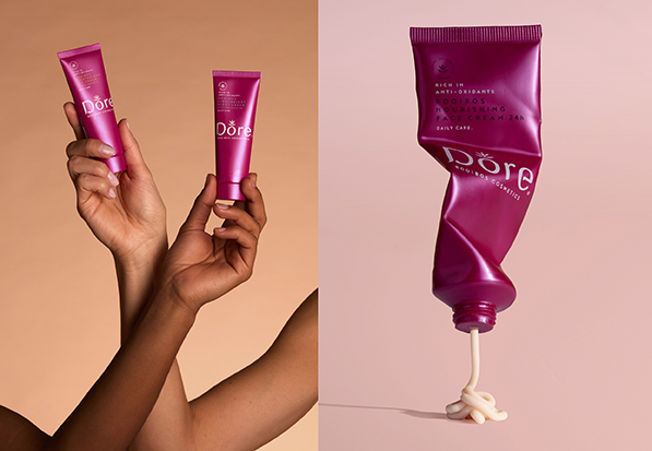
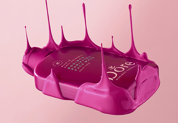
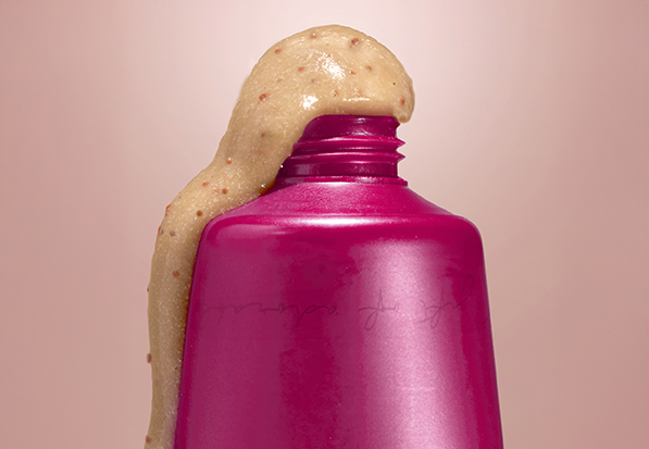
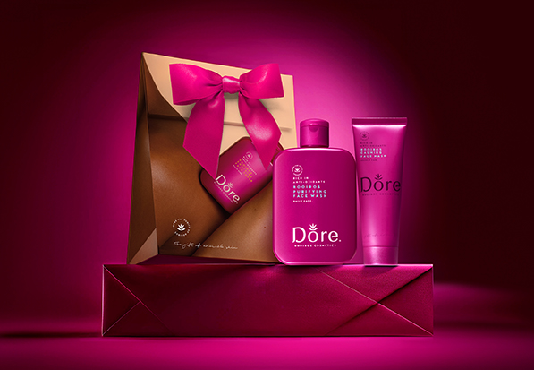
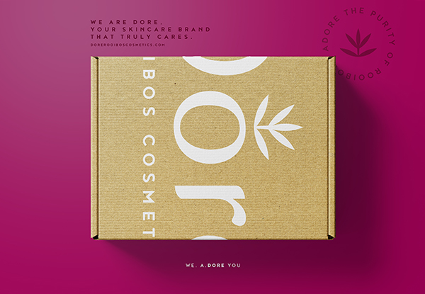
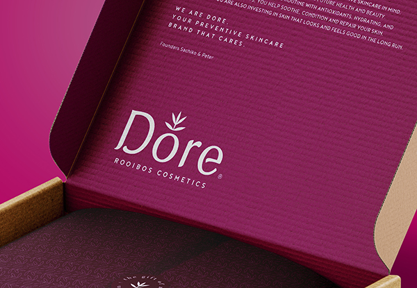
Dore Rooibos Cosmetics.
We. a.dore you.
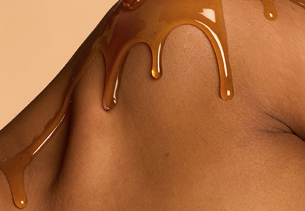
Dore Rooibos skincare products are developed with preventive skincare in mind enhanced by the powerful ingredient Rooibos. Our story begins in South Africa, the only place in the world where rooibos grows naturally. For generations, rooibos has been valued for its soothing properties and natural antioxidant power. Inspired by this powerful botanical, we created Dore Rooibos Cosmetics: Pure, honest skincare created with a preventive mindset that combines the antioxidant power of rooibos with effective hydrating and cell renewing ingredients. Our philosophy is simple: great skin is not just about today. It is about what you do for it every day.
Because beautiful skin is not a quick fix. It is something you build, day after day.
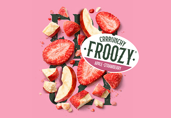
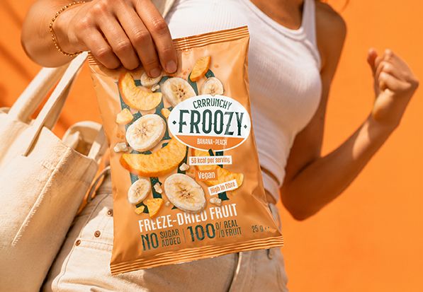
Brand- & logo identity & Copy.
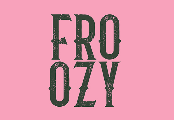
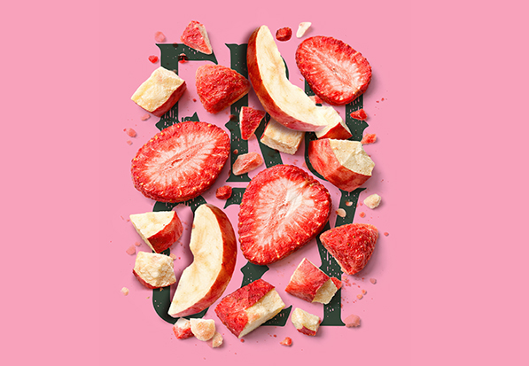
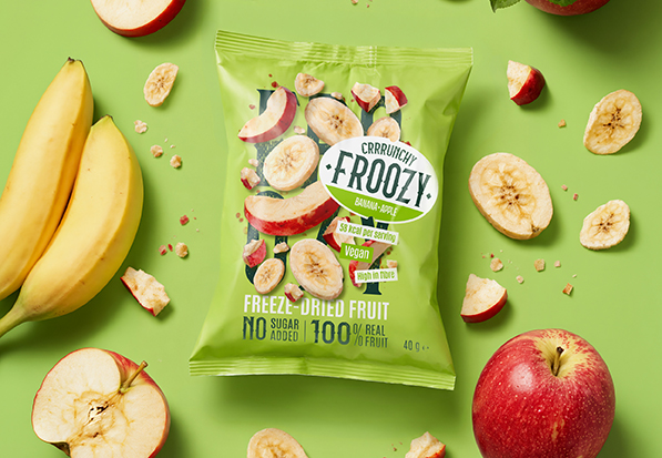
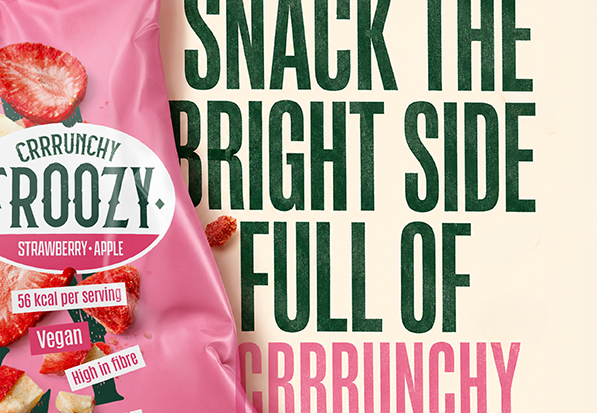
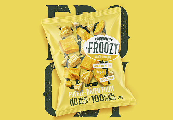
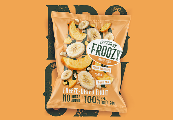
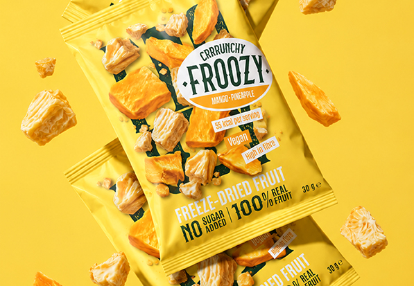
Created in collaboration with NowNewNext. It’s not a snack. It’s fruit, transformed. Froozy brings fun and trust together by turning real fruit into a light, crunchy snack that kids want because it’s fun and parents are happy to give them because it makes sense. Snacking without a second thought. Without the guilt. Freeze-dried fruitsnack full of flavour, full of fun in every bite. Just right. No oven, no sugar, no tricks. Just ripe fruit and an ice-cold secret. Froozy, snack the bright side. Full of CRRRRRRunchy good vibes!
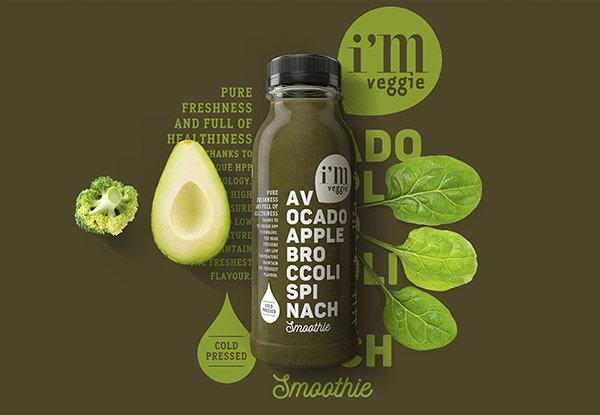
Brand- & packaging identity, naming and tone of voice
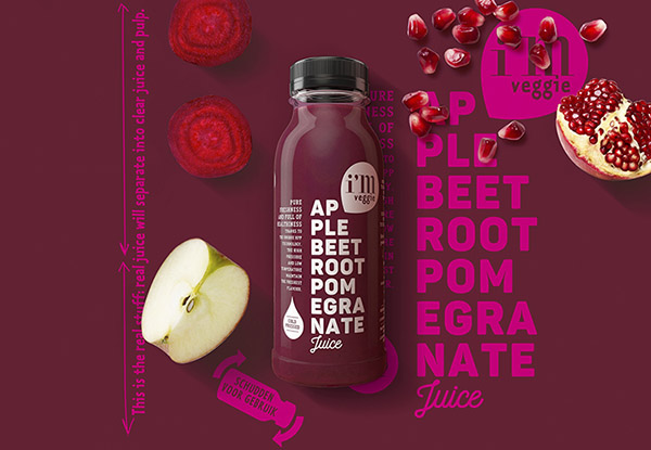
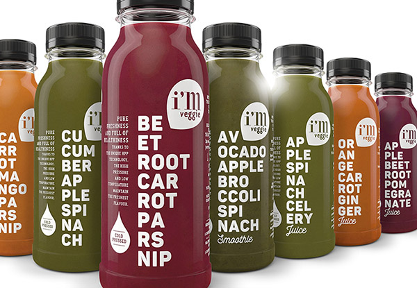
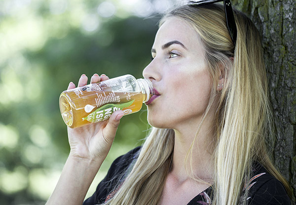
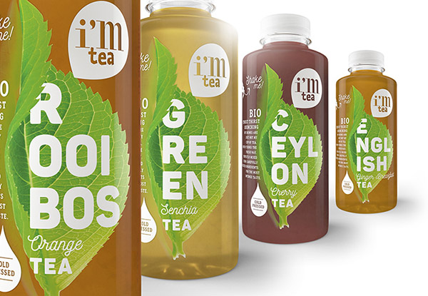
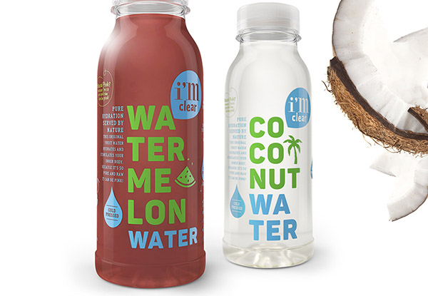
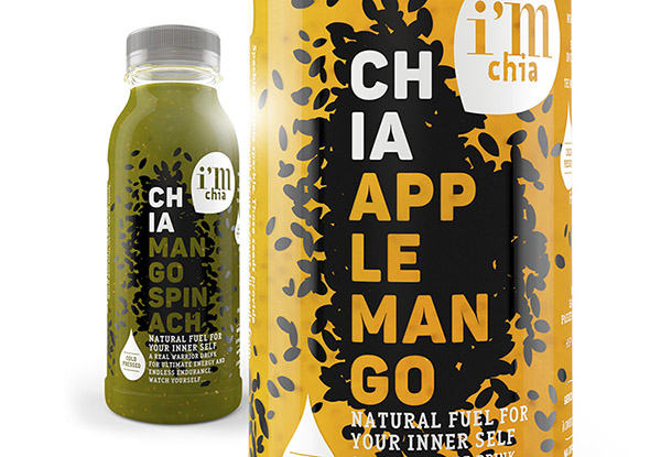
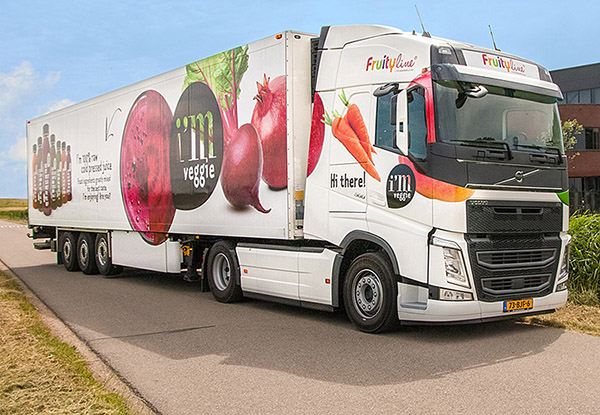
Well, I have to say, I’m very very cold pressed! On behalf of RCLM I was pleased to create this range of juices, smoothies, powershots, teas, waters, nuts and protein drinks.
Repositioning Brand- & logo identity.
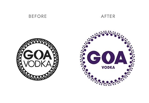
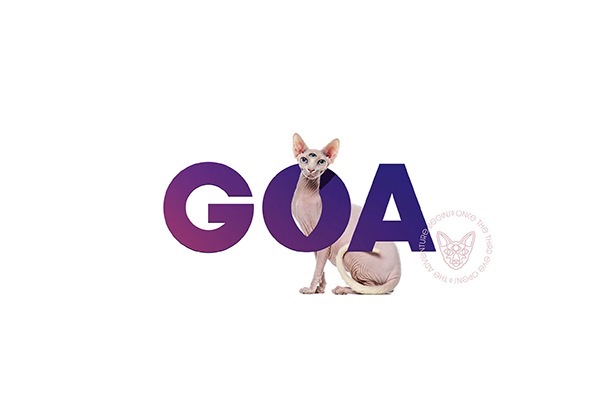
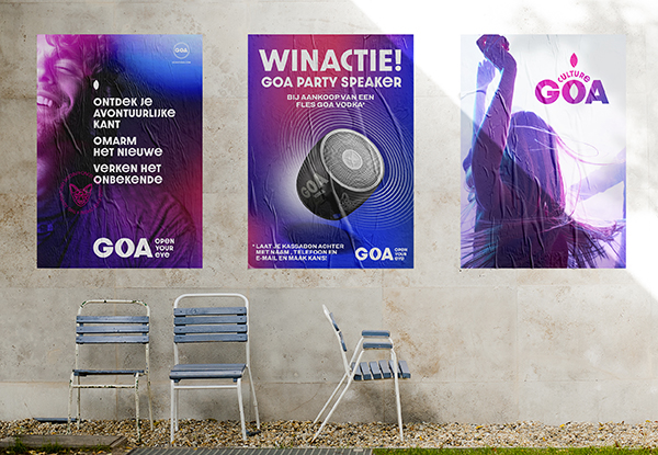
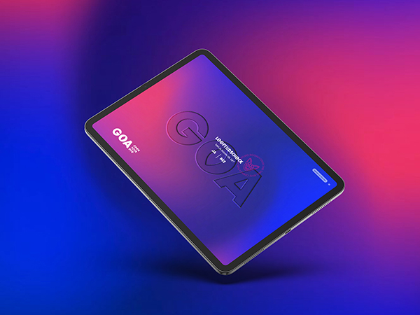
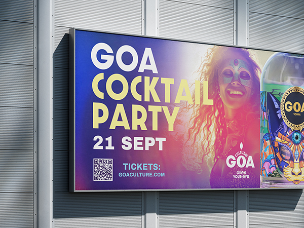
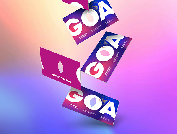
GOA. Open Your Eye.
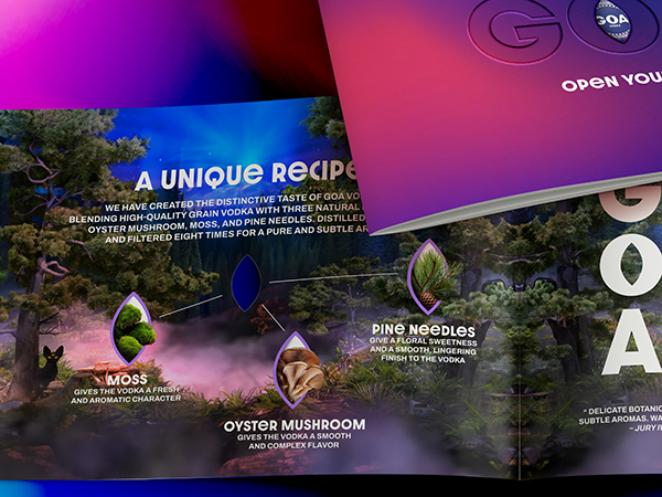
Created in collaboration with WeThePeople. Discover your adventurous side, embrace the new, explore the unknown. Open your eye. The world gets better when original minds come together. GOA is an award winning premium Dutch grain vodka, born from festival culture and inspired by the wild. Infused with oyster mushrooms, moss and pine needles, it brings an unexpected taste of the forest into every bottle. But GOA is about more than just vodka, it’s a vibe. It brings together creative minds, kindred spirits who share the same curiosity, values and way of looking at the world.
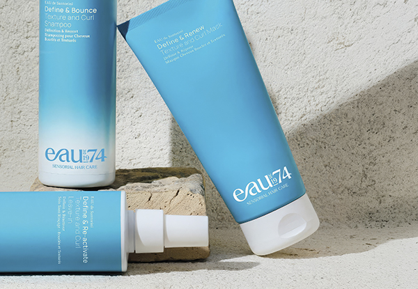
Strategic positioning Brand-, logo- & packaging identity.
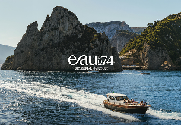
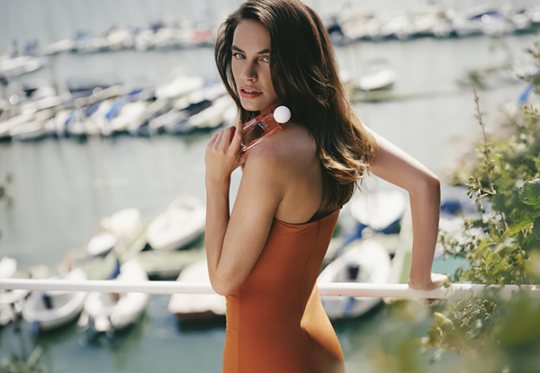
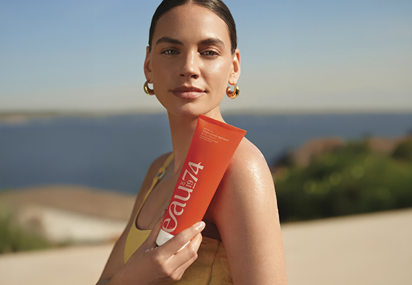
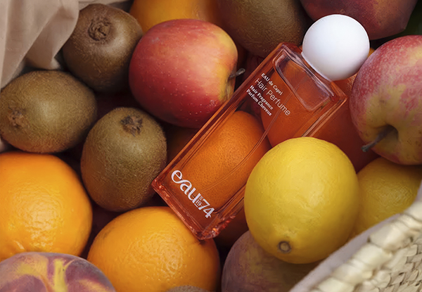
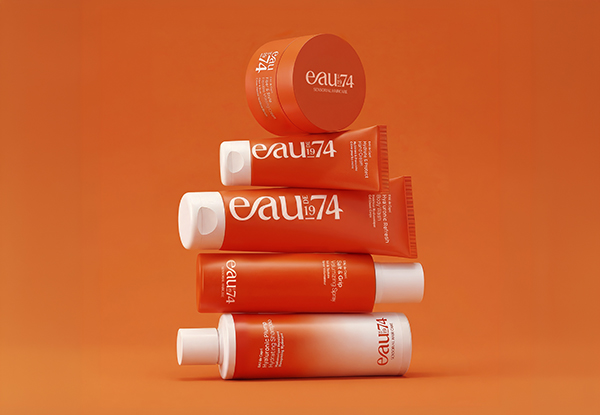
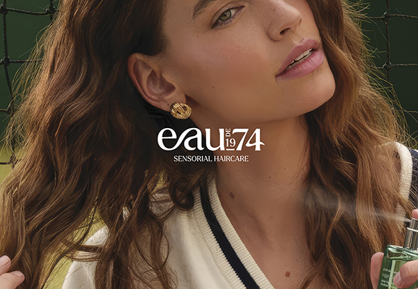
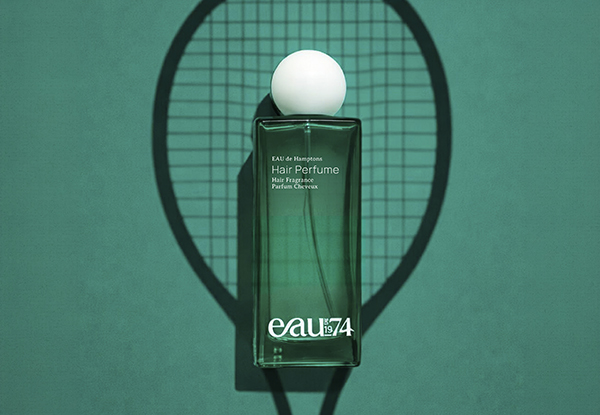
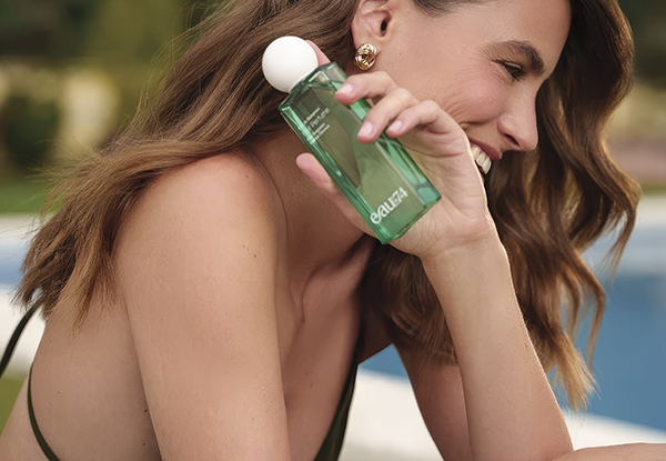
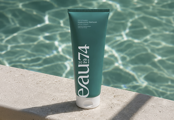
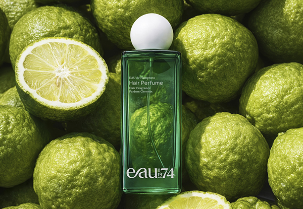
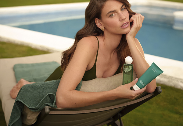
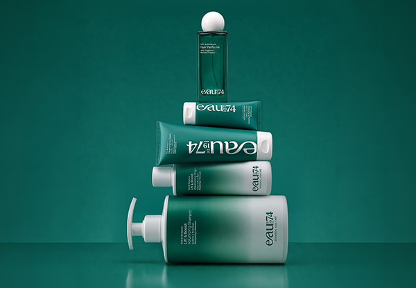
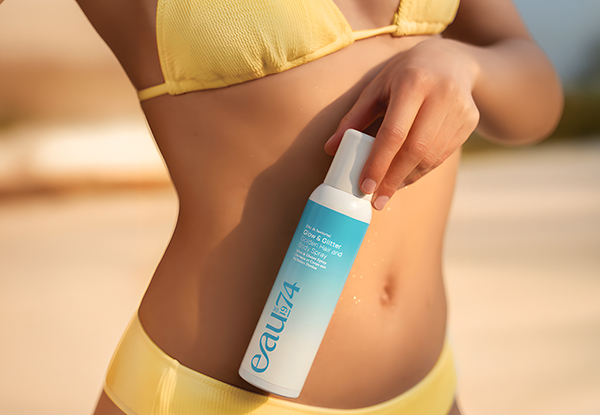
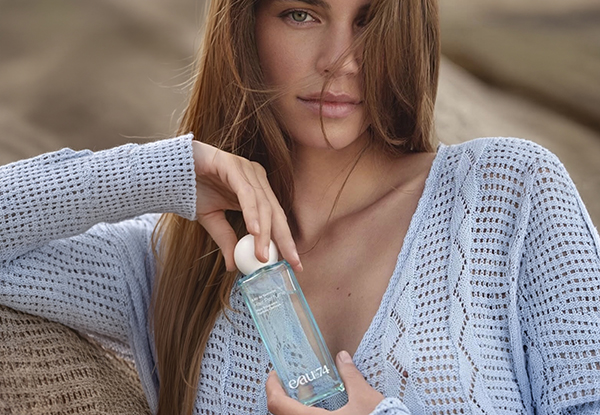
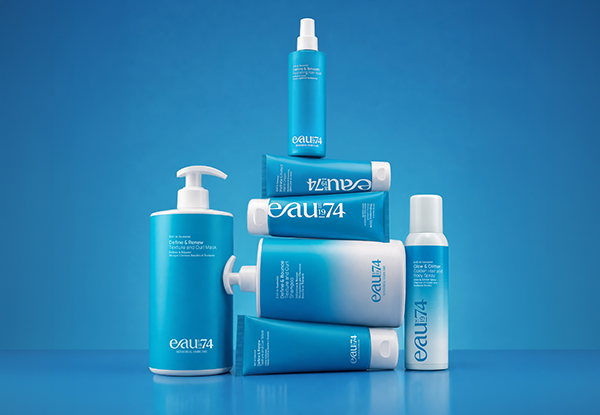
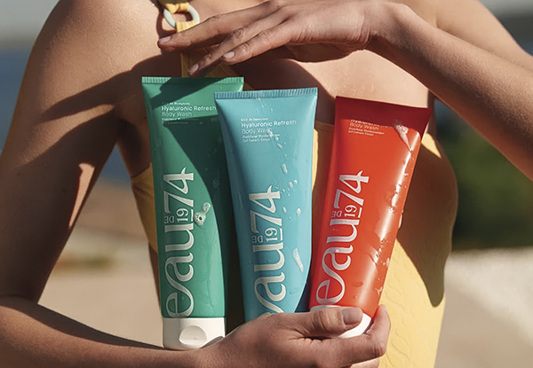
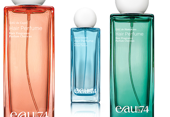
EAU de 1974. Sensorial Haircare.
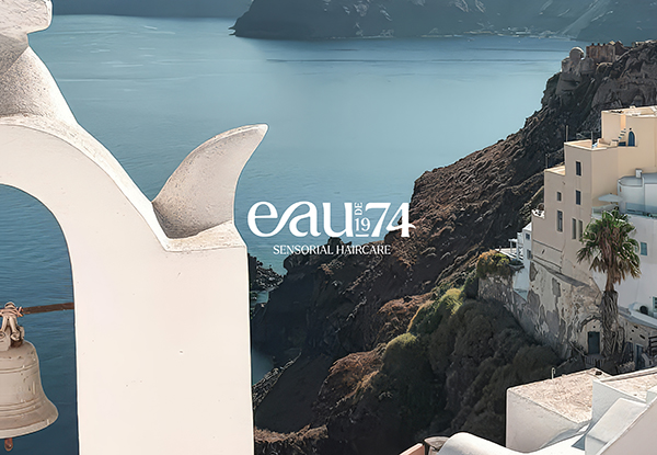
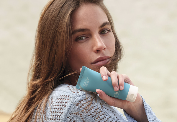
EAUde1974 draws inspiration from luxury coastal destinations, with each fragrance in this collection telling its own unique story. EAU de Capri, EAU de Santorini, and EAU de Hamptons will surely add a splash of luxury with the allure of high fragrance. From haircare to body care and beyond, the thoughtfully crafted products are here to elevate your daily rituals with luxurious touches and sensory bliss. Inspired by the essence of water, EAUde1974 captures the essence of luxury and nature. The name “EAU,” derived from the French word for water, symbolizes vitality and purity, core principles that define our product philosophy. The addition of “de” in EAUde represents a harmonious blend of fragrant oils and water, crafting a sensory experience that delights the senses. With a rich heritage rooted in the hair cosmetics market since 1974, our brand combines decades of expertise with an unwavering commitment to excellence.
Still taking shape. More to come soon.
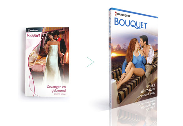
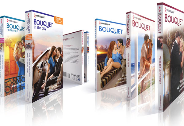
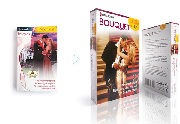
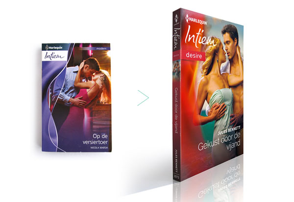
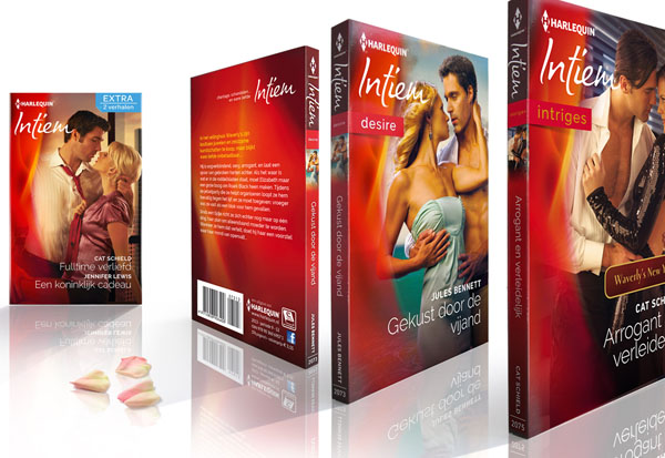
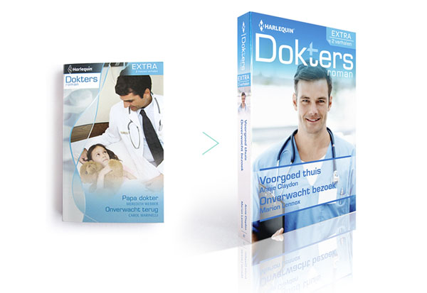
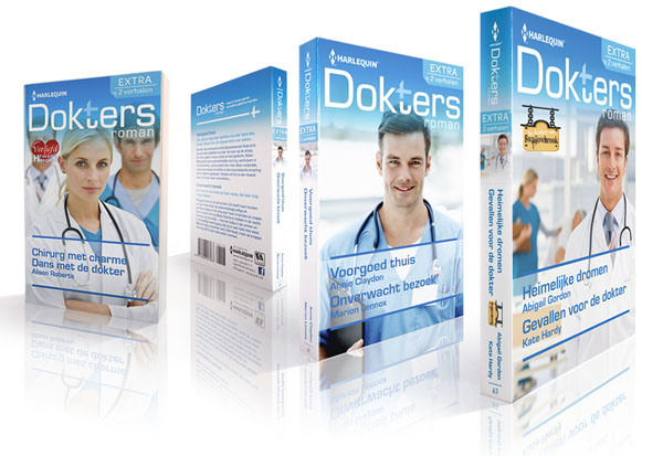
Pocketbooks repositioning of the brands Bouquet, Intiem and Doktersroman
Takes you to a world of glamour, passion and seduction.....
Indestructible romance!
Created during my freelance activities at nu: amsterdam.
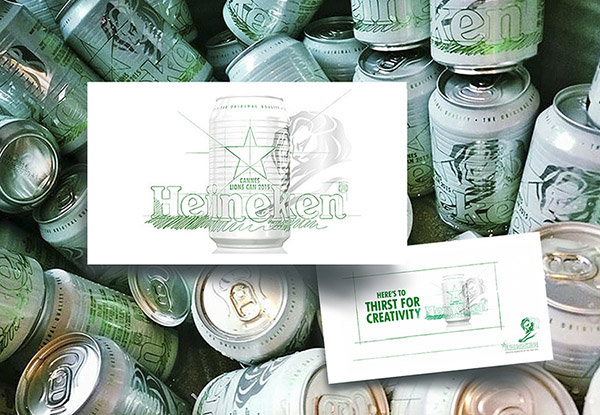
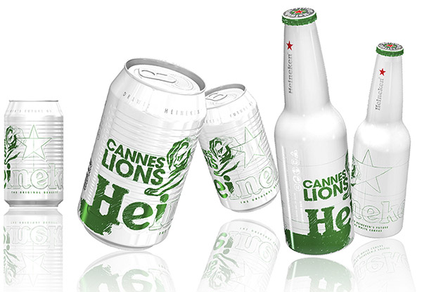
Packaging design Limited edition Heineken Cannes Lions – International Festival of Creativity
Created during my freelance activities at dBOD.
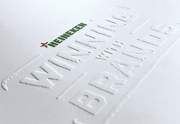
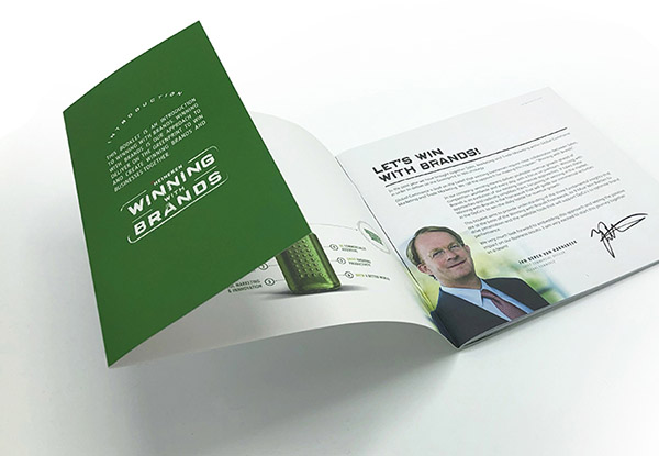
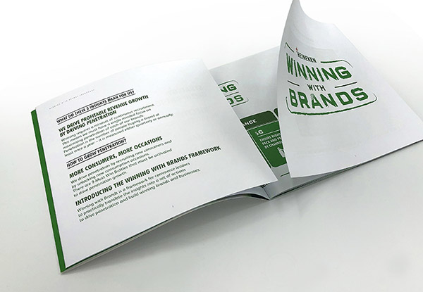
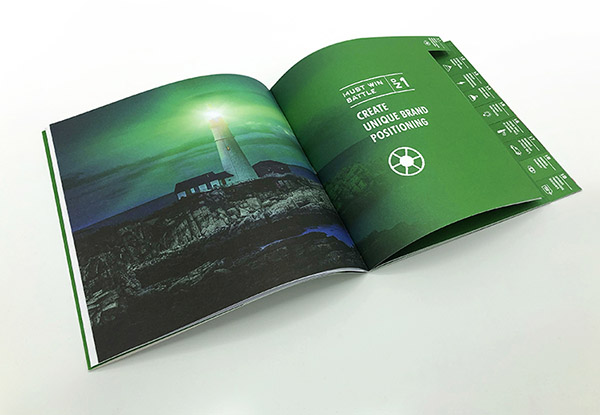
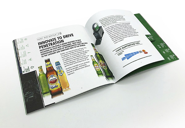
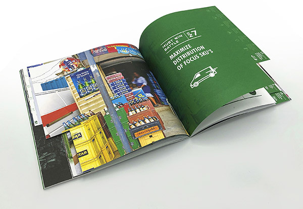
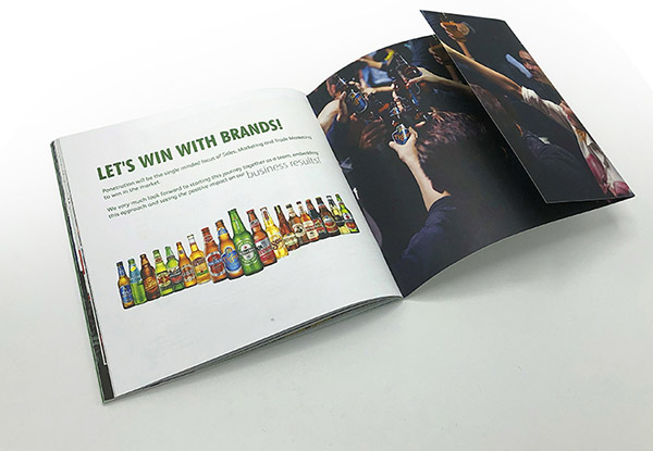
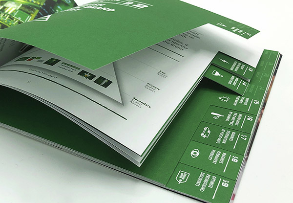
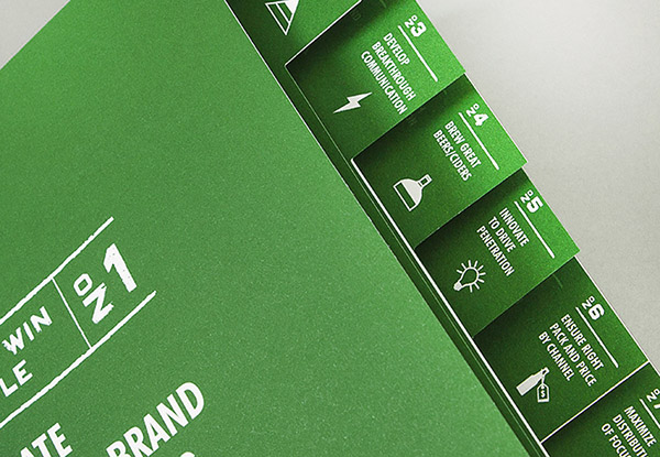
Corporate design booklet for internal purposes.
Winning with Brands! Heineken’s approach to deliver on the greenprint to win and create winning brands and businesses.
Restyling brand identity and packaging design
Created during my employment with dBOD.
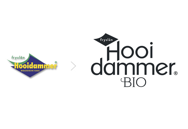
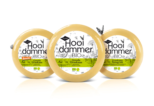
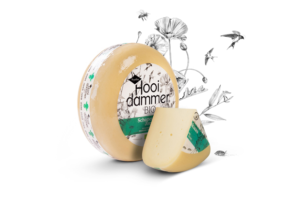
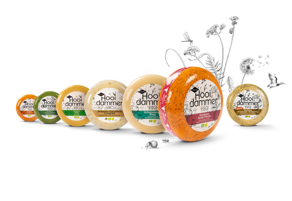
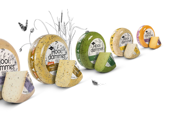
Strategic positioning Brand-, logo- & packaging identity, tone of voice, copy, communication design. In cooperation with Food by Design.
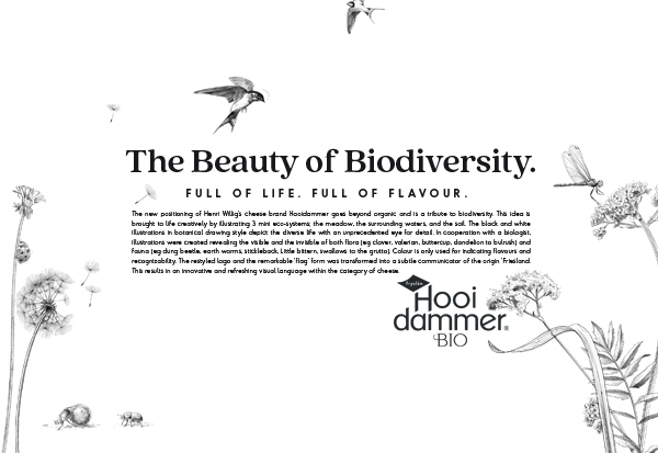
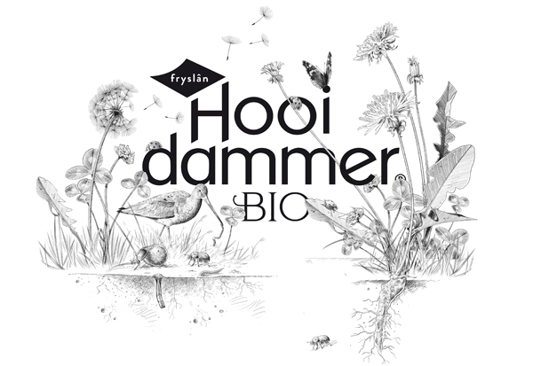
Tribute to biodiversity! Hooidammer cheese brand goes far beyond organic. It’s all about dedication to increase biodiversity. Vivid meadows that will result in a rich, layered cheese flavour. Biodiverse agriculture, maximally land-bound and balanced. The beauty in biodiversity. This is how nature and dairy farming enhance each other allowing the production of cheese in an environmentally-friendly and sustainable manner. Various illustrations visualize the rich, buzzing life around the organic farms of Hooidammer. Full of life, full of flavour.
Brand identity.
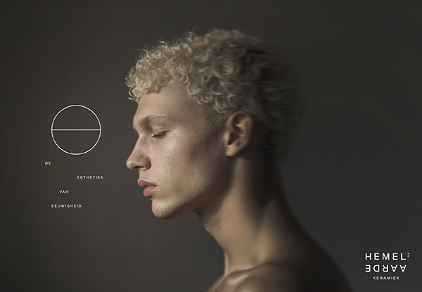
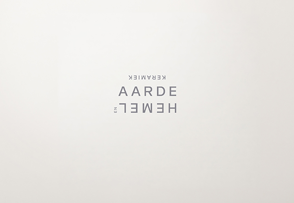
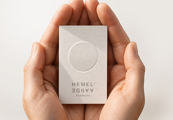
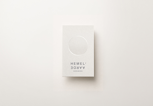
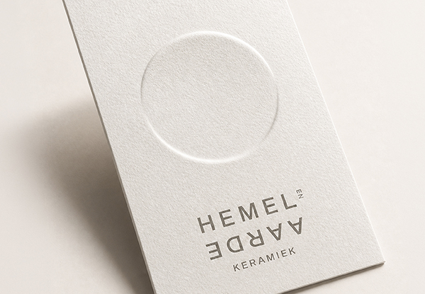
Hemel en Aarde Keramiek. Beautiful in their simplicity. Memorable in their beauty.
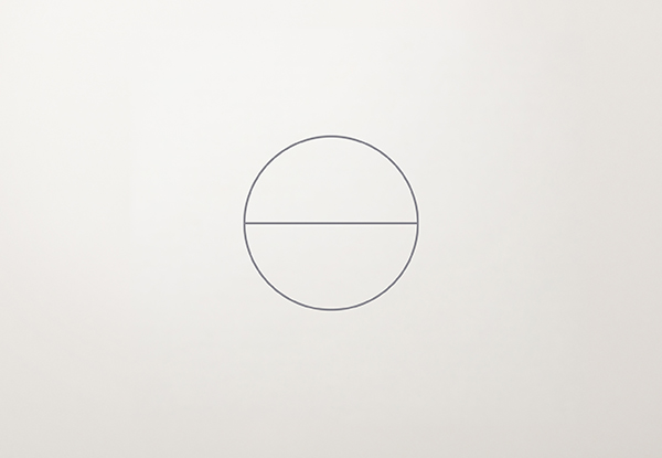
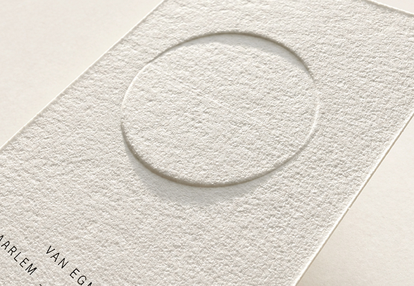
Hemel en Aarde (Heaven and Earth) Ceramics founded by Lonneke Verwer is a place where you can find contemporary ways to preserve the ashes of a loved one. Its handmade, minimalist urns are not immediately recognisable as urns, but instead resemble beautiful, tactile objects. They can be held and kept close, creating a renewed sense of connection with the person who is deeply missed. The cards feature a 3D relief emboss forming a circle that appears to rotate around its axis. The lower section gradually rises into an emboss, while the upper section gently recedes into a deboss. An exceptional example of craftsmanship that perfectly reflects the essence of Hemel en Aarde Keramiek.
Brand- & packaging identity.
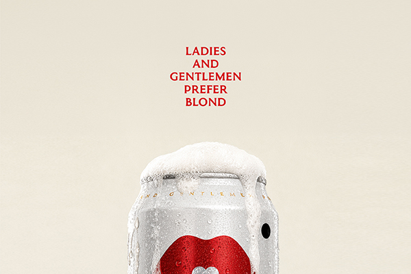
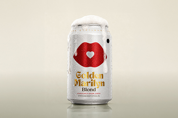
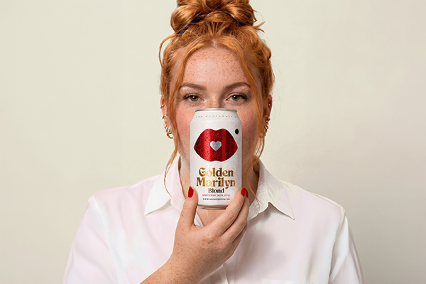
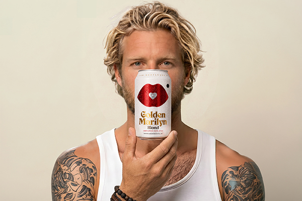
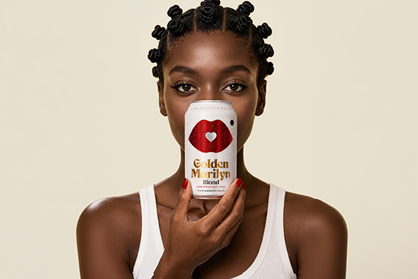
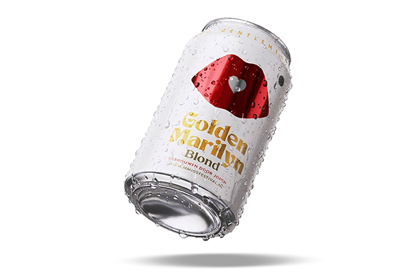
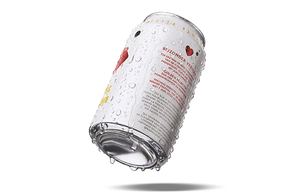
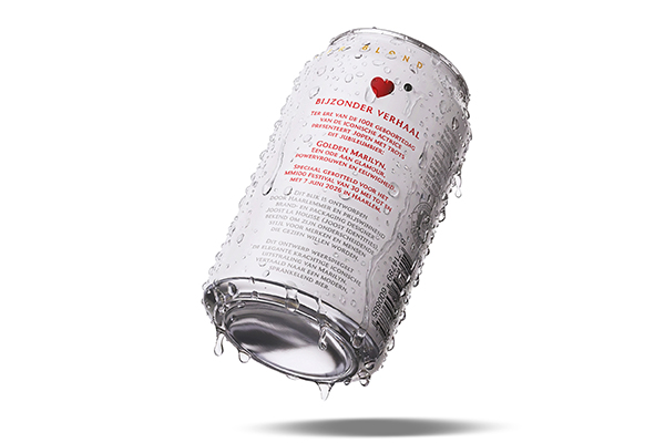
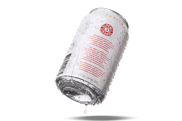
The Goldens. There is an icon within everyone.
Created on behalf of Stichting Productiehuis de Verbinding. “Darling… some things aren't meant to be drunk first. They're meant to be kissed.” Golden Marilyn is a limited-edition blonde beer created as a tribute to the 100th anniversary of Marilyn Monroe. Marilyn represented far more than glamour. She challenged expectations, redefined femininity and claimed her place in a world shaped by men. She never followed the rules. She rewrote them.
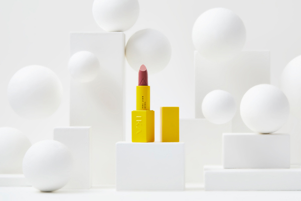
AWARD WINNING - Strategic positioning Brand-, logo- & packaging identity, tone of voice, copy, communication design.
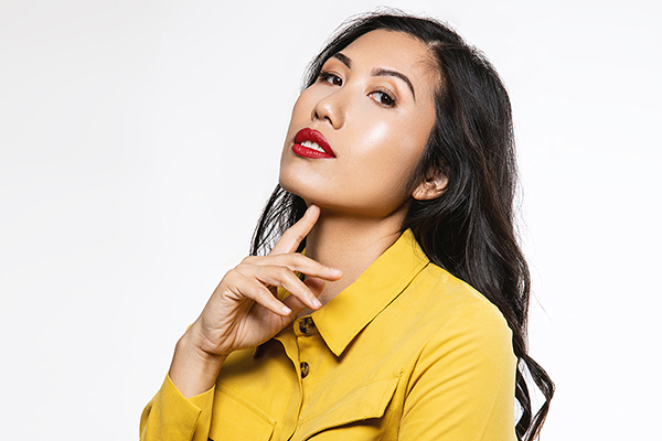
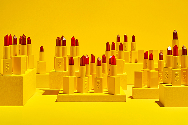
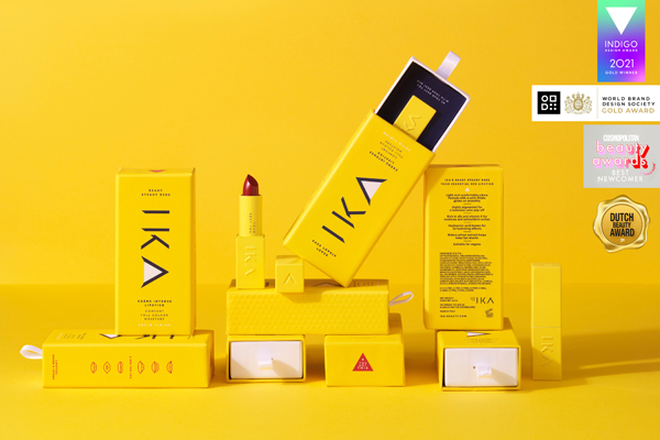
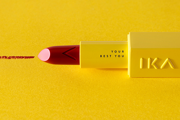
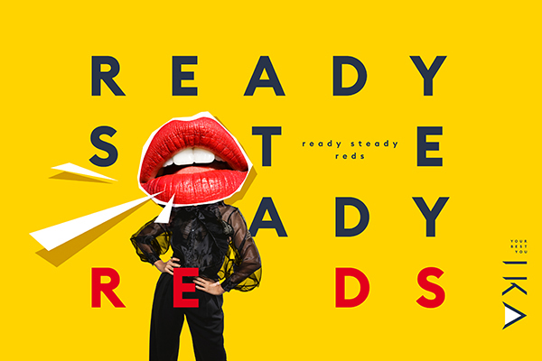
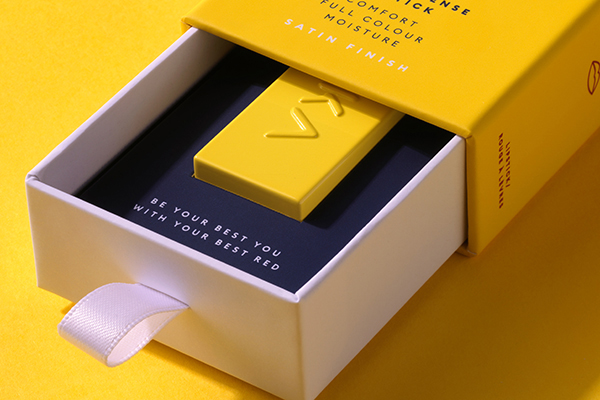
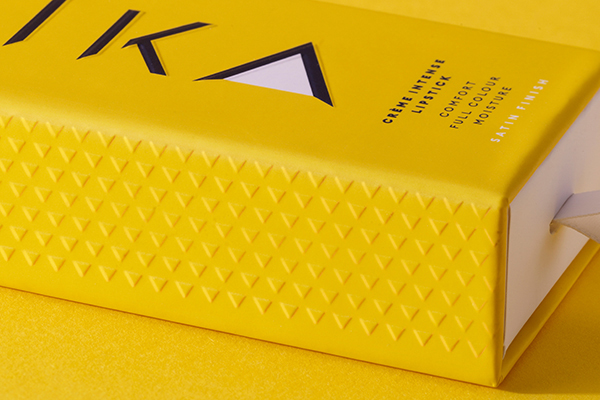
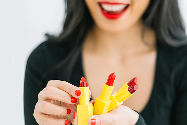
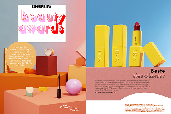
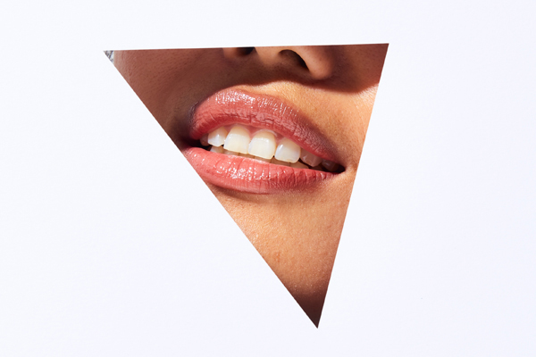
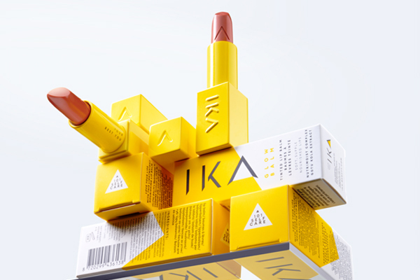
May we introduce to you: IKA Beauty The Ready Steady Reds Collection. A range of creamy red lipsticks, with a satin finish. Cruelty free & Vegan.
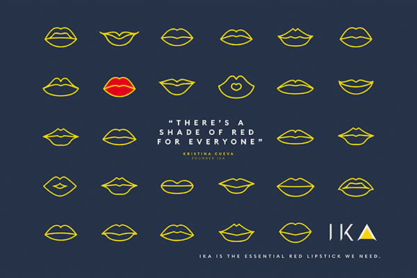
IKA Beauty does things differently: instead of focusing on the dream of becoming the ‘ideal woman’ by using cosmetics, the brand focuses on how its products boost the wearer’s own identity, confidence and creativity, as reflected by its tagline ‘YOUR BEST YOU’.
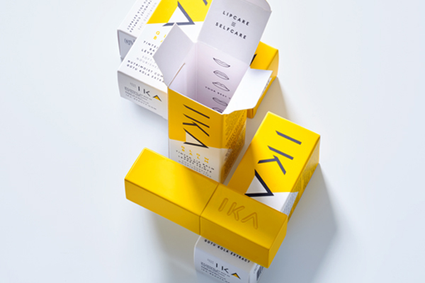
IKA wants the lipstick wearing ritual to also be a reminder to those wearing it, that she has her own back. We are extremely proud IKA has been internationally recognised on several occasions and awarded with awards for brand- and packaging design, innovation and best newcomer.
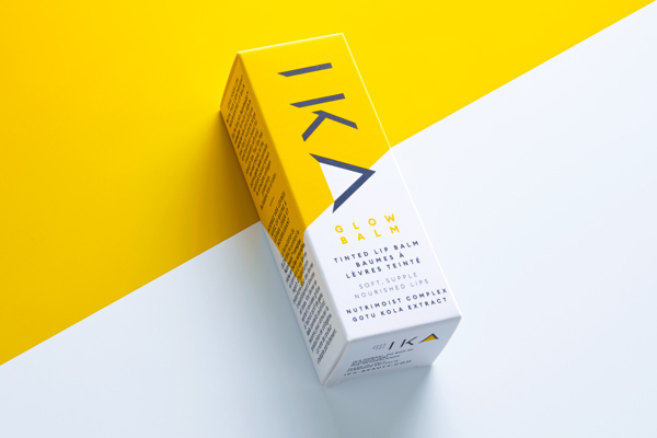
AWARD WINNING – Strategic positioning Brand-, logo- & packaging identity.
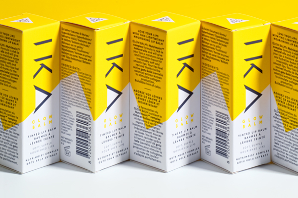
GLOW as YOU are! When you are your best you, you glow! That’s why IKA developed the perfect GLOW BALM for you in your trusted yellow bullet. Like a hybrid serum and tinted balm. Its decadent yet lightweight texture makes it feel like a serum disguised as a balm! GLOW BALM will boost your lips’ hydration and give you a slight sheen and a hint of color. Not sticky, not tacky but just the right pampering for your lips. No confusion with a lipstick. It’s au naturel and dewy YOU!
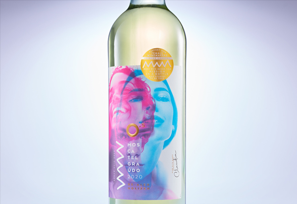
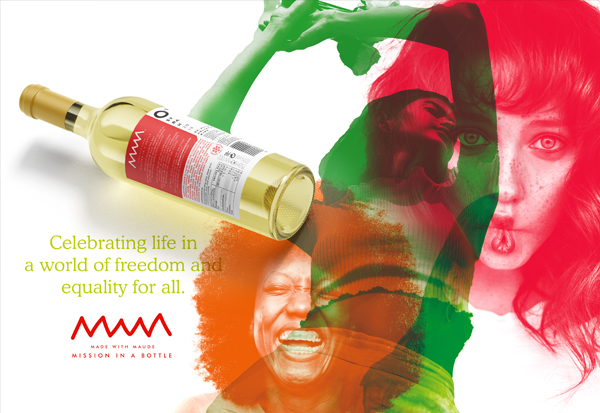
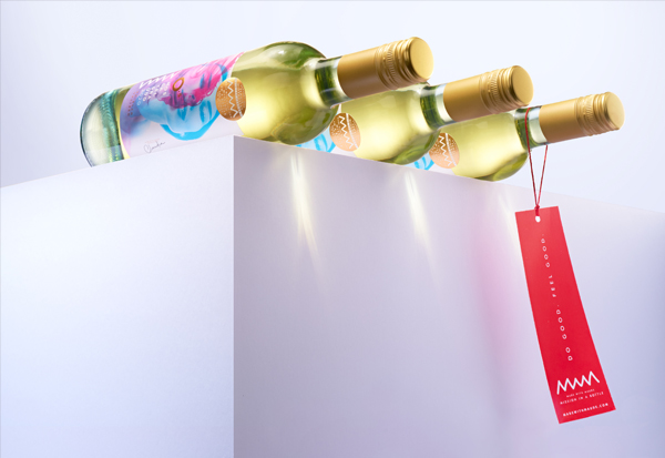
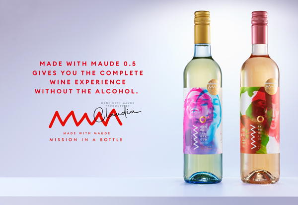
AWARD WINNING – Strategic Brand- & packaging identity, tone of voice, copy, communication design.
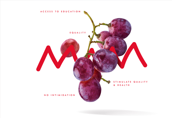
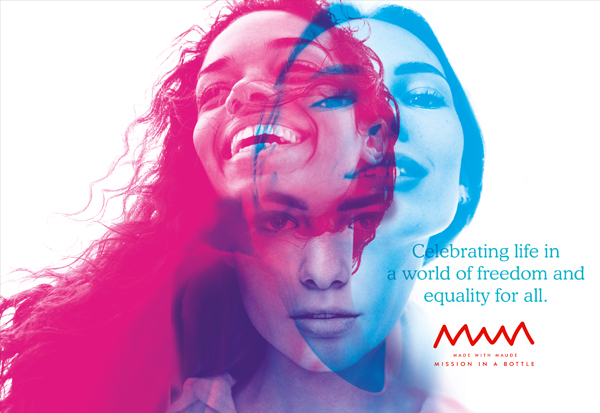
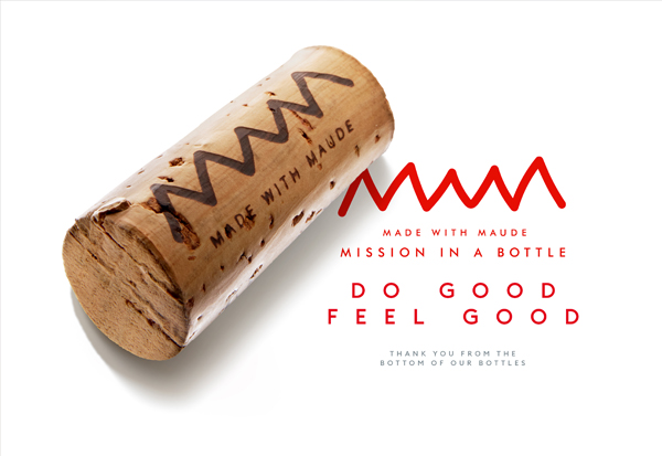
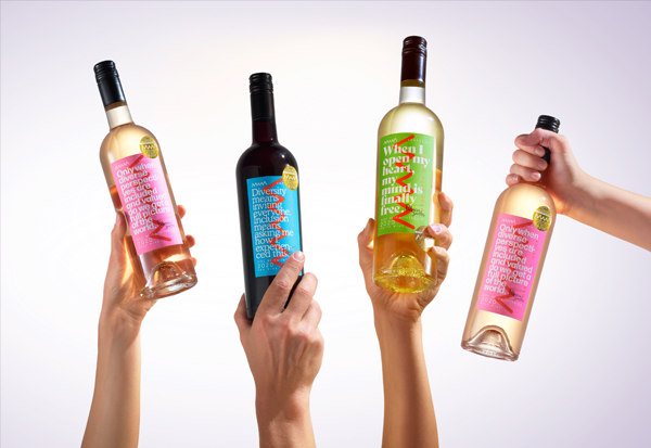
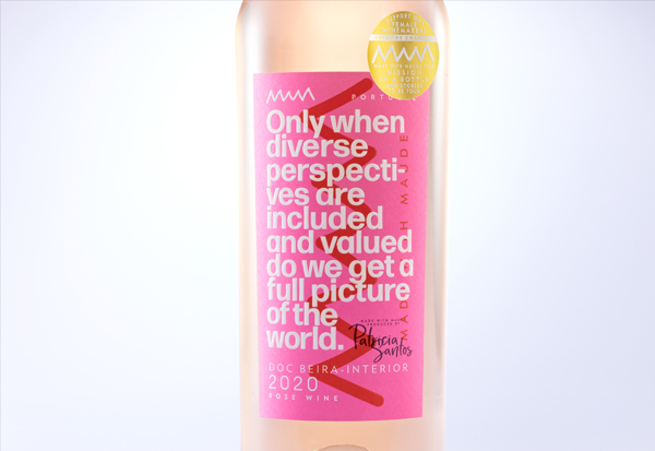
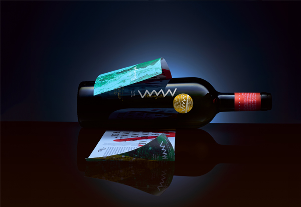
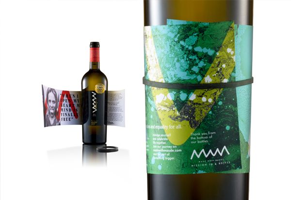
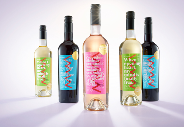
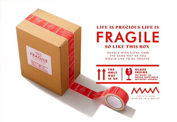
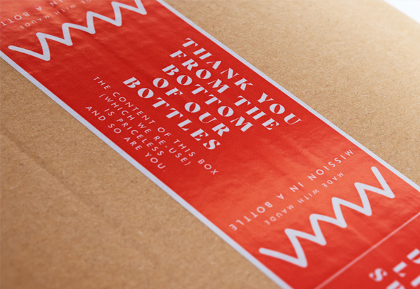
Made with Maude. Mission in a Bottle. We don’t follow the rest. We want stories to be told. Sparks of joy in our wines, creating remarkable moments In an ideal world with equality. Our aim is to set up an international movement to strive for equality. Collaborating just with female winemakers. Thank you from the bottom of our bottles. Join our movement here.
Brand - & Packaging identity in cooperation with Ariane van Mancius of Now New Next.
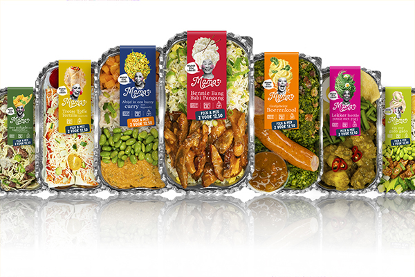
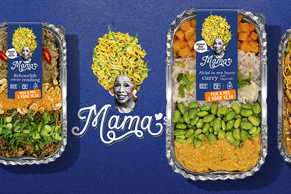
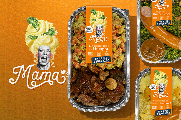
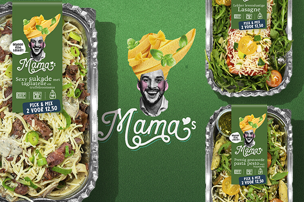
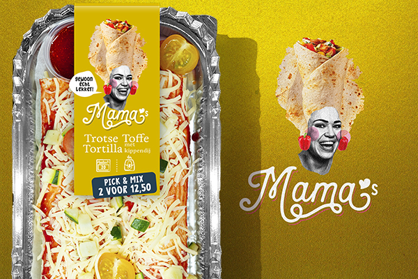
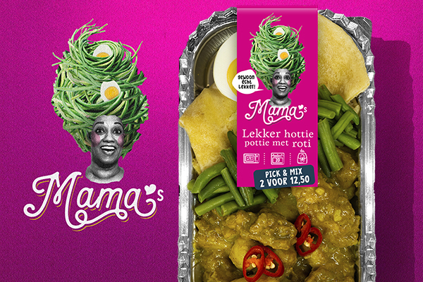
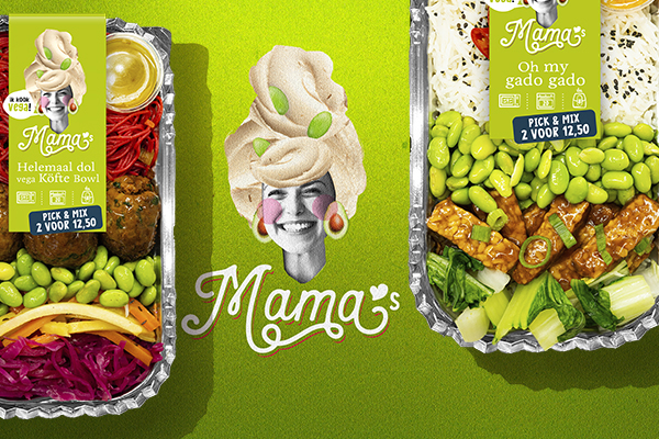
Let them have their way, our Mamas! They offer us warmth, fun and comfort. They care for you and unburden you. They teach us what good food is. Something they learned from their Mamas. They cook as if their lives depend on it. Every day, all over the world, everywhere. Healthy and fresh, prepared with love and tasting like a homemade meal. Mamas Meal is the new, ready-to-use brand that really is tasty!
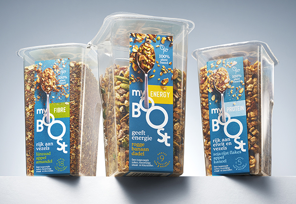
Brand-, Packaging design and tone of voice.
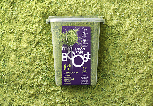
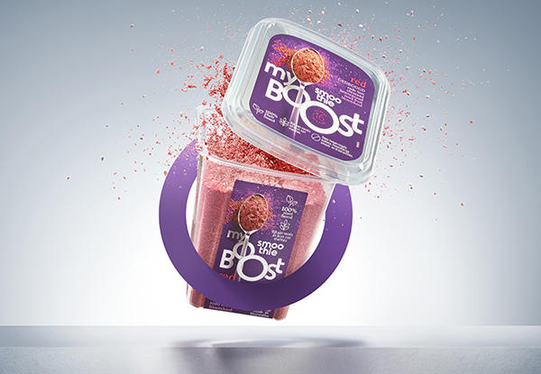
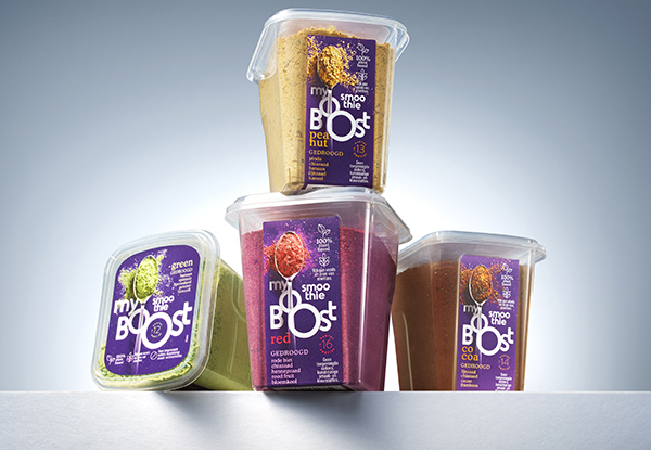
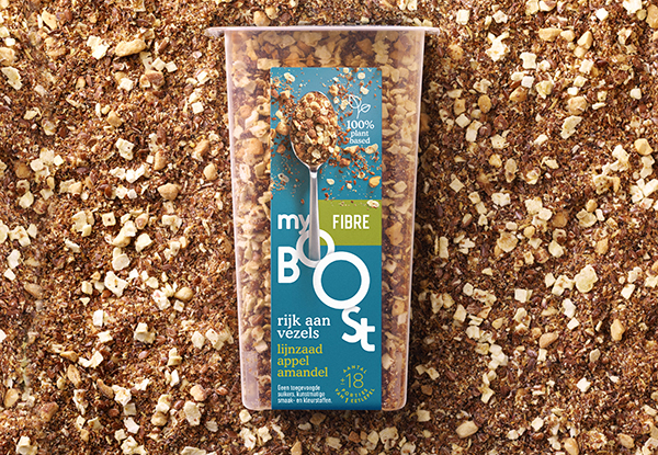
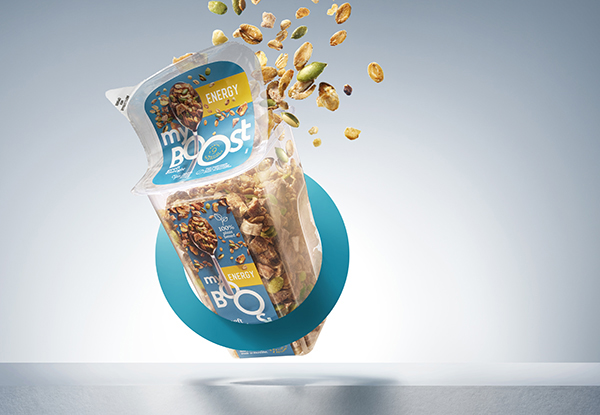
The alarm clock goes off... You are snoozing. And again. And again. Until: GO TIME!! Add just one tablespoon protein, energy or fibre to your yoghurt, or a boost to your smoothie and you will be ready to rock your day. 100% plant-based powders. Time to boost your day, the easy way!!
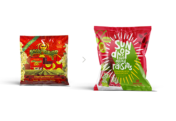
Repositioning Brand-, logo- & packaging identity.
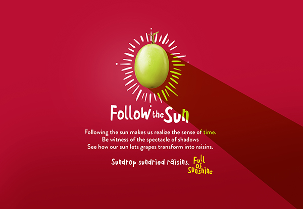
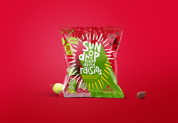
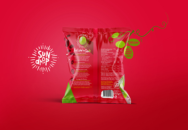
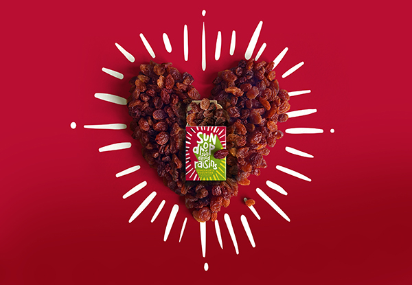
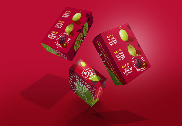
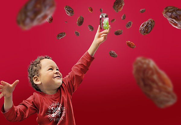
Sundrop. Follow the sun!
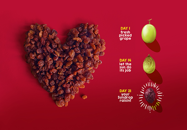
Without sun no sense of time. Without sun there is no life, Without sun no Sundrop Raisins. Have you ever wondered what happens to a freshly picked white grape? Well, the sun keeps a watchful eye on it, gradually transforming it into a delightful Sundrop raisin, hence its dark color. All natural! Let the Sun be with you!
Repositioning Brand- & logo identity & Copy.
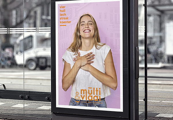
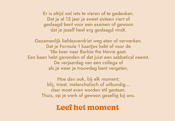
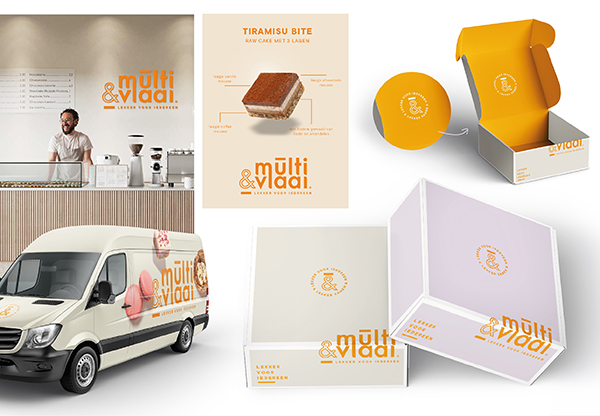
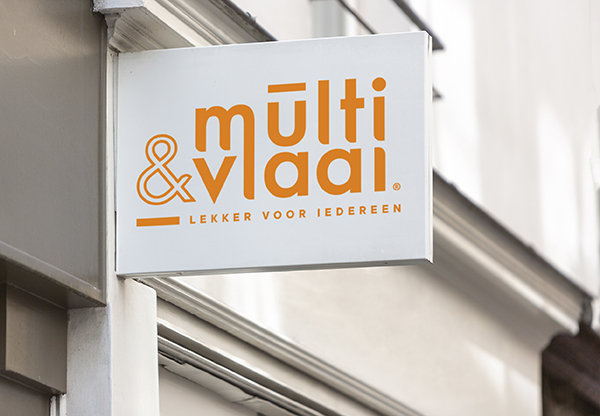
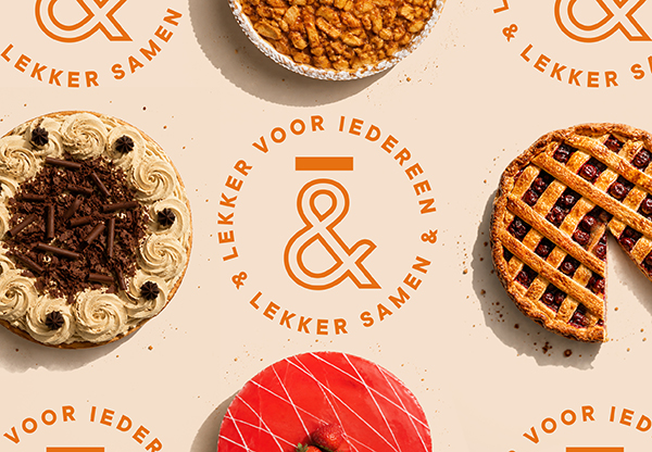
Created in collaboration with NowNewNext Multivlaai, a beloved brand with a rich heritage in traditional Dutch pies, faced a significant challenge. Its brand experience, product range and in-store experience no longer reflected the current zeitgeist, making renewal essential, both to retain loyal customers and attract a new audience. The brand evolved from the Everyman archetype to the Creator, placing greater emphasis on creativity and innovation throughout its product offering and retail experience.
Strategic repositioning Brand-, logo- & packaging identity, tone of voice, copy, communication design.
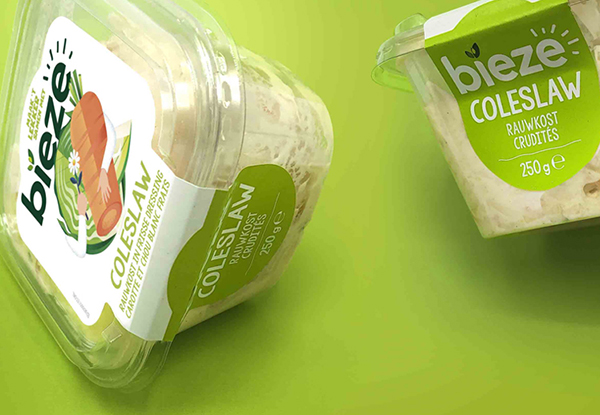
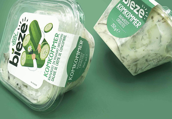
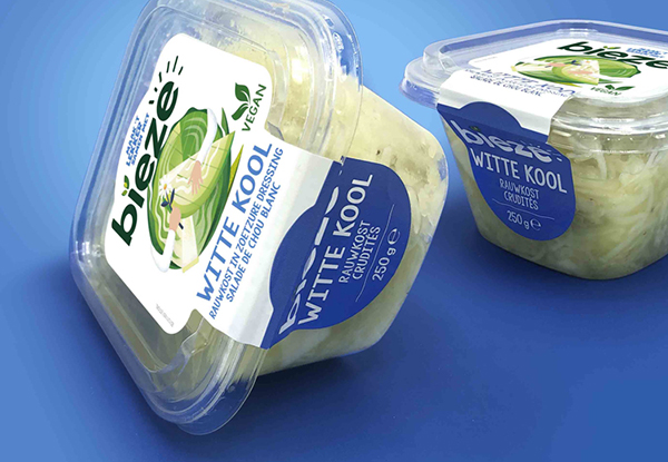
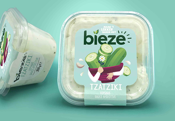
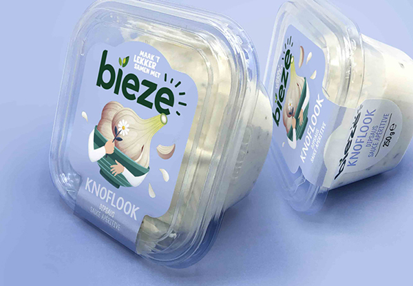
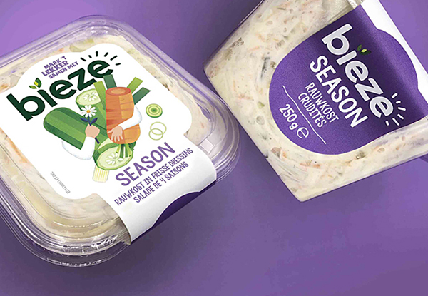
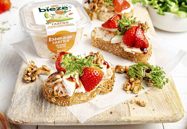
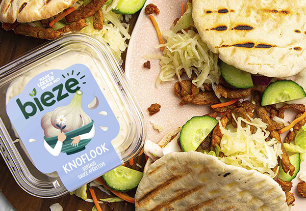
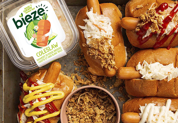
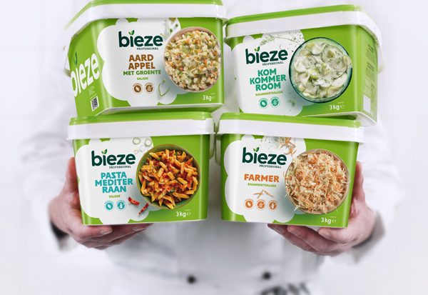
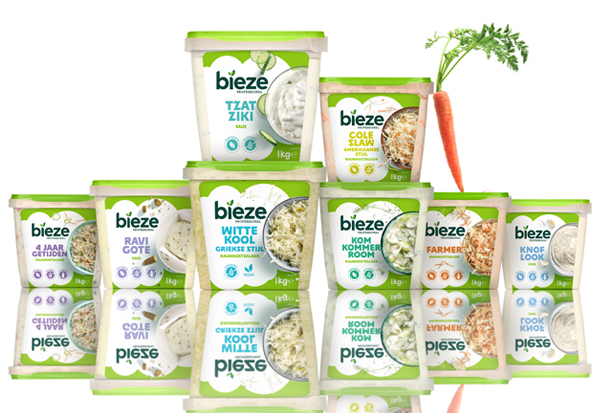
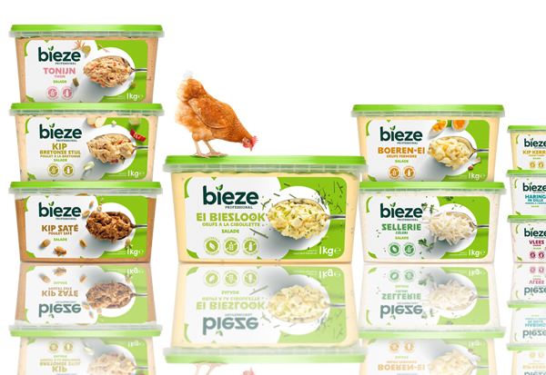
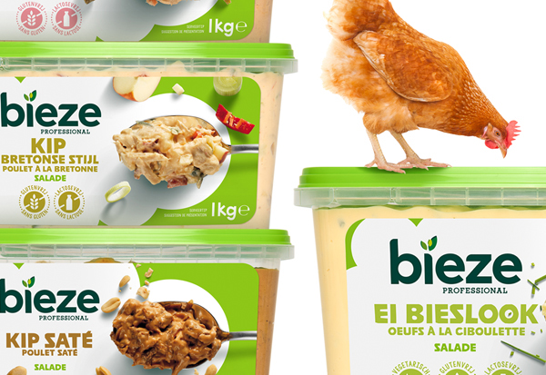
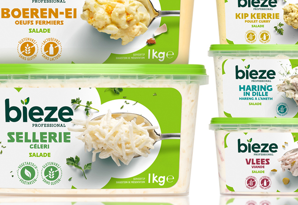
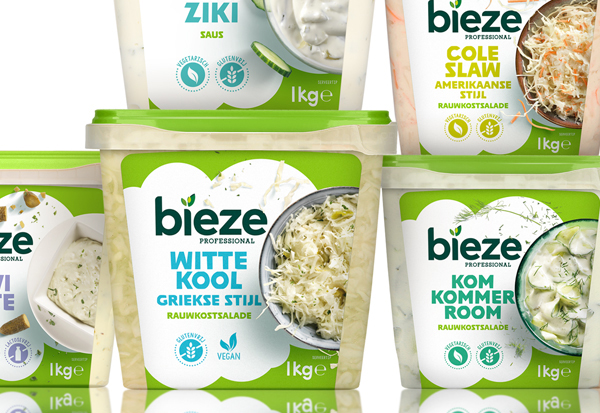
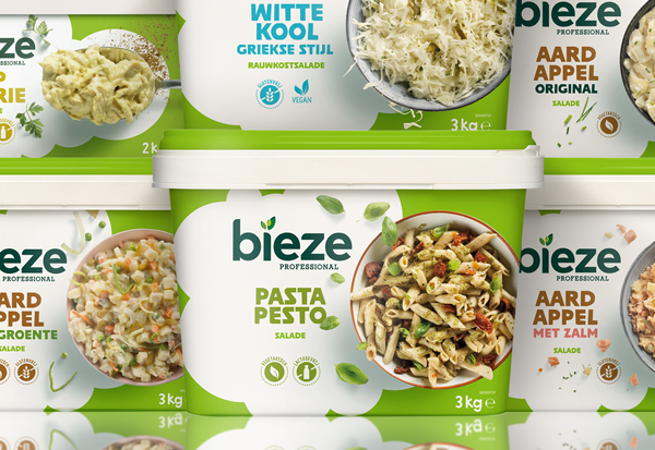
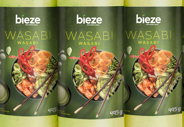
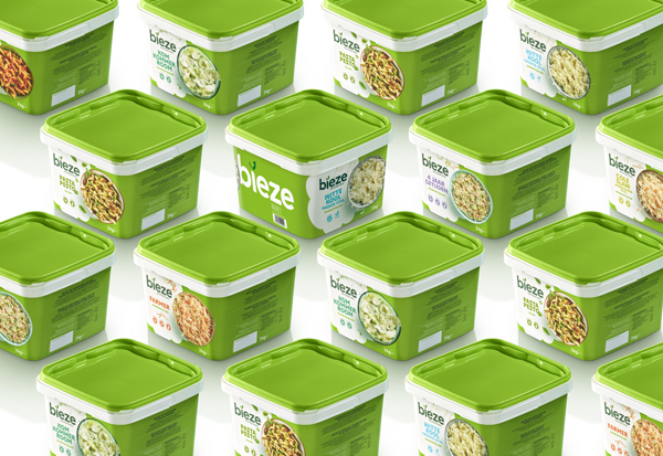
We bring a smile to your day-to-day life. And we will tell you why: together is always more fun and with Bieze salads and dips, it is also tastier. Because we enjoy eating well together. And it contains so many vegetables that you will not be able to carry it!
Strategic repositioning Brand-, logo- & packaging identity, tone of voice, copy, communication design.
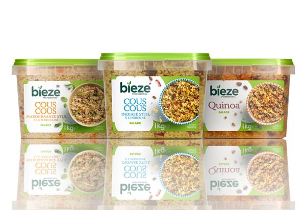
Uniform appearance, bilingual and provided with clear navigation claims; that means easy enjoyment with a smile. It’s clients ambition to push the boundaries of the traditional fresh convenience categories with this new packaging design is. Bieze Professional is a fresh contemporary food service brand for fresh convenience high-quality products for an attractive price. The mission is emphasised with this cheerful display: a smile at our chefs’ tables but especially their clients’ tables!
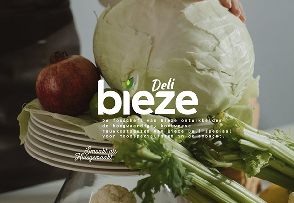
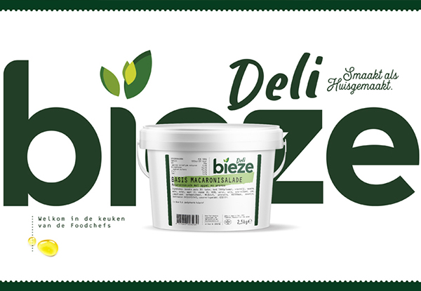
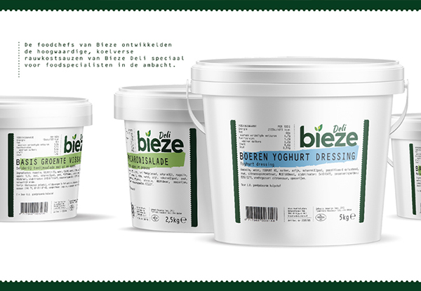
Strategic postioning Brand-, logo- & packaging identity and tone of voice.
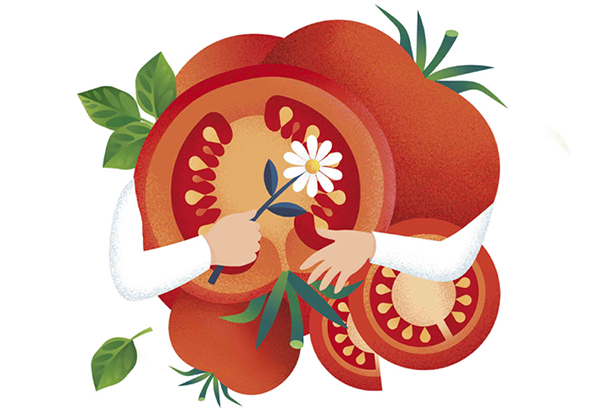
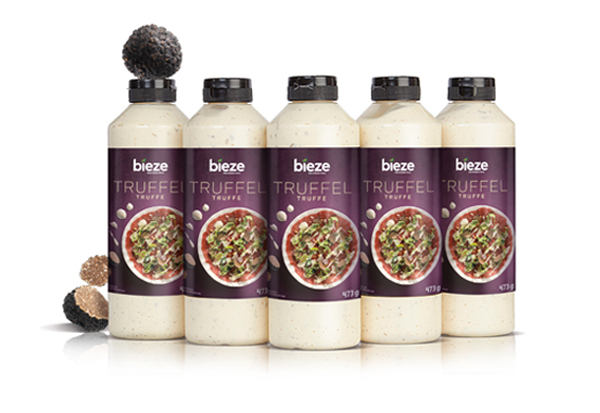
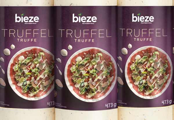
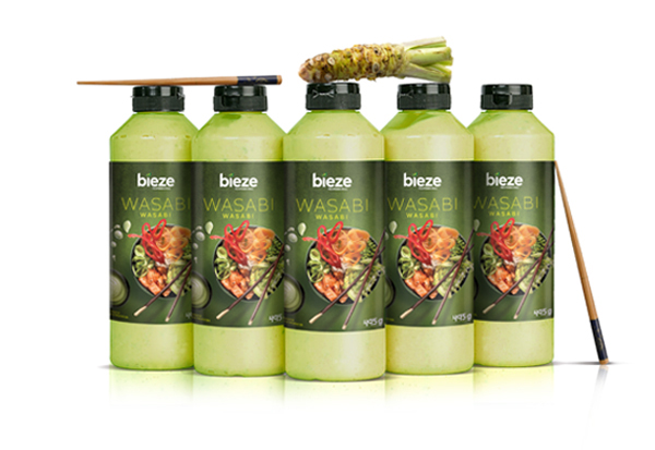
The Bieze food chefs enjoy good and tasty food and they developed the high-value, refrigerated Bieze Deli products especially for artisinal food specialists. A source of inspiration saving time and delivering quality, whilst allowing for one’s own personal touch. The solution for specialists and food professionals in the catering industry who value high quality, freshness and a full, rich taste.
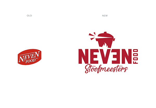
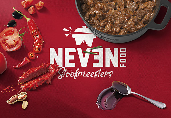
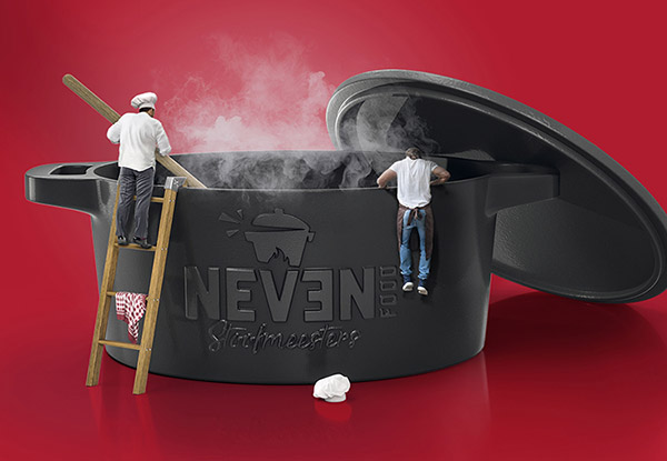
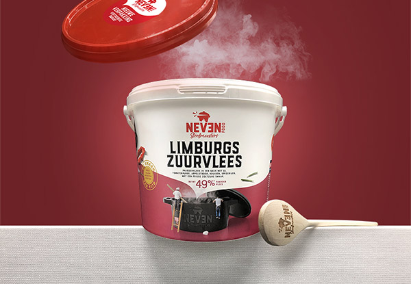
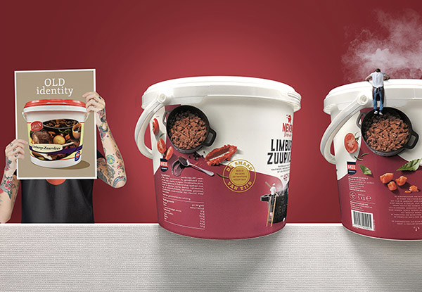
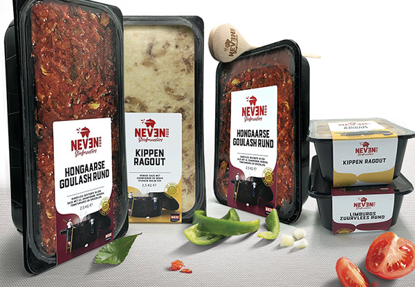
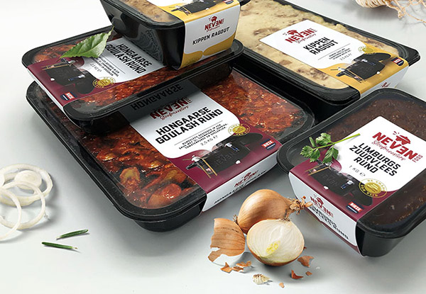
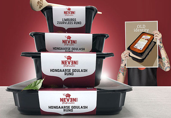
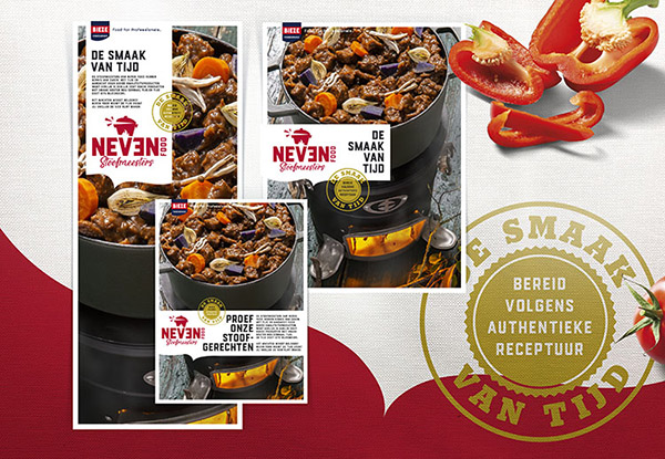
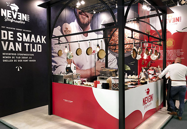
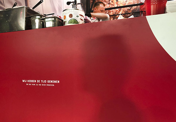
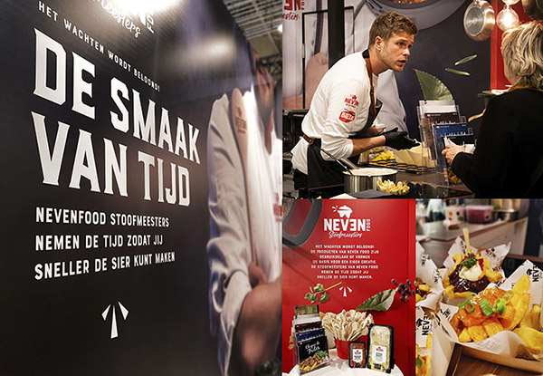
Strategic repositioning Neven Food Stoofmeesters – Brand-, logo- & packaging identity, tone of voice, copy, communication design and exhibition stand Design.
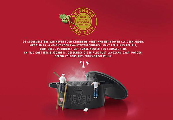
The stewing masters of Neven Food know the art of stewing like no one else. Because let´s be honest, to produce a quality product takes time.
Authentic recipes prepared slowly in the old-fashioned way. And time does something remarkable. Daily life rushes by, but the Neven Food Stewing Masters take their time, allowing the Chef to shine. It is worth the wait! See here for yourself!
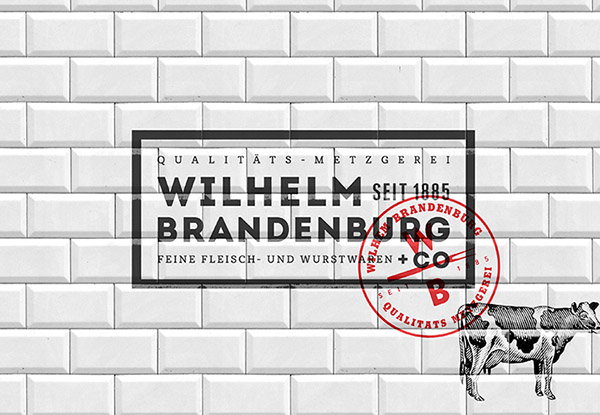
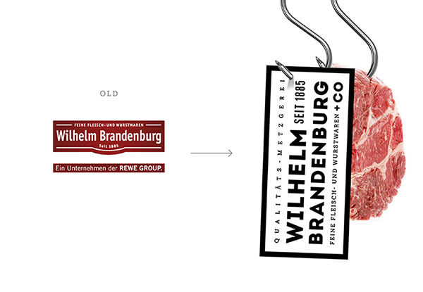
Repostioning, Brand- and Packaging design.
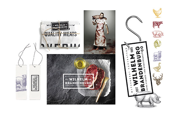
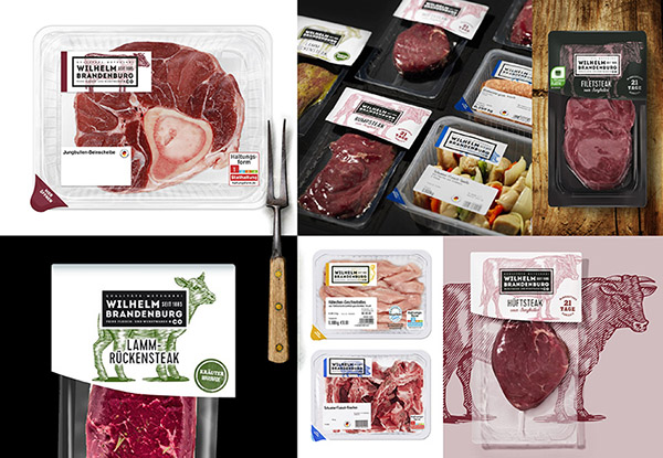
“Fleisch-, Wurst- und Schinkenspezialitäten“ since 1885. The new proposition and design breathes quality, tradition and craftsmanship.
Authentic values transformed into a contemporary (supermarket) brand. On behalf of Yellow Dress Retail I was pleased to create this range.
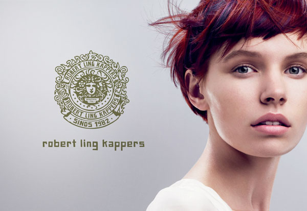
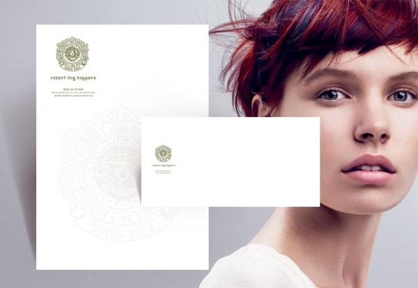
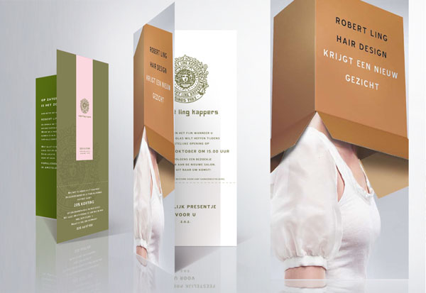
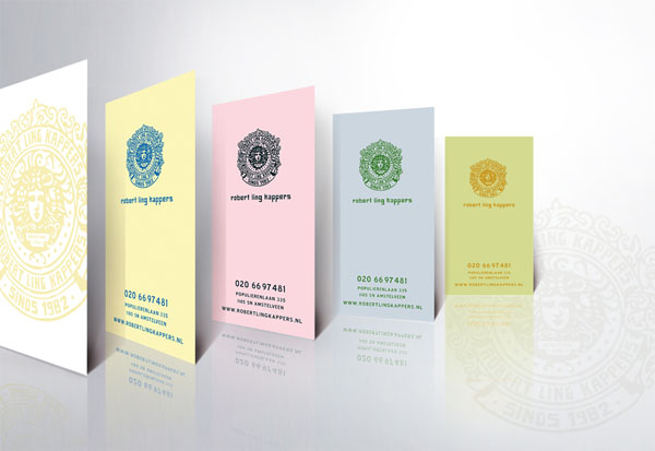
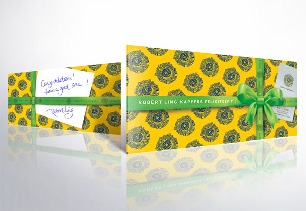
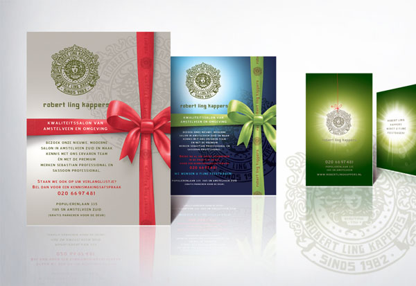
Indentity for a high standard hairdressing salon.
Image Sassoon Professional: © Copyright 2010 Procter & Gamble. All Rights Reserved.
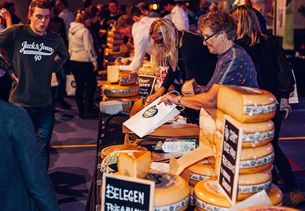
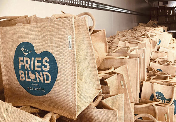
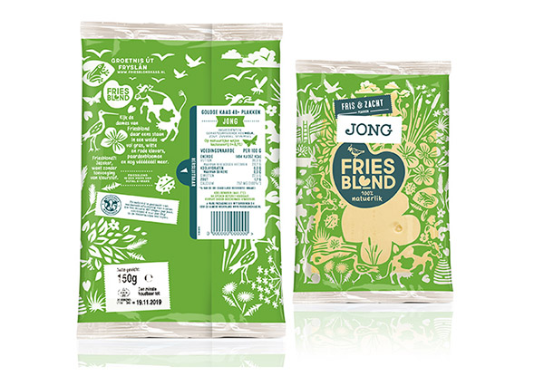
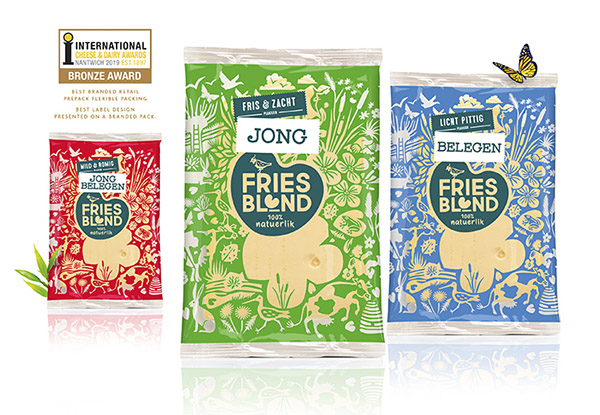
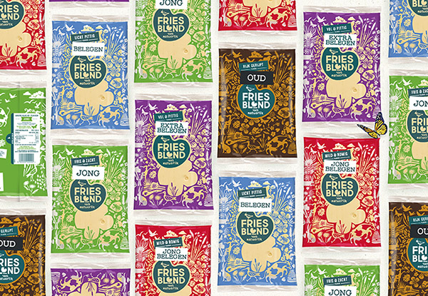
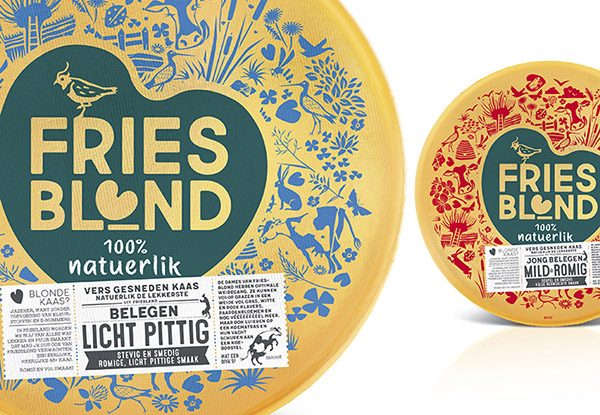
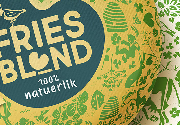
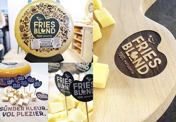
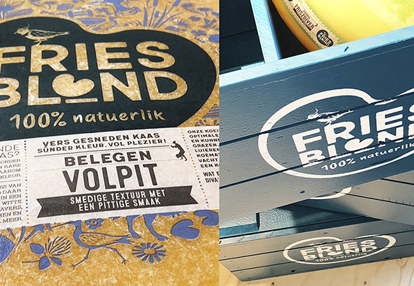
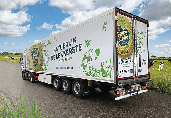
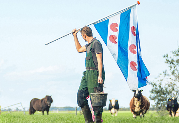
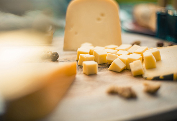
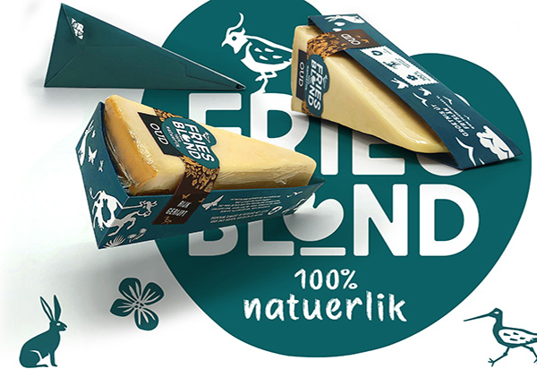
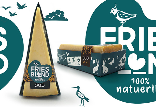
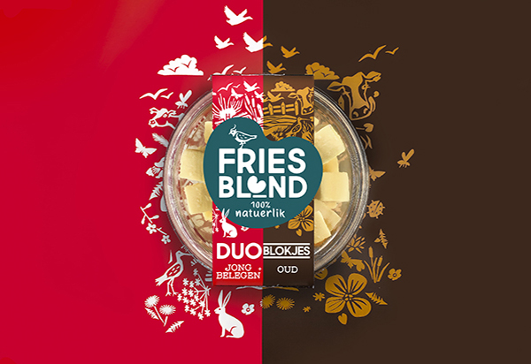
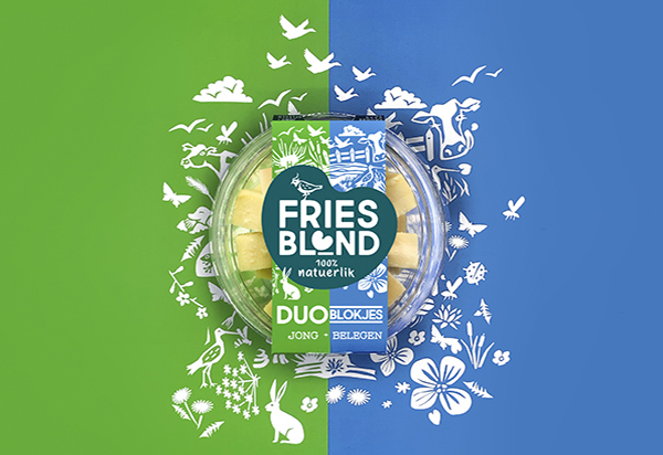
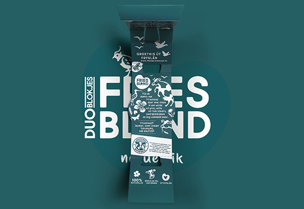
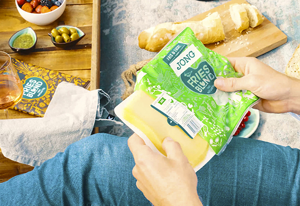
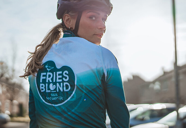
Positioning, naming, tone-of-voice and packaging identity new International cheese brand FriesBlond.
Look! There it is, that scrumptious blond Frisian: FriesBlond! What kind of cheese is FriesBlond? Well, it is easy to spot that this cheese is different. No colour additives and weird E-numbers. Hence those nice blond looks! You cannot get it any more natural. Sûnder kleur. Vol plezier! The cheese and it’s packaging did win 4 prizes at the international cheese & dairy awards at Nantwich. In cooperation with Food By Design Marielle Bordewijk.
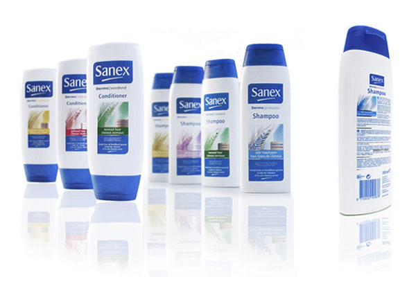
Restyling logo and a selection of packaging Body- and Haircare products.
Created during my employment with dBOD.
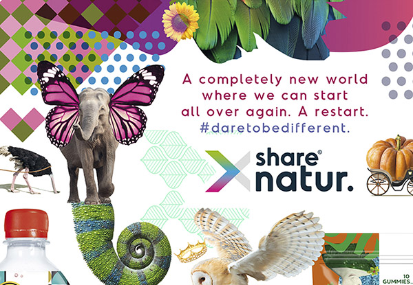
Imagine. How would your perfect world look like? A completely new world where we can start all over again? A restart?
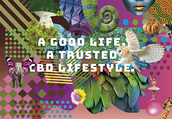
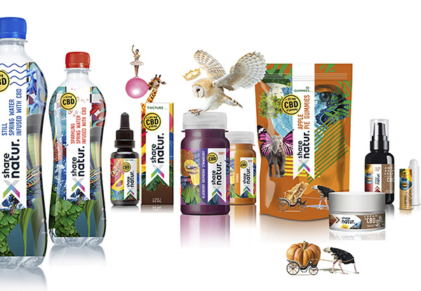
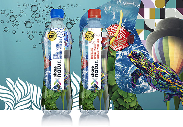
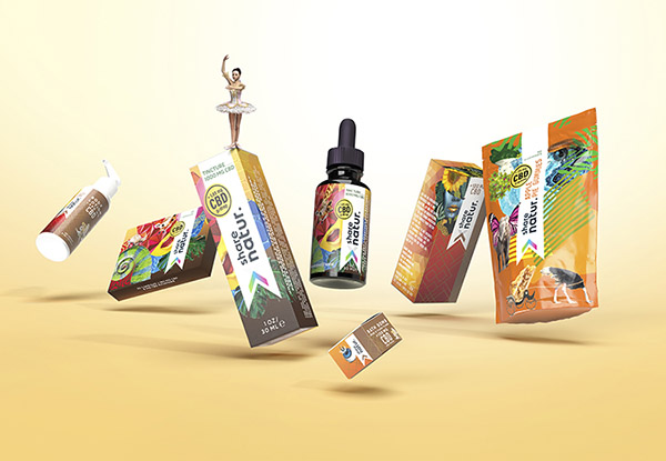
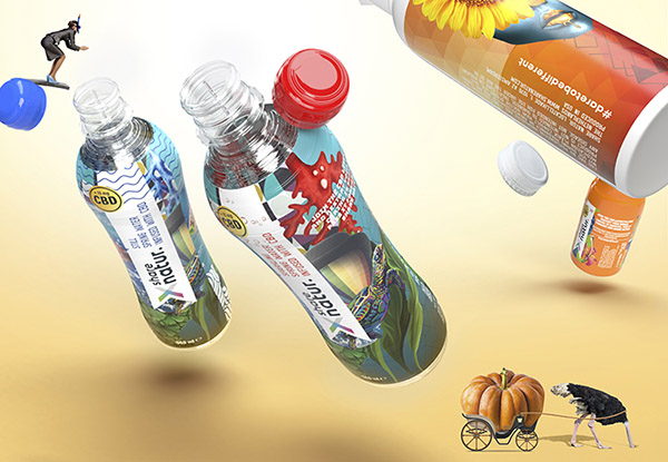
Brand- & Packaging design Share Natur. A good life, a trusted CBD lifestyle.
In cooperation with Ariane van Mancius of Now New Next we were approached by Share Natur to develop a new brand identity for their range of world class next generation health, functional and wellness products for the global market. I was very pleased to create this over the top surrealistic fictional world.
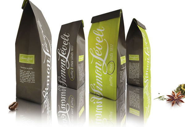
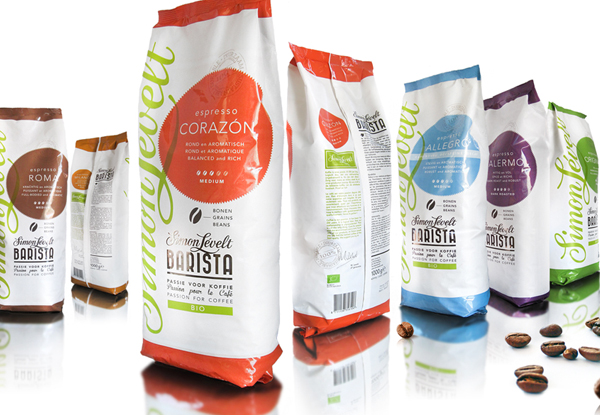
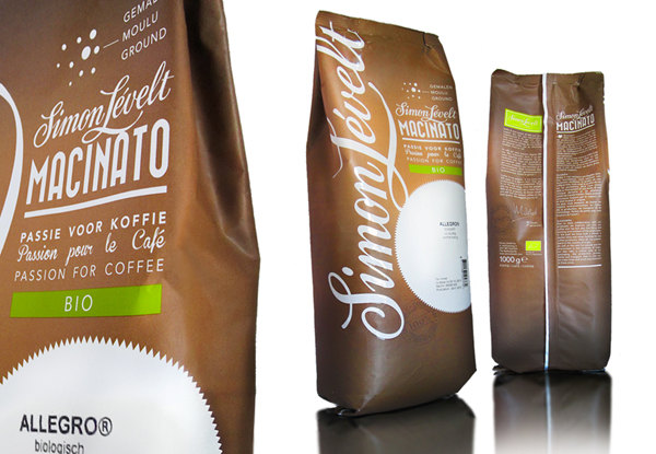
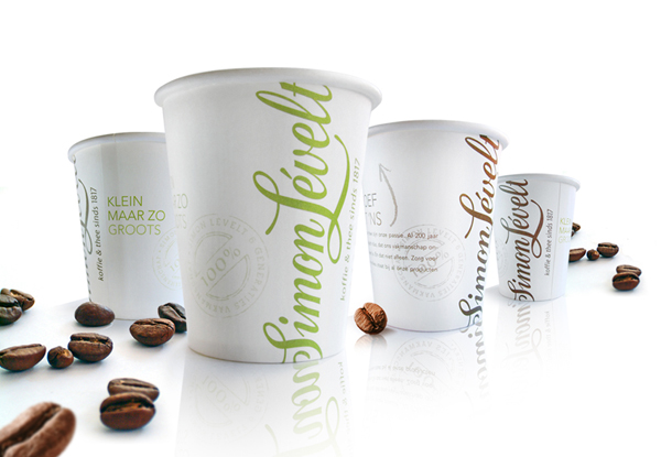
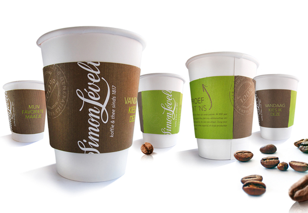
Packaging design for coffee & tea brand since 1817.
Created during my freelance activities at RCLM.
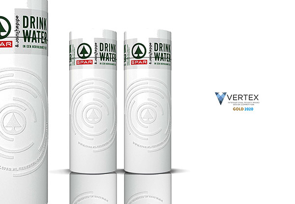
AWARD WINNING - Packaging design Reusable Waterbottle Join the Pipe.
More and more people from all over the world share the dream of Join The Pipe to redistribute drinking water worldwide in a fair way ánd to tackle plastic soup at the source. Every bottle is a piece of the longest water pipe in the world, long enough to bring water to all of those without. On behalf of Yellow Dress Retail I was pleased to create the packagingrange for Spar Reusable Waterbottle Join the Pipe.
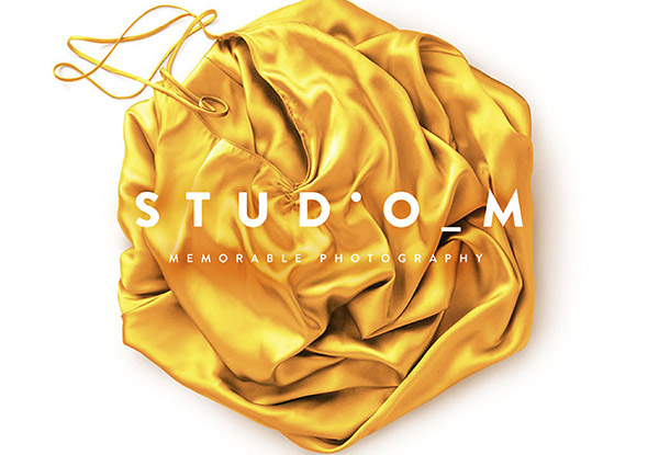
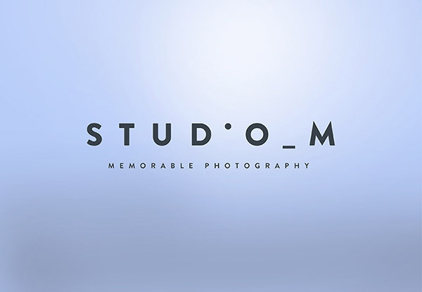
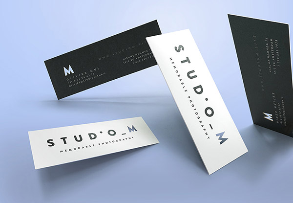
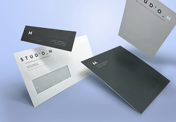
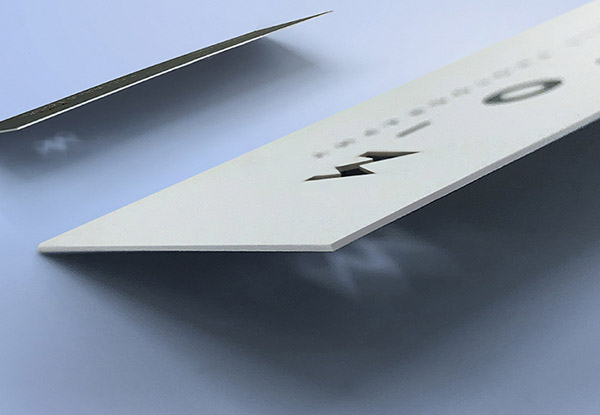
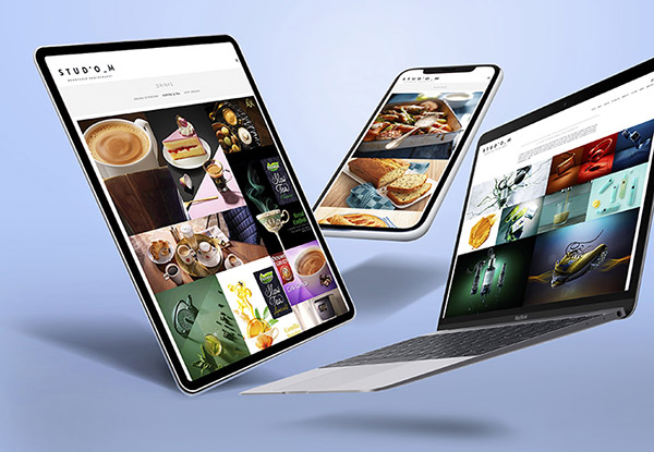
Brand Identity Studio_M Memorable Photography.
Breathtaking images of Studio_M are memorable, magical, meaningful, mouthwatering and mysterious all taken by founder Olivier Mul and his companion Wimer Meijer. They cover all fields of expertise from high-end culinary photography to beauty- and advertising photography. Experience the memorable moment right now!
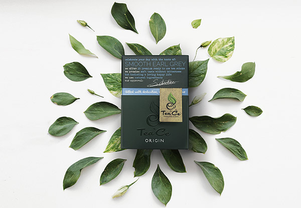
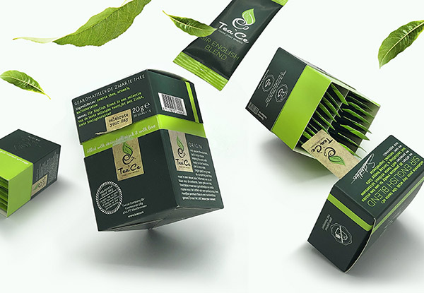
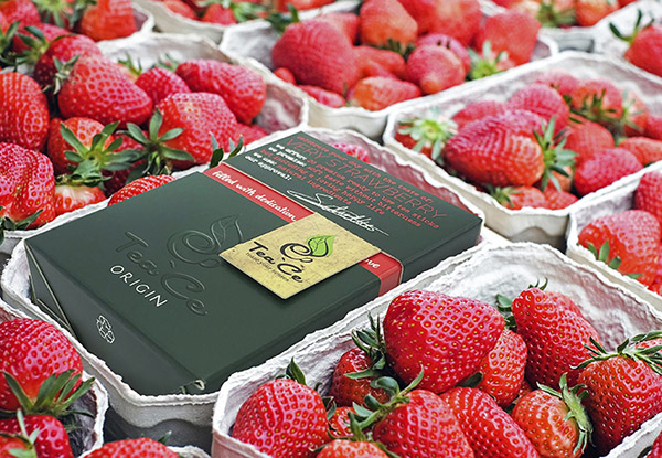
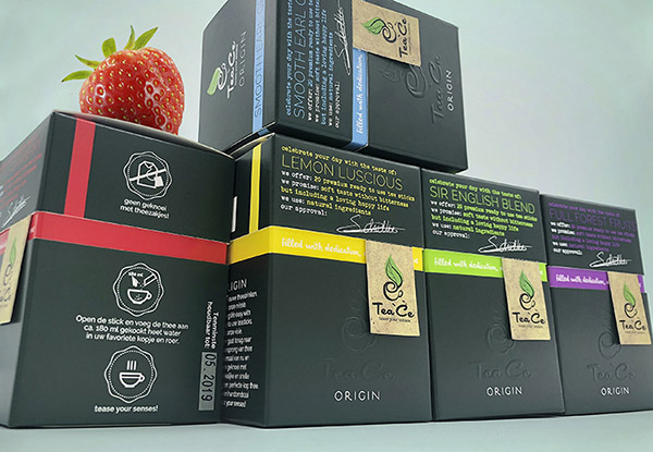
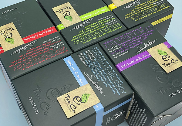
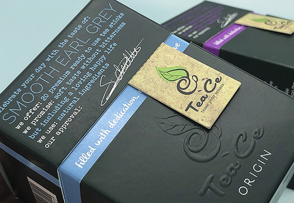
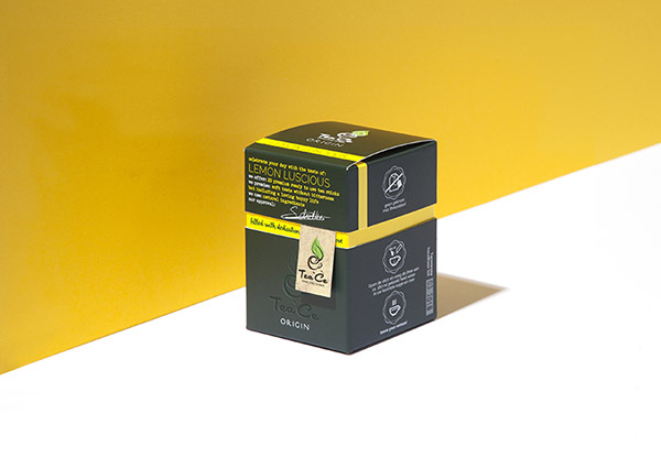
Strategic positioning, Brand-, Packaging identity & naming.
Tea, re-imagined. For centuries the tradition of tea has remained unchanged. Until now! Tea’ce has managed to develop tea infusions with only a intense, pure tea flavour without any bitterness. Tease your senses without any mess with tea bags!
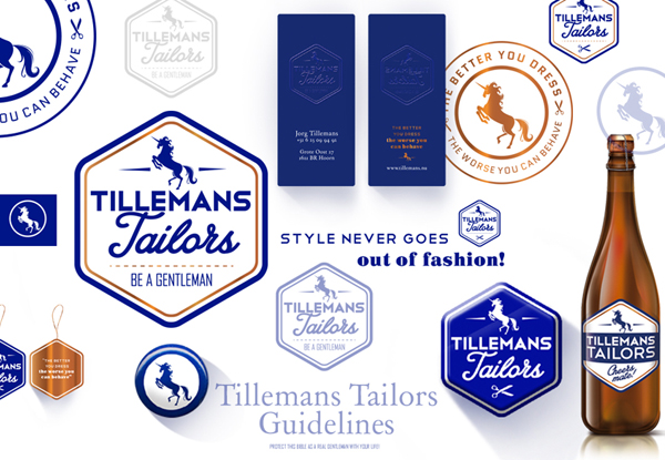
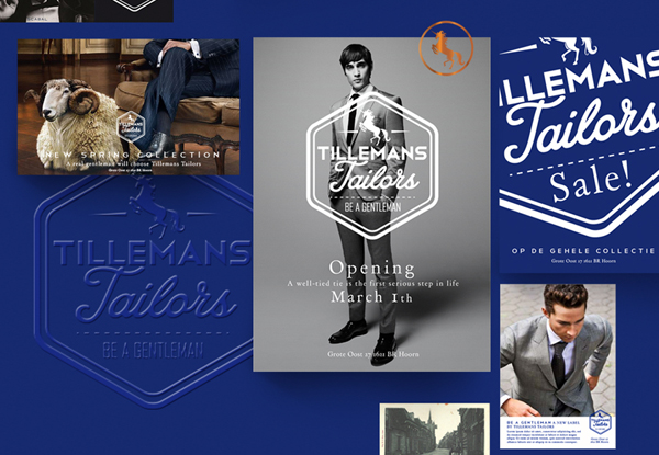
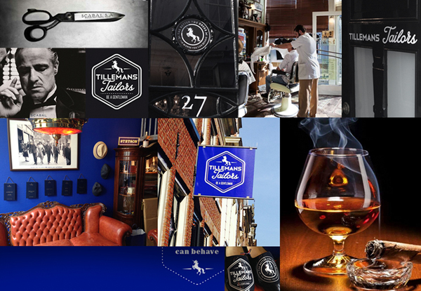
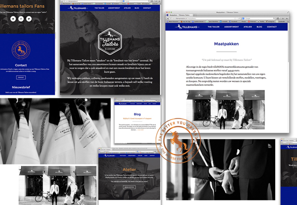
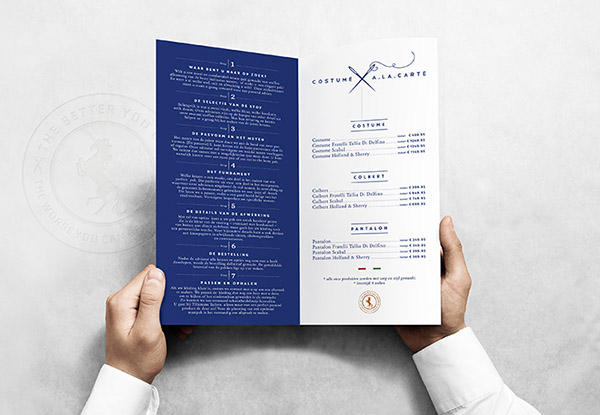
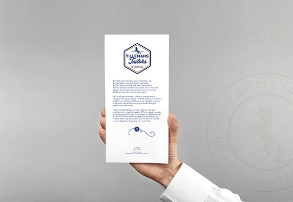
Corporate identity Tillemans tailors.
MEN ONLY! The better you dress, the worse you can behave! Don’t be boring, dare to choose your own style. Be a gentleman!
Go ahead and have a look here.
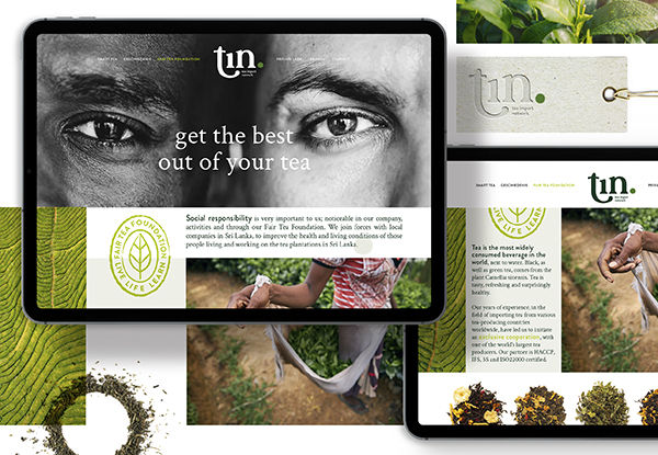
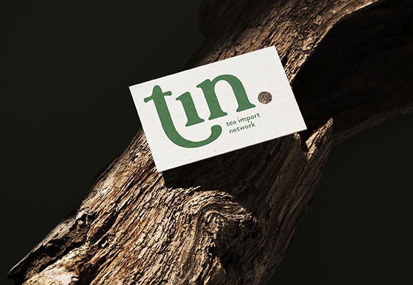
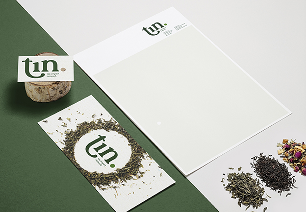
Repositioning Renaming Brand- & logo identity.
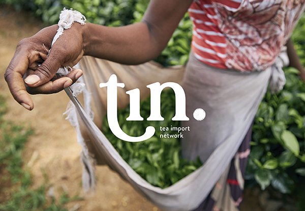
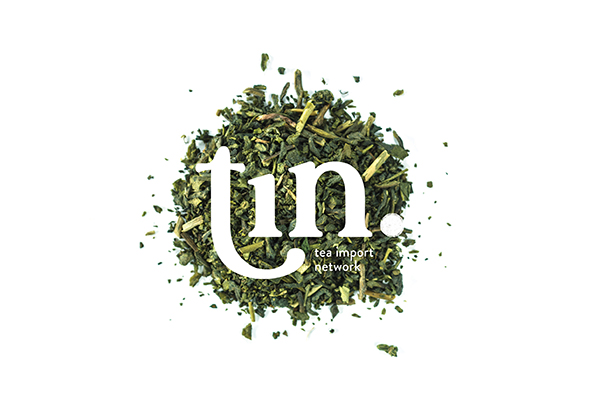
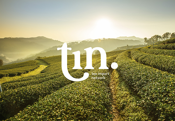
Created in collaboration with De Club. Around 1600, tea was shipped from Asia to the Netherlands for the first time. It travelled a long way in wooden chests, where it proved highly sensitive to humidity and light. To protect the tea and guarantee its quality, the inside of each chest was lined with panels coated in a thin layer of tin.That extra element, added for the perfect cup of tea. No tea without Tin. And there’s more to the name: Tin also stands for Tea Import Network.
Conceptdevelopement Visual identity.
Toby’s develops, produces and delivers personal care products for sale under clients’ own brand labels.
In cooperation with Studio_M we created a series of images.
Brand-, packagingidentity, naming and positioning.
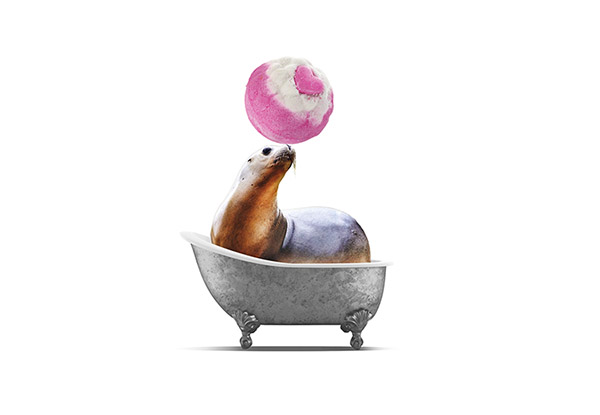
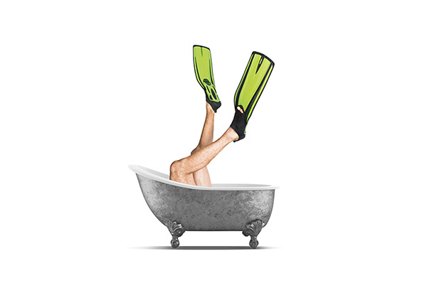
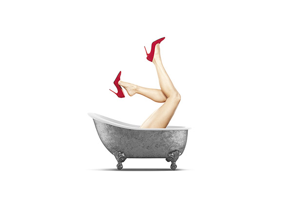
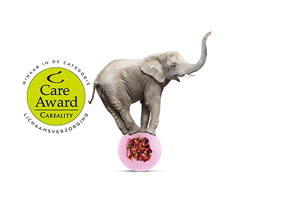
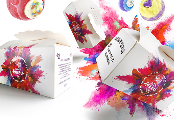
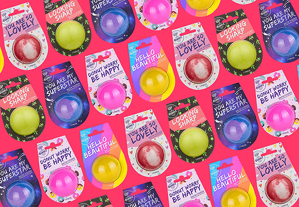
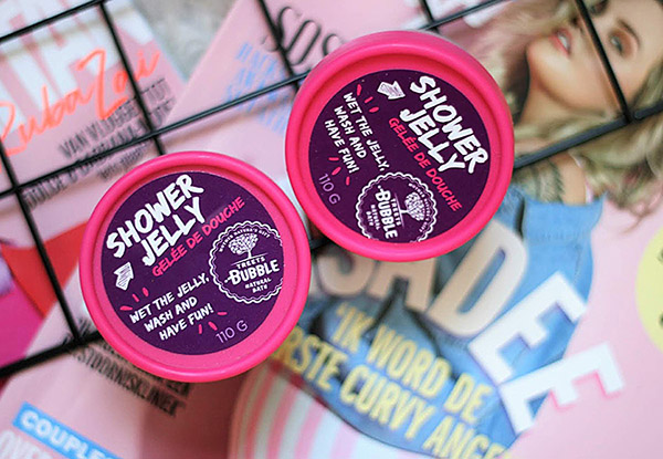
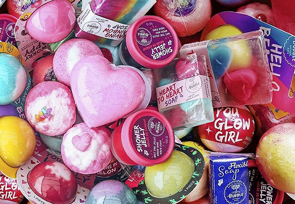
Happiness is homemade! Welcome to our kitchen. Today we will make cupcakes and tomorrow sparkling balls. The day after tomorrow we have planned a detox moment finished off with some sweets. Of course, it’s not a real kitchen but a metaphor for a sensory experience: stimulate and activate all our senses. Treets Bubble offers this experience through a range of bath products. The fragrance, touch and sound will turn Treets Bubble into a fun and loving brand that understands “The fun of Bathing”.
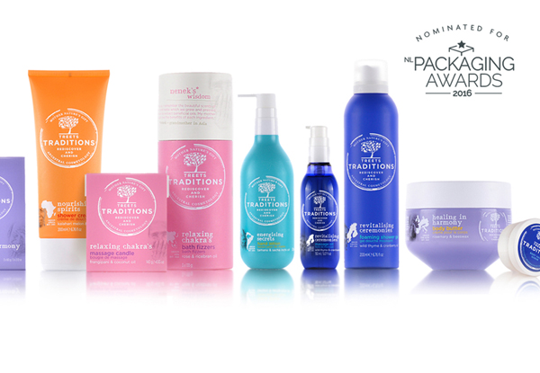
Brand-, packagingidentity, structural, naming and positioning.
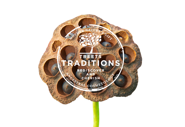
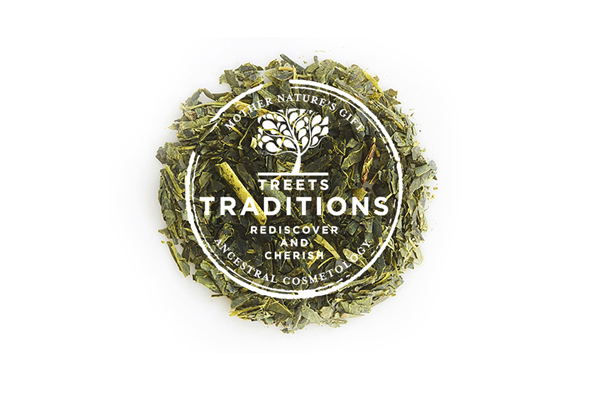
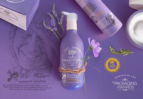
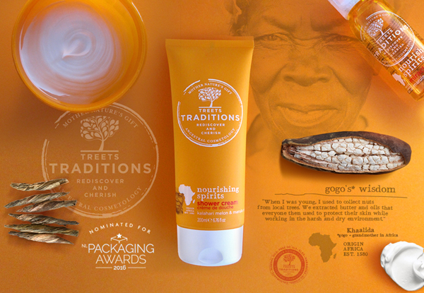
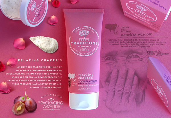
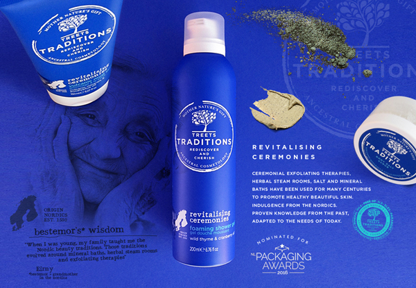
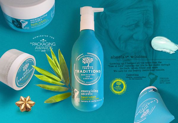
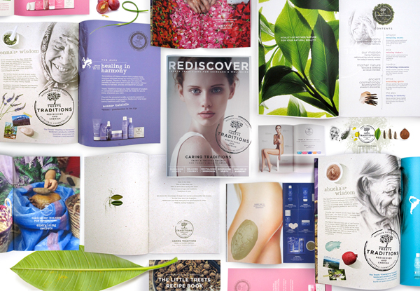
Our ancestors didn’t have pills or daycream to heal or protect themselves against the circumstances. They have the strong healing power given by nature. People prepared blends of extracts coming from plants, herbs, flowers and oils. Experimenting and discover. They developed their own traditions of skin and body care. This history goes back for thousands of years. This knowledge and their traditions were passed on from one generation to the next. We want people to rediscover these traditions, so they will not be forgotten. products based on proven knowledge from the past, adapted to today’s needs. We love to share, have a look here.
Brand-, packagingidentity, naming and positioning.
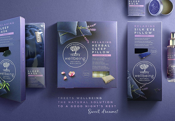
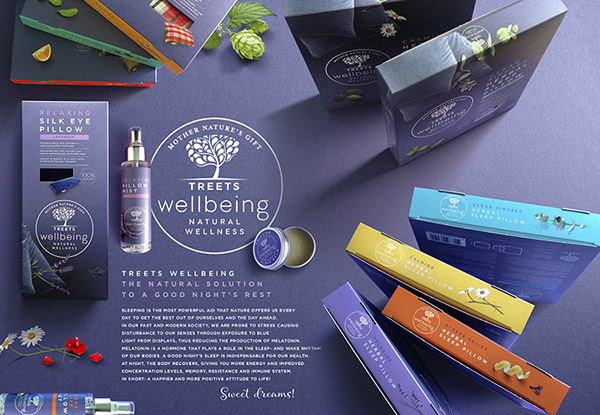
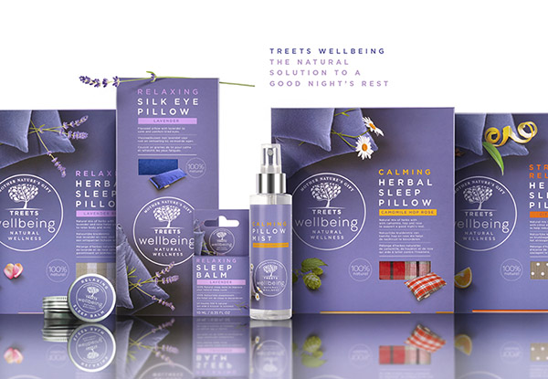
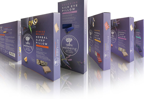
A beautiful skin starts with a good night’s rest. Contemporary hectic lifestyles cause stress and as a result, we are less able to truly experience our daily lives, and have less time for each other and ourselves! Many of us are experiencing sleeping problems due to the pressures and stress we face during the day. We are prone to stress causing disturbance to our senses through exposure to blue light from displays, thus reducing the production of melatonin.
Treets Wellbeing Sleep bring back the wisdom of our ancestors that will enrich your life. Return to pure & natural remedies and begin to feel more relaxed and a more positive attitude to life!
Brand-, packagingidentity, naming and positioning.
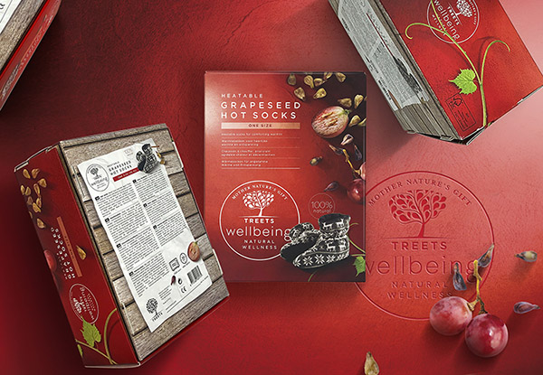
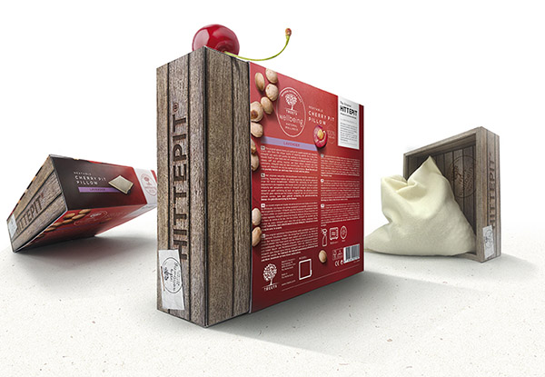
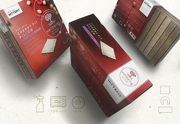
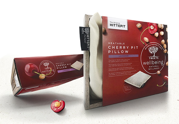
It has been known to mankind for centuries: the targeted use of heat is one of the oldest healing methods known to mankind. A human being cannot live without warmth. Social warmth or a warm cup of tea or a heated bath. Warmth is good for us, it provides the ultimate relaxation and benefits our bodies, -muscles and -minds. It improves blood circulation and loosens sore, tight muscles and joints. Treets wellbeing Warmth offers you a charging moment and vital energy.
Brand-, packagingidentity, naming and positioning.
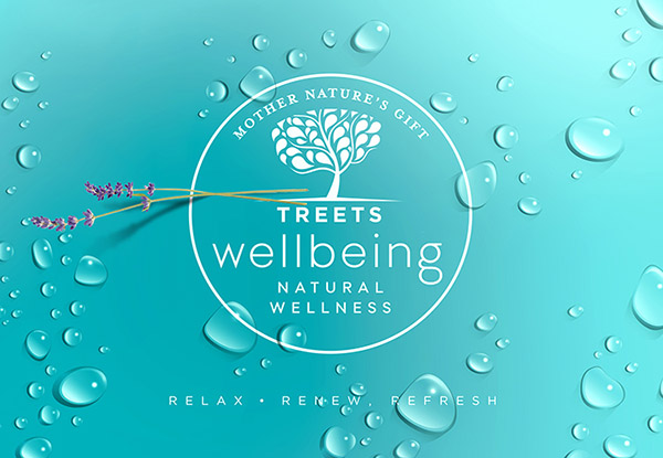
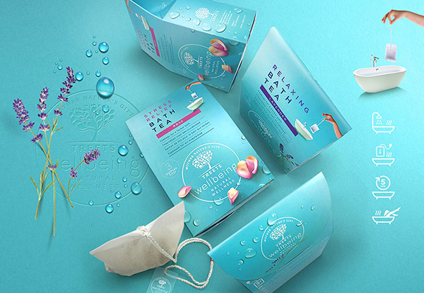
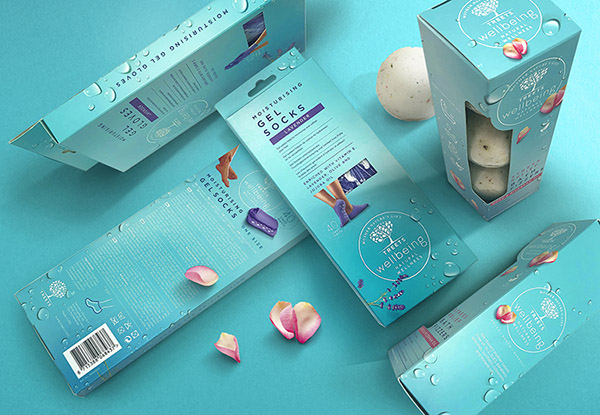
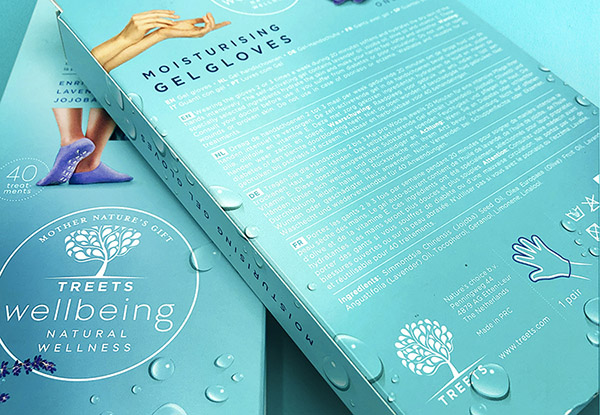
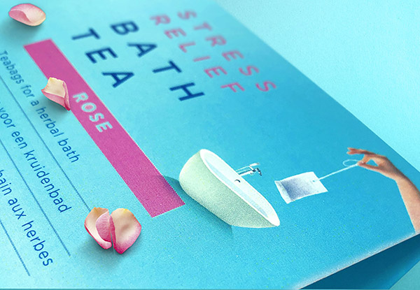
In the hectic world we live in, our inner self and being true to ourselves are of great importance. We need relaxation, mindfulness, self-reflection or relief, allowing our bodies and minds to relax. Removing negativity so that one can radiate positivity. It is all about the feeling of self-development, the feeling of happiness and satisfaction towards yourself and your environment.
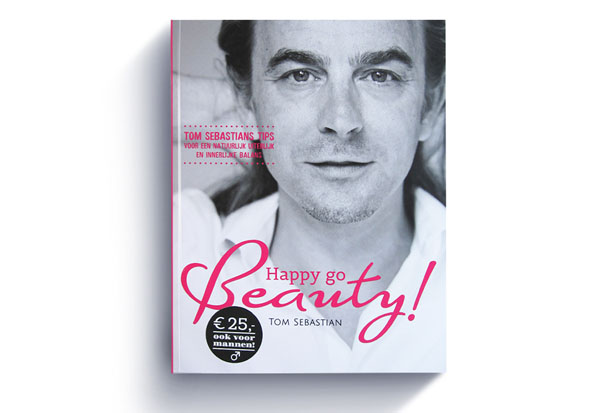
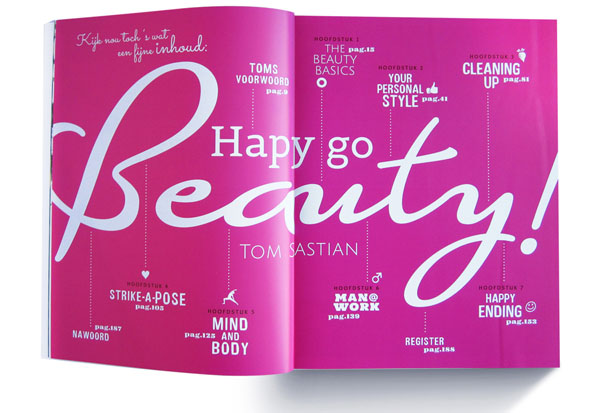
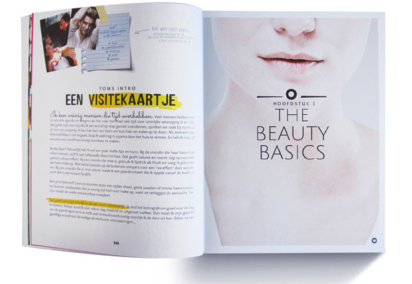
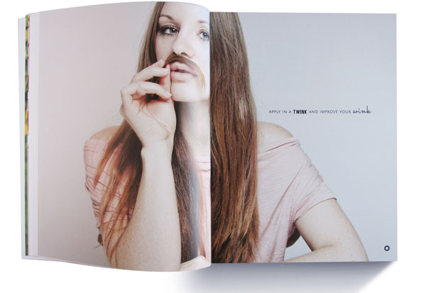
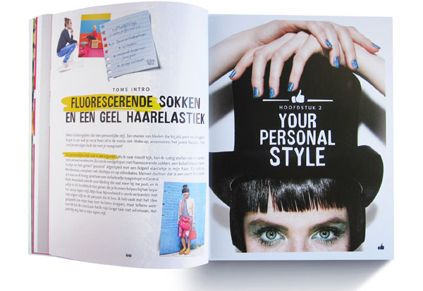
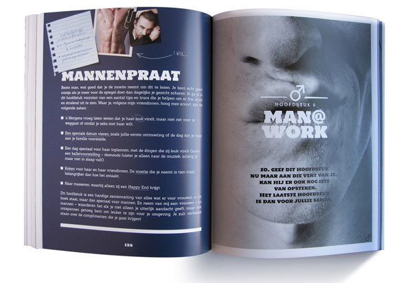
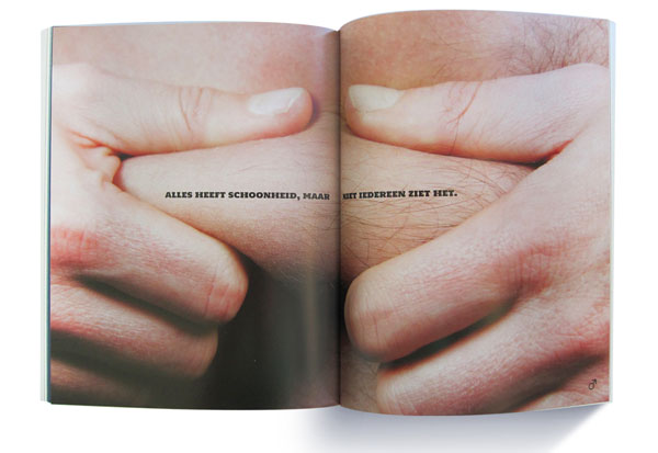
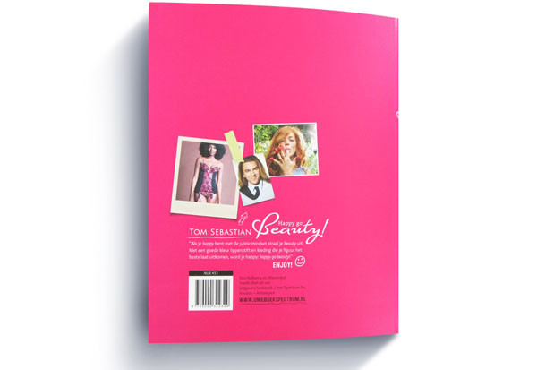
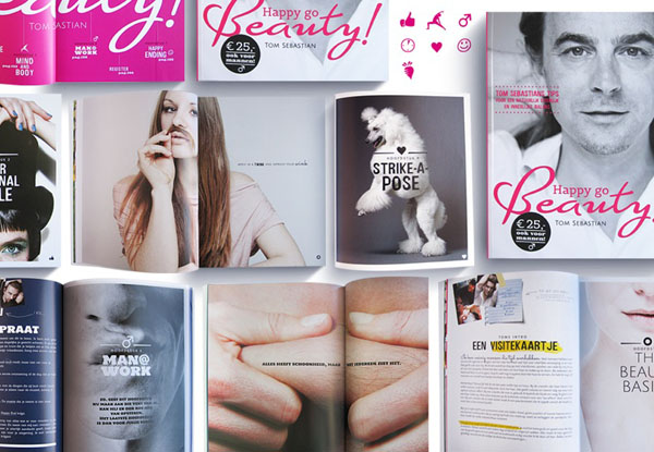
Happy Go beauty! Book design & tone of voice.
A bit cheeky but always looking on the bright side of life. Happy Go Beauty! Even interesting for you guys!
Authors: Makeup artist and TV personality Tom Sebastian and Karen van Ede.
Created during my freelance activities for publisher: UnieboekSpectrum.
Oh yeah! Give me this beautybible! Order here.
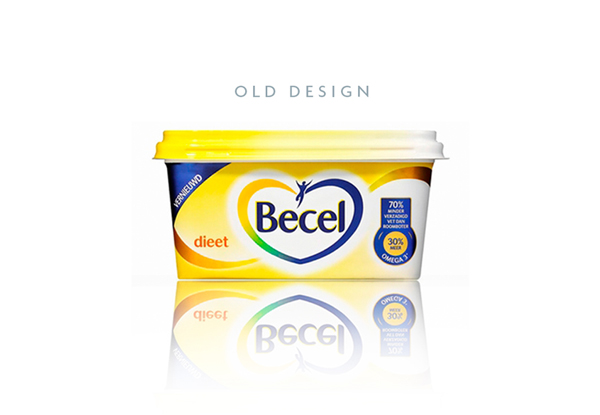
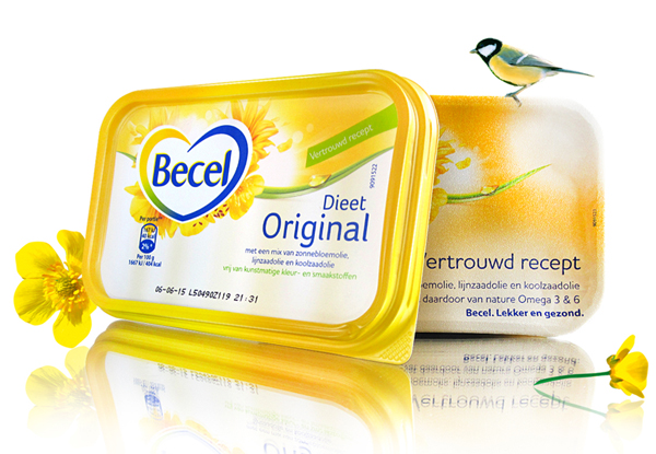
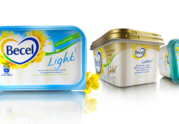
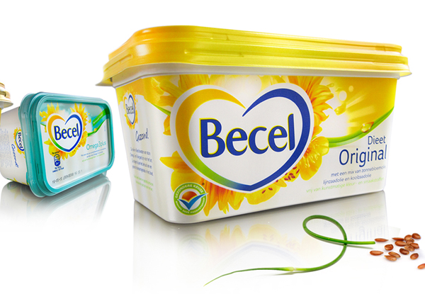
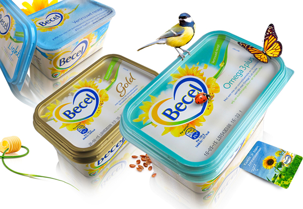
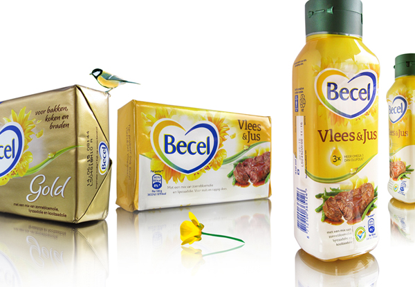
Becel Margerine Repositioning en Restyle Packagingdesign.
The one and only healthy everyday sunshine on your morning table! It all comes "Straight from the heart." The health issue is still the focus. But foodappeal and emotion should prevail.
Repositioned from functional healthy to tastfull quality lifestyle. The subtly restyled Becel logo is the heart of the pack.
The new Becel Identity created during my freelance activities at HAJOK Design GmbH.
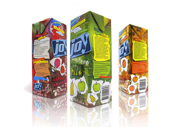
Identity and packaging for Joy Kidsdrink, with a tough look and feel.
Created during my employment with dBOD.
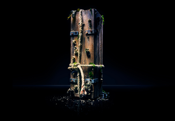
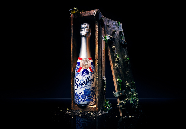
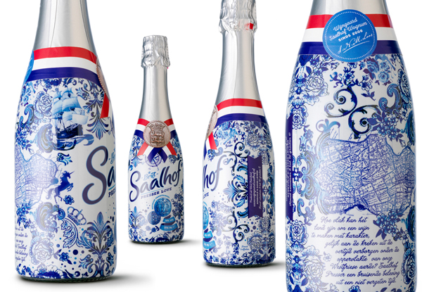
Packagingdesign Saalhof Presser Love Brut “The Miracle of West Friesland”
In the Golden Age, Hoorn was a place who experienced a period of prosperity. From the city Hoorn the VOC vessels “de Eendracht” and “de Hoorn”, sailed around the world and traded with faraway places which brought great wealth to Hoorn. On the 29th of January 1616 Captains Schouten and Le Maire founded the southernmost tip of South America, and they named it Cape Hoorn after their hometown.
As part of the 400 years of Cape Hoorn, Vineyard Saalhof Wognum created a special edition of wine named “The Saalhof Presser love Brut”. Inspired by the rich history of the VOC, a sleeve made up of historic West Frisian elements resembling a ric image such as a white porcelain Old Dutch bottle with a look and feel which fits into this present time. Elegantly finished with a waving Dutch flag sealed with a West Frisian penny. The wooden wine case founded from a sunken VOC ship was a one-time edition. Photography: Studio_M Photography.
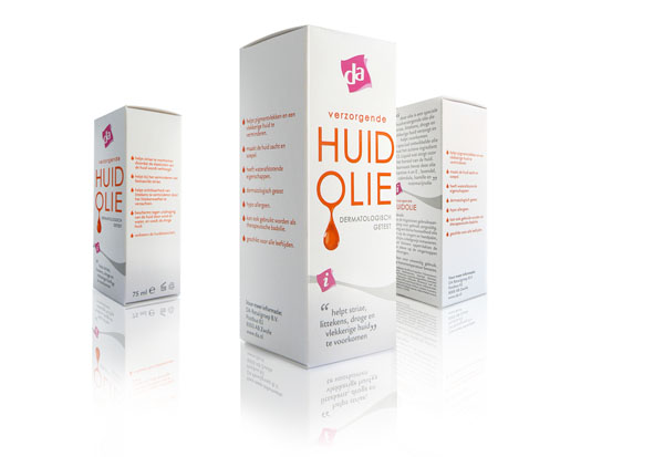
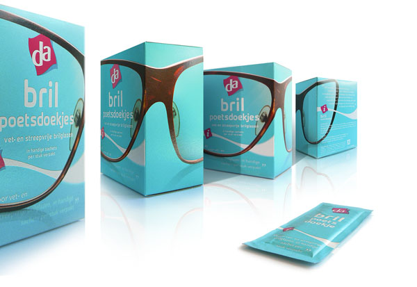
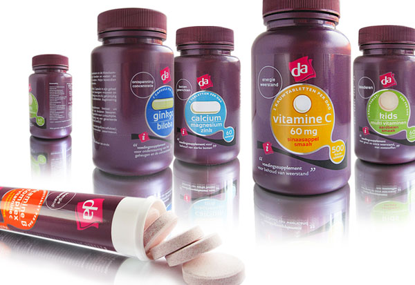
Identity for a Design Agency specialized in Private Label packaging design, Retail design and -communication.
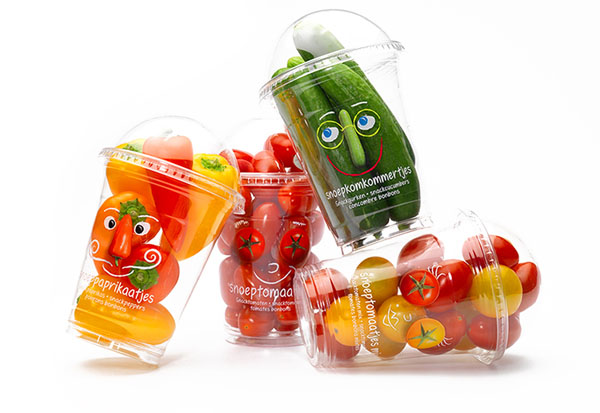
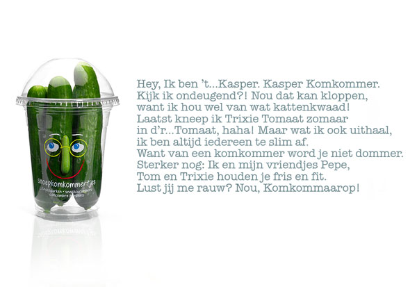
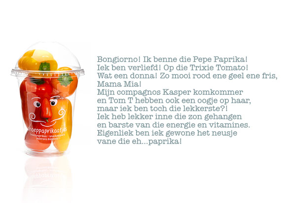
Healthy kids snack range.
Created during my freelance activities at Yellow Dress Retail.
Concept: Joost la Housse Execution & Copy: Joost la Housse & Bart Nagel (Yellow Dress Retail).
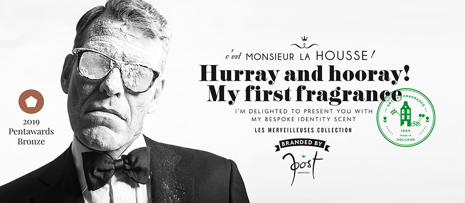
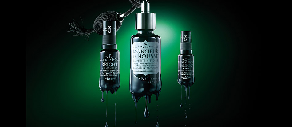
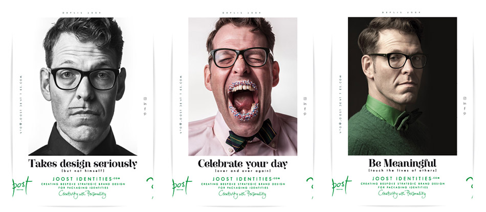
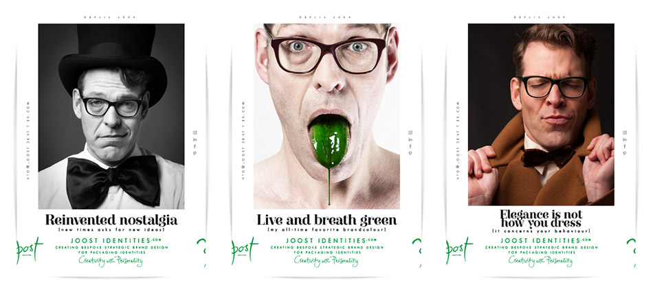
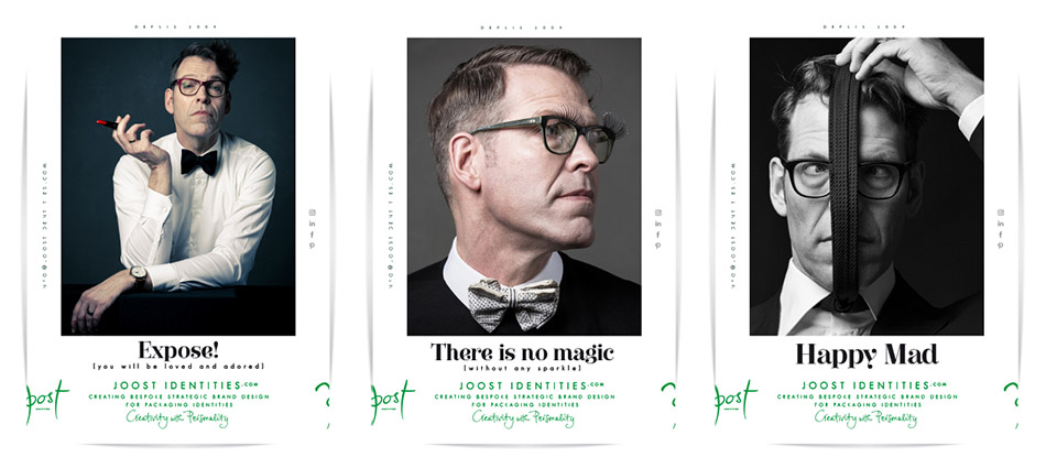
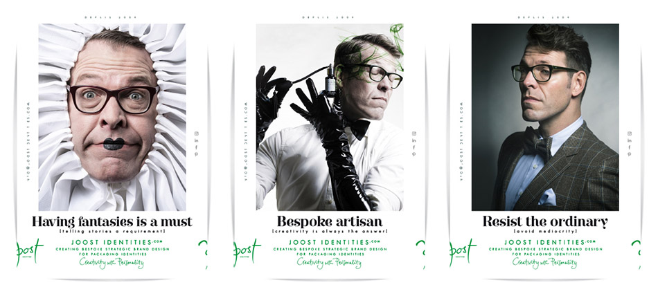
Our brain was not made for statistics, but for storytelling. A good story anticipates emotion, causing you to be touched by it, resulting in a better understanding of a brand. Monsieur La Housse is my candid artistic interpretation of Joost Identities. It forms a story reflecting personality through imagination, fantasy and escapism, achieving a perfect alliance between dreams coming true and taking challenges in the reality of the world we live in.
AWARD WINNING – Monsieur la Housse Artisan Fragrance: Creativity with Personality.
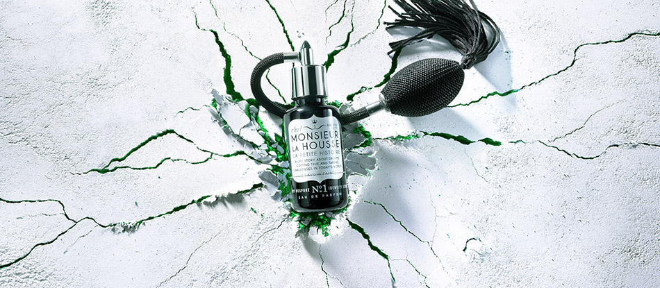
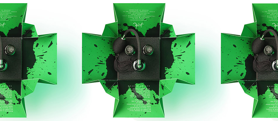
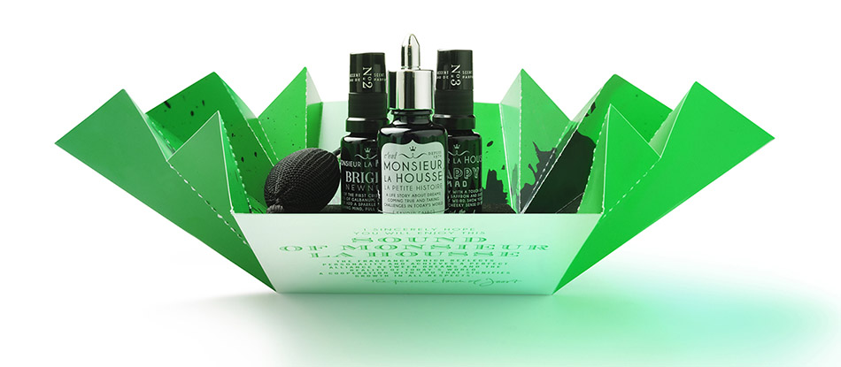
10th anniversary of Joost ID in 2019. On this memorable occasion, a promotional gift is being issued with a limited edition of 110 items. A personality, a brand or a person, each has its own unique DNA from which it can act depending on what is asked from its environment.
This given has been captured and translated into a unisex fragrance concept: the base fragrance ‘True Gentleman’ with black balloon-atomizer combined with 2 quirky odour accents ‘Happy Mad’ and ‘Bright Newness’ with spray atomizers. Thus, you can create many possibilities, extra dimensions and a versatility that symbolizes you as a brand.
The Truly multi-sensory interpretation of Joost Identities. Visualized and captured in an unique fragrance concept. Co-creation with Tanja Deurloo, Rob van Dam Studio_M and Vrijdag Premium Printing.
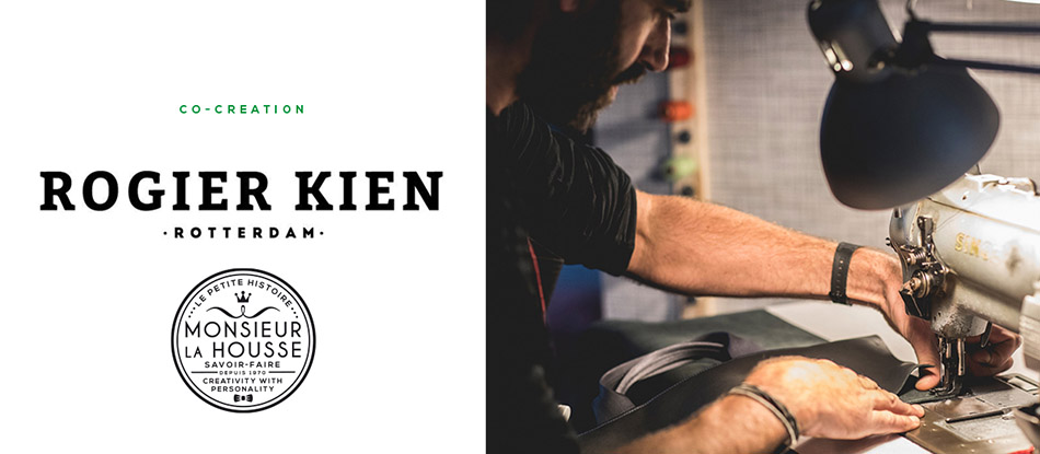
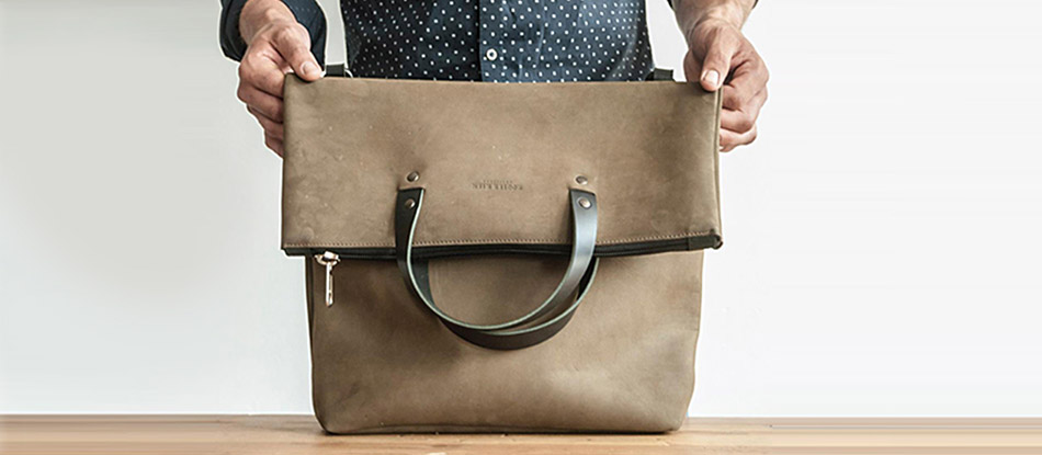
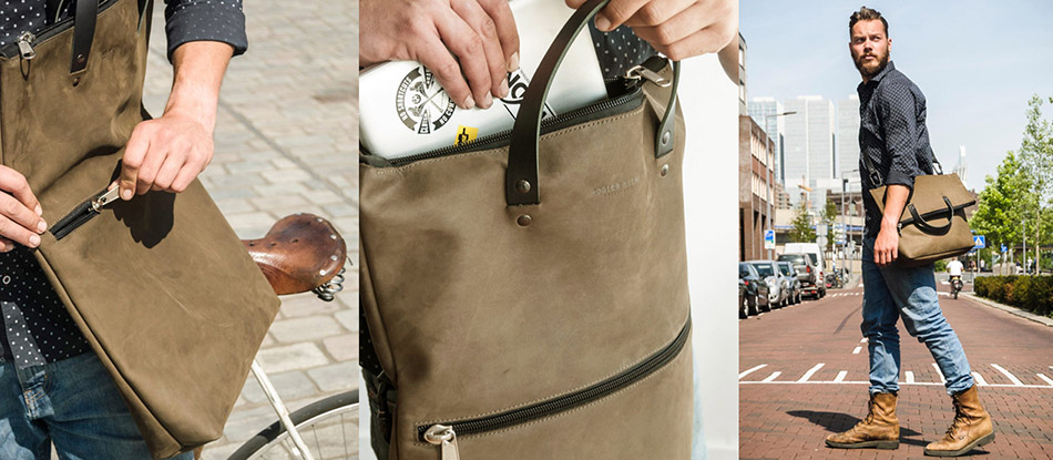
Monsieur la Housse Tote Bag; sophistication with discreet luxury.
Customized & handcrafted. Craftsmanship, expertise and love for materials with a keen eye for detail. Co-creation with Rogier Kien. Photography bags: Joep van Aert.
Images say more that words.
Don’t stick into old patterns. Let yourself disappear in your own fantasy and clear your mind! Show your personality and I will show you mine. Photography: Rob van Dam.
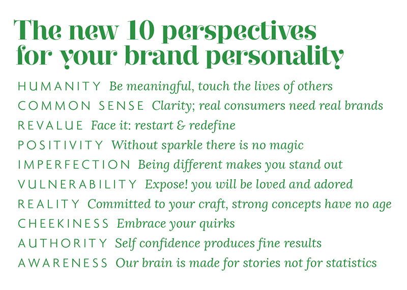
Consumenten hebben voorkeur aan merken die naast hen staan en dezelfde idealen hebben. Als merk ben je uiteraard meer dan alleen het product of dienst dat je verkoopt. Daarom heb ik de 10 geboden aangepast naar ’De 10 nieuwe merkperspectieven’. Houd dit in gedachten als je over gaat tot de (her) positionering van jouw merk in alle touchpoints.
People prefer to side with brands that have a similar stance as ours when it comes to viewpoints. You are much more than just the product you are selling. Therefore I have adjusted the 10 commandments into ‘The 10 new Brand perspectives”. Keep this mind for all your touchpoints when building or repositioning your brand personality.
Joost la Housse
Thomsonlaan 26
2014 TT Haarlem
Nederland
+31 (0) 6 10392830
info@joostidentities.com
www.joostidentities.com
Rabobank IBAN NL09 RABO 0148 4136 76
BTW-id NL 001960353B32
KVK 34320876
Algemene Voorwaarden zijn gedeponeerd onder KVK 34320876
- de eigenaar: de eigenaar van de website, te weten Joost Identities
- gebruik(en): alle denkbare handelingen
- u: de gebruiker (bezoeker) van de website
- de content: alle op de website aanwezige inhoud
Het onderstaande is van toepassing op de website die u op dit moment bekijkt. Door de site te gebruiken, stemt u in met deze disclaimer.
Hoewel de content door de eigenaar met de grootst mogelijke zorg is samengesteld, aanvaardt hij geen aansprakelijkheid ten aanzien van mogelijke onjuistheden van het getoonde. Mocht u van mening zijn dat bepaalde content inbreuk maakt op uw rechten, dan verzoeken wij u ons dat te laten weten.
De eigenaar is niet verantwoordelijk voor content op de aan deze website gekoppelde bestanden en / of websites waarnaar wordt verwezen. Ongeautoriseerd of oneigenlijk gebruik van de content of delen daarvan maken inbreuk op intellectuele rechten. Alle rechten op teksten en beelden zijn in handen van Joost Identities of de respectievelijke eigenaren. Voordat u overgaat tot het overnemen van de content of delen daarvan, dient u toestemming te vragen aan de eigenaar van de website.
© 2020 | JOOST IDENTITIES HAARLEM
- the owner: the owner of the website, namely Joost Identities
- use(s): all conceivable uses
- you: the user (visitor) of the website
- the content: all content found on the website
The below is applicable to the website that you are currently viewing. By using the website, you tacitly agree to this disclaimer.
Although the owner has compiled the content with the greatest possible care, he accepts no liability with regard to possible inaccuracies in the displayed. If you believe that certain content infringes your rights, please let us know.
The owner is not responsible for content on the files linked to this website and / or websites to which reference is made. Unauthorized or improper use of the content or parts thereof infringe intellectual property rights. All rights to texts and images are owned by Joost Identities or their respective owners. Before proceeding to copy the content or parts thereof, you must obtain permission from the owner of the website.
© 2020 | JOOST IDENTITIES HAARLEM